A huge insurance run.

Tuesday, April 23rd, 2013

This might be the best thing I’ve ever printed. Details about this project are on this pdf.

precita park sign

In case it isn’t obvious, this is a site specific children’s toy/word art installation. The tiles are interchangeable by row. I made eighteen tiles for each column (not shown).

The tiles were cut out with a computer controlled router–a true gift of modernity:

[iframe width=”560″ height=”315″ src=”http://www.youtube.com/embed/k0HjaESKE2A” frameborder=”0″ allowfullscreen]

Thanks to zMom for the world’s fastest drying acrylic paints.

The most violent show on TV, with 308 dead (or undead) bodies shown in the eight episodes.

Sunday, March 31st, 2013

“I thought the most beautiful thing in the world must be shadow.”
Sylvia Plath, The Bell Jar

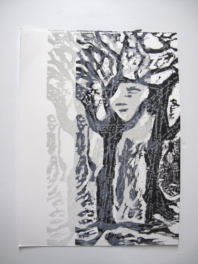
For what is likely my final offering in this record-smashing month of feather2pixelation, I am documenting some more stuff that I am finishing up for the CityArt April show.

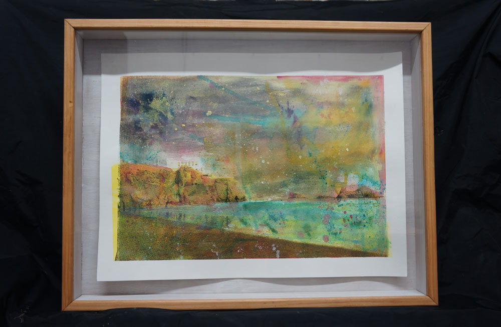
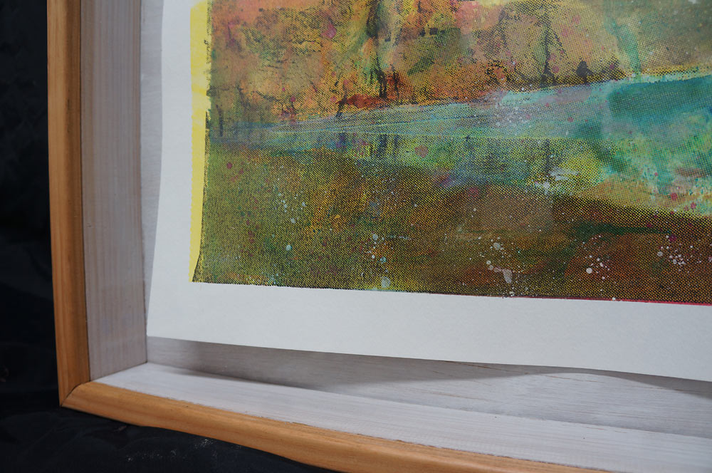
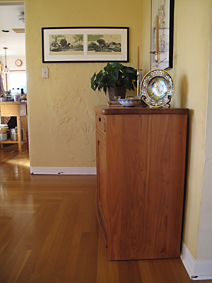
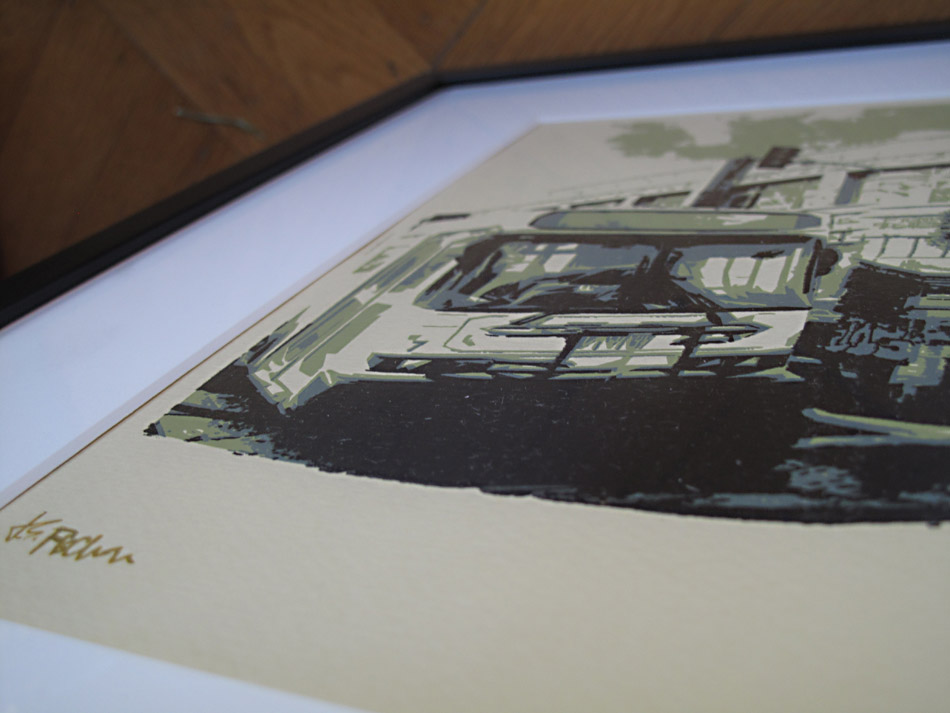
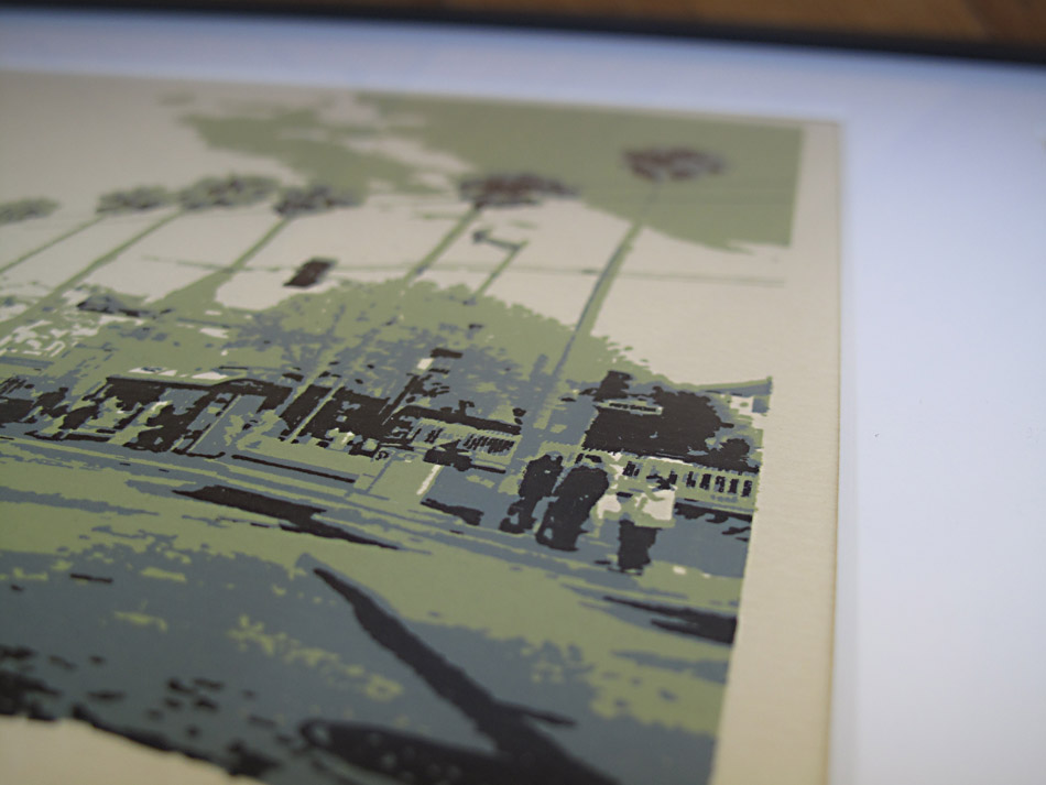
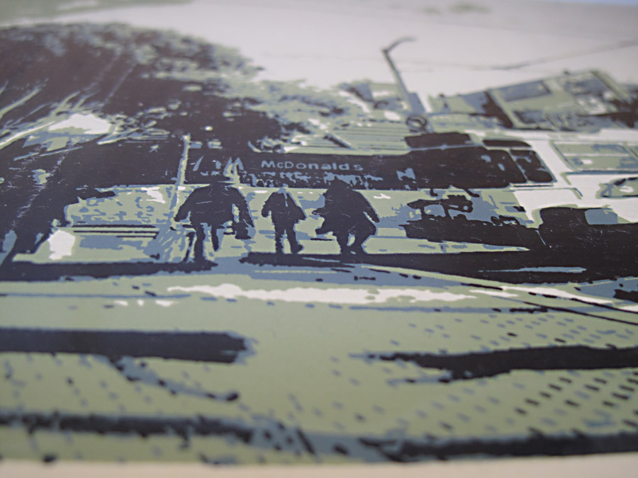
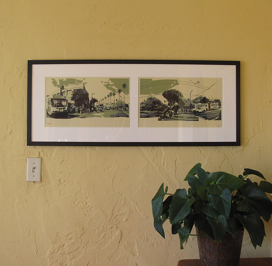
I am most excited about a shadowbox prototype I slapped together for these Ocean Beach paper prints.  Increasingly influenced by the impeccable eye of zMom as well as the practical concerns of selling scrap cardboard in a commercial art gallery, I am very slowly warming up to the concept of picture frames.

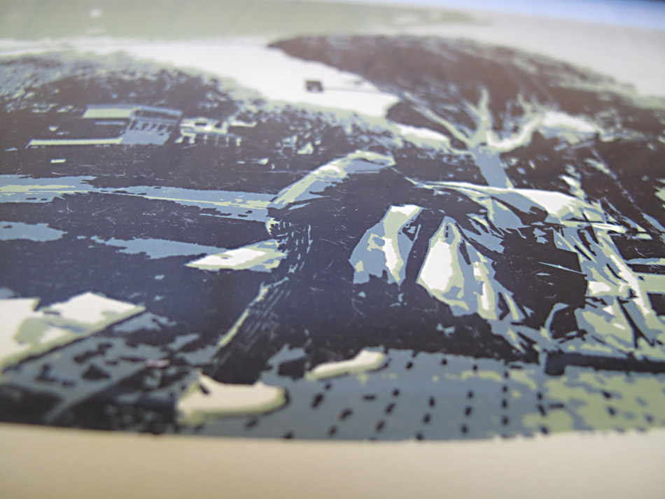
The primary concern is empirical. To me, the danger of presenting art behind a bunch of glass and mat board is that emphasizes the image over the physical.   I don’t want people to approach this piece as a colorful picture of the California coastline.  Much more preferable is an innate sense that comes from experiencing in person a luxuriously thick slab of paper with a surface textured in layers of  saturated inks.  Otherwise why not just print the shit out on my Epson and save $255 a month on studio rent?

That might not sound like a big deal, but in a world where there is no shortage of images–if anything, we live in a state of image overload–the  more emphasis on the material properties of the art object the better.  If I can’t smell, taste, or touch the art object, I hope to at least see it for what it is.

There is a need for visual artists working today to think of their work less as an image and more as an experience.  This is partly for ego reasons and partly for the reason that not doing so would mean that there is no compelling reason for new visual art to exist.

Thought experiment: wouldn’t we be disappointed if we went to see the original Declaration of Independence in Washington and they had framed it in mat board?  Anyone can Google the text or even an image of the Declaration of Independence, so why do we still go to the National Archives and wait in line for an hour? To see the physical ink on the original piece of parchment.  It is a thrilling piece of paper to look at.

Cue the shadowbox!  I feel like this is a very ideal solution, especially for paper work.  That it is in essence a display case for a mere sheet piece of paper in a way serves to elevate the object in borderline absurd fashion (an exaggeration that has been thoroughly deconstructed in Twentieth century art).  This particular shadow box might actually backfire, as it is made out of 3.5 inch-wide fir slats, casting a ridiculously long and possibly distracting shadow.

And I am still at a loss to make perfect miter joints.

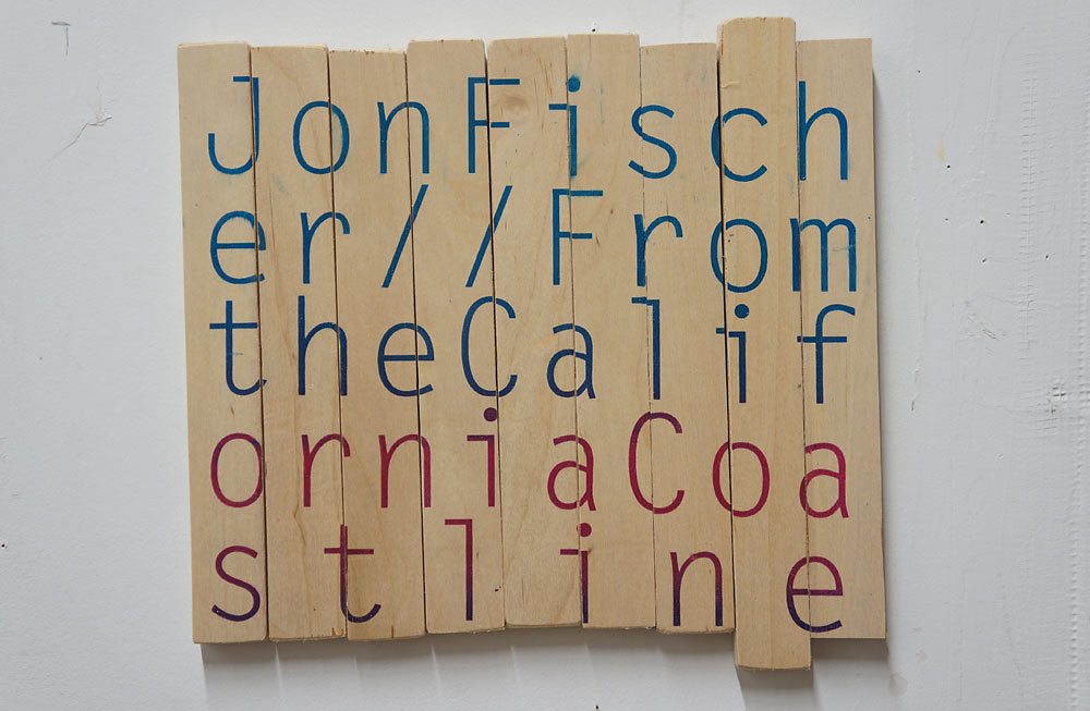
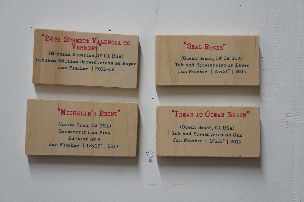
Also: some new signage and an alternate take on yesterday’s teaser.

3 years now of daily and sometimes abusive use.

Monday, December 24th, 2012

In 2009 when I was furiously producing a screenprint on wood for every intersection of Twenty-Fourth Street in the Mission District, I had the foresight to print a few copies on paper.  Here in 2012 I wish my 2009 self had even more foresight because a few copies is not enough.  This delayed regret comes to the fore only now because I just saw a professionally-framed version of Mission Street and it looks fantastic.   Ever the wise art collector, Z-Mom purchased this diptych at my Fall Open Studios with top secret plans to spend three times the amount on a frame job and hang the result on a very prime bit of dining room wall.  Last night in Santa Cruz I saw it for the first time at its new home and I immediately wished I made more.  I don’t really like frames, but this could change my thinking.  At least for multi-panel prints on paper.  It looks great.  It looks better matted and framed than it does unframed.  So thank you, Ziggy.

A sneak peek at our CR-V ad for the big game.

Saturday, January 21st, 2012

This Saturday saw the completion of a rare printmaking collaboration between myself and the extended Bregman family.

The project involved the production of one edition of prints that modestly explored the concept of Kindred.  Ziggy (aka Zmom aka Zig_Poet@gmail aka Erin’s Mom), an accomplished Santa Cruz print maker, started things out with a woodcut she described as “invoking the family tree:”

[flv:zmom_print.flv 480 360]

After that, I compiled a primary source motherlode of old letters, journals, report cards, and telegrams found in the Bregman family archive and also one of the world’s great junk shops (thank you, Ben Hill).  With the help of Erin and my letter-writing typewriter, I constructed the words into an extra special, one-layer silver screenprint:

Today in my San Francisco studio it all came together:

What a cool little project. So now I guess if someone I don’t know likes it, it’s off to Australia. Or something.