Archive for the 'questionable experiments' Category
He lights a fire within me.
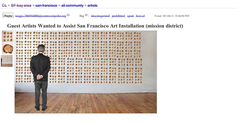
Tuesday, June 18th, 2013Know anyone who wants to help me and Ben create a wall of Toasted Puns? Please pass on this link ASAP.
Their menu choices seemed to reflect no particular concern about the fact that they were planning to spend the weekend underwater.
Wednesday, March 20th, 2013Work continues on my 35mm slide project.
My friend, musician Dina Maccabee asked me to prepare the visuals for a show she’s playing later this month. I agreed gladly because it’s a great collaboration opportunity and because I have been meaning to start playing with the possibilities of fabricating slides. And so Dina has transmogified “playing with the possibilities” into “forcing me to experiment until I make something usable under deadline,” which is typically more productive.
So after a little reconnaissance at SCRAP (one of a few creative-resuse meccas in town), I discovered the reusable and creative plastic slide frames that open up to allow you to interchange 35mm film clips between two glass plates.
A simple play session demonstrated that, to my joy, it is entirely possible to cram all kinds of shit in the frame, lock it, and successfully project.
This opens up an exciting avenue of projecting 35 mm collages and screenprinted slides.
[iframe src=”http://player.vimeo.com/video/62267316″ width=”600″ frameborder=”0″ webkitAllowFullScreen mozallowfullscreen allowFullScreen]
Punched its ticket to the NCAA tournament with a 68-65 win against Wichita State.
Tuesday, March 19th, 2013I am starting a project that involves making and projecting 35mm slides from scratch.
I figured my first step should be to test my found projector with some found slides. To my delight, it worked great.
[iframe src=”http://player.vimeo.com/video/62141608″ width=”500″ height=”281″ frameborder=”0″ webkitAllowFullScreen mozallowfullscreen allowFullScreen]
Soundtrack thanks: Ben, Joe, Nowell, Shal
One of the most glorious musical numbers in movie history.
Tuesday, March 12th, 2013I thought I would provide a little more detail on how I’ve been combining wet media with screenprinting. Basically I started by making a bunch of these two layer (yellow and black) screenprints on very thick watercolor paper:
Then I applied the wash over the print. And that’s the cool part: because the wet media is liquid and mostly transparent, I can work right on top of my image. This is a lot more fun than the other way around, which would require inventing a way to figure out where the image will end up before it’s printed.
And here is my latest attempt, for the April 2013 “Pink” show at CityArt Gallery on 828 Valencia:
Cliff House | Screenprint and Ink on Paper | 18x 24 inches | 2013
Behind The Latest ‘Downton Abbey’ Departure
Sunday, March 10th, 2013I have seen the future and it is wet media.
Those kindly and supportive folks following my last few projects may have noticed a painterly touch developing. Or rather than “a touch,” one could fairly call it ” a punch in the face” as there is nothing gentle about it. At least not yet. Like in all all arenas besides street fighting and lab report grading, I do aspire to always brandish a gentle touch. So with the long road ahead in mind, I have been experimenting with inks, washes, and watercolors–the large group of liquidy art materials generally known as wet media–and I aim to harness their drippy and vibrant properties to shift the balance of my screenprinting towards the organic.
One of the things I love about screenprinting is that it involves a unique tension between control and lack of control. Preparing, exposing, and layering stencils is an analytic process with little room for error. It is followed by a printing stage that is tactile, free, and subject to limitless possibility. Most screenprint stuff trends towards one of these poles. For example, on one extreme end I would think of production print work (t-shirts, signs, etc) while some of the more abstract work from the last century stakes out the most identifiable territory on the other. A big ongoing goal of mine is to develop a unique physical screenprinting process that negotiates a balance in between. And that is a long journey.
That’s also a long way of saying look at this practice piece. I recently acquired a variety of really nice papers and this is one of my first shots at applying art to it (possibly for the purposes of one final edition of Silian Rail posters for their imminent, final show ever). From my “Eight Ideas at Ocean Beach” stencils:
Cliff House | Screenprint and ink on paper | 18×24″ | 2013
I didn’t turn in the homework because I got confused about what the homework actually was, but now i understand it was the questions at the end of the chapter.
Sunday, January 27th, 2013Here’s a preview of my latest series Eight Ideas at Ocean Beach. There are actually sixteen separate pieces–each with a corresponding idea at Ocean Beach–but the gallery wall only fits eight at a time and I do not want to confuse visitors. They will likely be confused enough about why I would print images of myself running around with a crazed look over a perfectly beautiful image.
I am calling this a screenprinted motion picture. I think that is legitimate because each piece is truly one frame in a film I shot for this project. Notice how the background scrolls from left to right? Notice how I lose my hat at the end? Notice how I am wearing a bathrobe? (It’s got an ideal shape for screenprinting). I feel excited about this new direction and my aim is to cultivate collaborations with directors, writers, and actors, costume folks. This time around, it’s just me though. Thanks to EB for filming.
The Ocean Beach Ideas are from my working list of phrases documented in these posts.
Come see them in person all month!
City Art February Show
Opening reception: Friday 2/1/13 7-10 PM
City Art Gallery
828 Valencia @ 20th. SF CA
This would not be the first time that rumors eclipsed the actual findings from Mars.
Tuesday, November 27th, 2012I decided this first print on my Mt. Tam piece was a failure:
However, this failure wasn’t totally negative. I really like the quality of the print up close:
I just need to re-calibrate.
Kobe to LA critics: ‘Shut up’
Saturday, November 17th, 2012My work on the Rapha Cycle Club mural is complete. To recap: the SF based design firm Rebar hired me to put this image on vertical wood beams. Forty-five total beams, forty-five total square feet:
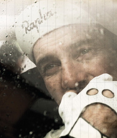
With screenprinting out of the question, I decided to get this done with large format digital prints on adhesive backed vinyl. It’s the very expensive stuff used for permanent vehicle decals, and I learned way more about 3M ControlTac technology than anyone should have to.
My neighbor Fran who runs a printing business out of her Precita Avenue garage, did the printing. EB and Tommy helped me out with the labor intensive application process, which took the three of us working together four hours to complete:
The grand opening of the parklet is 4pm on Friday November 16,2012. I’ll be there warming up for happy hour.
My prediction — Mitt Romney will be our next president By Karl Rove.
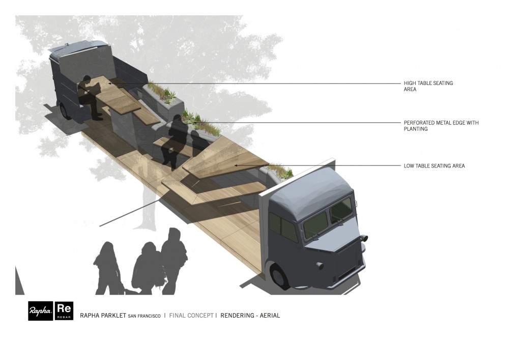
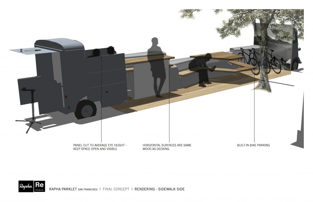
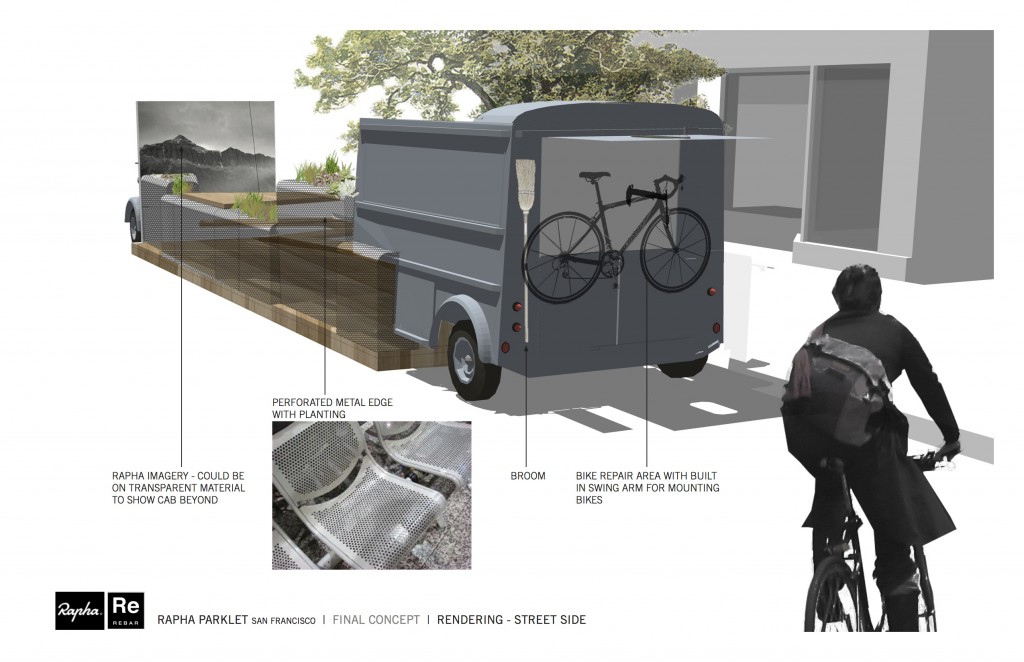
Thursday, November 8th, 2012I recently got myself involved with San Francisco’s parklet program. I am working with Justin Ackerman with the SF design-build firm Rebar to mount a humongous graphic on wood beams as part of a new parklet in Cow Hollow.
Parklets are an awesome development in urban planning. In San Francisco and Oakland, any business or group can petition to convert 1-3 curbside parking spaces into miniature urban gathering spaces. By law, these spaces must be available for the anyone to use, which benefits the public at large as well as businesses who take the initiative to enhance their space.
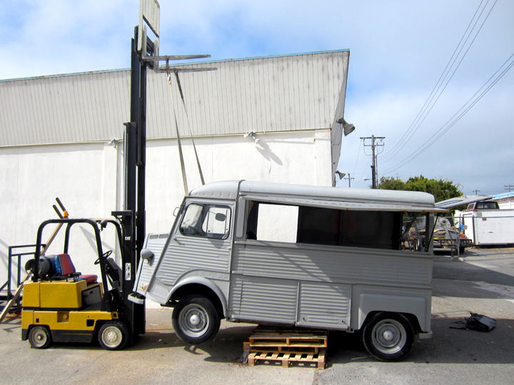
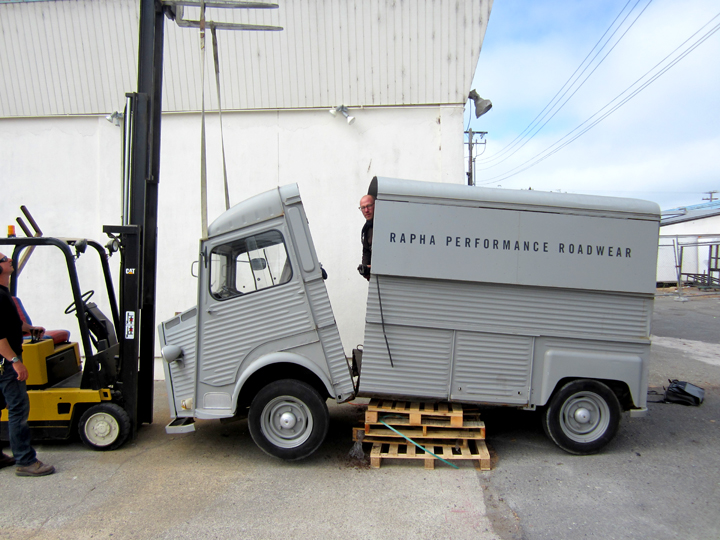
One of the best things about the program has been the diversity of innovative designs we’ve seen executed. For example, the parklet I am working on involves a sawed-in-half Citroën H Van, commissioned by a local bike club:
  |
At that point, we can steer the project into much more “bio-oriented” waters.
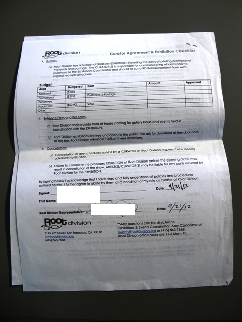
Thursday, September 27th, 2012Allow me to share this triumphant piece of paper. This is my signed, unsealed, and delivered contract to curate the July 2013 exhibition at Root Division. Over the course of this year, I developed this proposal with the help of some collaborators and it was accepted! It’s an art show based on wordplay. My goal is to make it so engaging that even the illiterate to have fun.
A data model by a Yale professor.
Sunday, September 9th, 2012A generous helping of my next generation prints on trash is now installed at the next generation Philz in Noe Valley.
The original Philz, located just an extended stumble down Twenty-Fourth street from Noe Valley, is one of the Mission District’s most gloriously funky and popular coffee shops. Hard as they try, no other contenders can seem to offer their customers ancient sofas quite as cozy nor Scheffleras quite as overgrown as the original Philz. However the new breed of Philz are different beasts altogether, with each new iteration reimagined to accommodate its indigenous clientele the way a young Lothario might modify his affect to the preferences of women in each new territorio.
Phil is ever the shrewd businessman.
For my own selfish reasons, this works to my advantage. Not only was this the first official “installation” at Noe Philz, but I got three beautiful new walls to fill with recent screenprints. The only question was could I improve them by hanging my art on them?
I took the opportunity to dig a little deeper in to this ongoing project, focusing on the disposable nature of the cardboard and the act of editioning and framing trash. Some of the more visually compelling of these pieces were beat up from being installed on the floor of a CELLspace show, so I decided to spend some time putting others through the ringer, too. I soaked them, sanded them, smacked them, derided them with harsh language. Actually I was pretty impressed by how hard it was to make screenprints on cardboard look beat up.
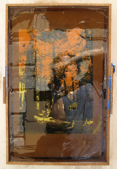
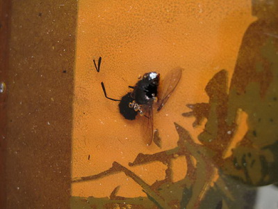
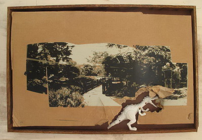
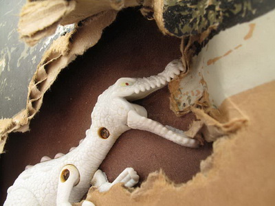
In addition, I let myself go with an idea for completely transforming a few of these into mini dioramas, which was fun. I cast one of them in prehistoric amber (a.k.a. casting resin) with embedded prehistoric flies (already dead). I custom fit a beautiful tree branch in another, complete with functional pine cone. A plastic dinosaur is eating one piece from the inside and another is a simply a plastic-faced box containing the remnants of a print. Even if it’s just me and a few kids who think this was a good idea, I stand by it. I think.
Here some snaps. Thanks to Tamara S for staying up till midnight helping me install.
He has no doubt that the starship has traveled to the past, as bullets are no longer used on Earth in the 2150s.
Wednesday, August 8th, 2012I have been working on preparing my prints on cardboard series for an upcoming installation. Mostly this involves fabricating lots of box frames out of hardwood flooring planks, but I also started thinking about ways to transform a few of the pieces into small dioramas. It’s been fun to think of ways for the art to interact with stuff.
In general I’m interested in exploring the possibilities of the limited edition in printmaking. Traditionally, printmakers (and often sculptors) generate a limited edition of anywhere from two to a few thousand identical prints, typically in one session, designating each piece with a serial number and then destroying the master plate so that no more prints can be struck.
To me this is one of the most compelling aspects of printing in the age of mechanical reproduction. The edition draws attention to a separation between the expressive and technical components of art making that is unique to printmaking. Printers spend most of their time pulling prints, which usually feels like an entirely different thing than being creative. The inspiration diverges from the perspiration–they can be entirely different activities.
Part and parcel to the workmanlike aspect of manufacturing prints is the intriguing burden that technology places on the contemporary printmaker: in an era when reproducing multiples of anything is frivolously easy, the art maker is compelled to not only generate multiples by hand–the art maker needs an interesting enough reason for multiples to exist.
With that said, here are two of my frivolous ideas for transform a few of my multiples into playful dioramas. I think the installation will feature 14 regular prints and 4 or 5 different altered prints.
1. Three Cones print cast in amber. Embedded with prehistoric bugs, the surface is hopelessly glossy so the photos suck.
 |
 |
2. SF Botanical Garden print with dino. I found this plastic toy on a walk a few years back. It seemed strange that it was unpainted, maybe some kind of prototype? My best guess of the species is Suchomimus or perchance Baryonyx. Joe Pisch, can you confirm? Anyway, this is a rare case in which hoarding weird shit I find on the beach paid off.
 |
 |
I’m selling it. this is real deal not scam and i have phone # to contact .
Saturday, July 28th, 2012First dance, first fistfight, first girlfriend: having logged many seminal moments of my life at summer camp, it was with a commitment to the memorable that I recently executed my duties as art director for one week of San Francisco Boys Chorus away camp.
It’s never really possible to know what kind of impact you are making on eleven year olds, but my basic plan was to win them over slowly by focusing on a precise five day project. Something that would keep kids busy with their hands and look really cool when it was done. Since the goal was to construct set pieces and props for EB’s parallel kid operas, we ended up painting a 50×50 inch Resistance-style portrait of Camp Director Claire. In her creation class, EB helped the boys work the painting into their story.
We began with a photoshoot.
I digitally processed one of the better images into seven discrete layers:
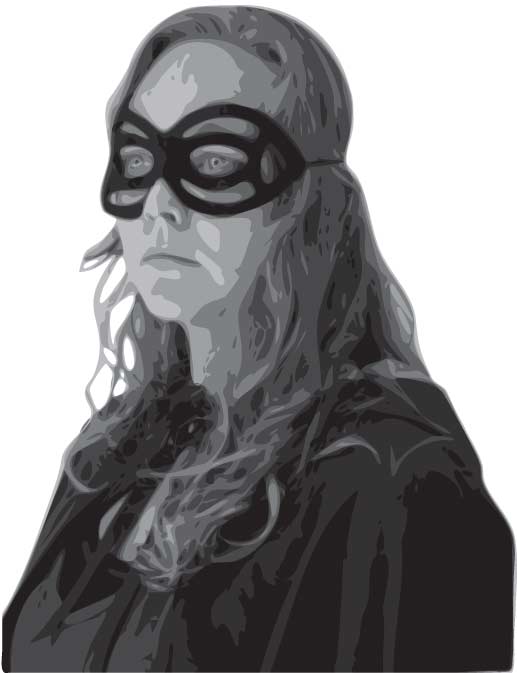
Over the course of five camp days, I projected each layer independently for kids to outline and paint on canvas hung from the wall. Registration marks were used to line everything up.
Then we stretched the canvas on a frame, ready for the show.
So it was pretty cool. And I got the kids to call me Jono. The painting looked very fine from a distance and I think the boys were into the program. Of course we did a bunch of other stuff. We made signs and banners. One day I chopped up a bit of branch from an apple tree and we made medallions. Located in Sonoma County at a Seventh Day Adventist boarding school on the banks of the Russian River, the setting was a nicer than summer camps I remember but the food a lot worse. A huge thanks to EB, Camp Director Claire, and Jess the counselor.
