Archive for February, 2012

Send your best interpretation of the theme.

Sunday, February 26th, 2012

Q: What’s seventeen inches long and divided into eight segments?
A: You are technically correct if you guessed the Peruvian giant yellowleg centipede, but you are more correct if you answer was “sheets of Fischer’s latest postcard edition

Because I want to maintain pace for 100 postcards in 100 years, putting my Three Cones in the Park stencils in service of a new edition seemed like a good weekend goal.

PS_Print was having a sale on posters, so I designed a postcard pattern and got it printed on some beautiful 11×17 card stock. Using the screens from my original piece on cardboard, I reprinted layers 2 and 5  on top of the pattern in metallic ink.

So the print is on the address side of the postcards, which is unconventional but I think it’s a good idea because it (a) subverts the tyranny of the two sided postcard (if you write on the front of a postcard, which side gets the fridge magnet?); (b) invites the sender to addtheir own art; and (c) looks more interesting.

Resisting the temptation to dig too much deeper in to postcard semiotics, I deferred to practicality and cut out paper squares that left white space for addresses.  After all, postcards are meant for mailing and mail needs addressing. It’s a pretty simple little screen printing trick: just lay some paper cutouts between the screen and the substrate–the ink will hold them in place for hundreds of pulls:

The resulting print:

After the second and final layer, I finished things off by hand perforating the sheets.

Here’s what one of the final 8 postcards looks like.  Go to my postcards section to see the entire sheet in all its 72dpi glory.
A figurative painter whose sultry and damaged women cavort unrestrained through opulent settings.

Sunday, February 26th, 2012

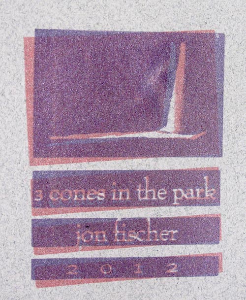
By no means is this a novel screen print technique, but I really like the effect of printing the same image in two slightly offset colors.  Here is an example for my studio session yesterday, shown in metallic red and violet.

That’s it.

Rain or Shine 2.

Tuesday, February 21st, 2012

Well, after battling with old expired emulsion, runny ink and a shitty design problems (all mercifully not chronicled here), I finished Stephen’s Print.  It looks like this:

Careful observers will note that I needed to enlarge the size of the dots on his jacket from the previous design.  Details like this consumed me for the most part, but every once in a while the project made me sad.

I took the liberty of spreading a few of these around the neighborhood, particularly in the West end of Precita Park, where Stephen lived.  I found a few strategically placed trees to discretely nail into.  Also I placed a limited edition of prints for public distribution at Charlie’s and Precita Park Cafe.  I think they will either be gone very soon or sitting around forever.

I documented the project in detail for my objects section.

And finally here is a good Times article on the incident.

I thought gee now what?

Tuesday, February 21st, 2012

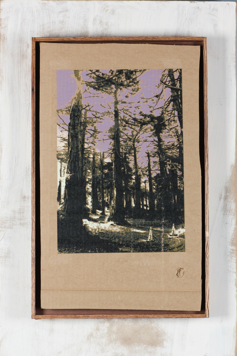
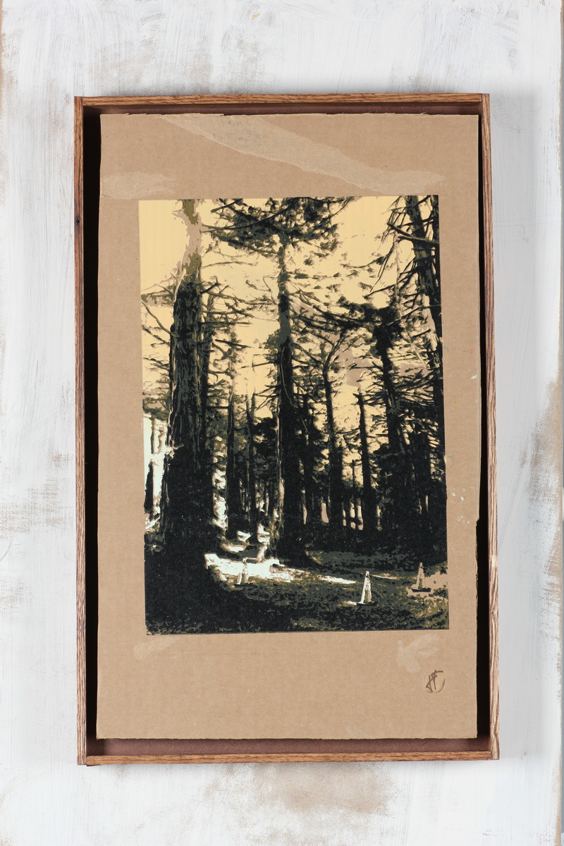
This is pretty stupid and took too long–much to long–for me to do, but I programmed a “View Pieces by Time of Day” button on my Three Cones page.

Why the best chocolate is the one you eat last.

Tuesday, February 14th, 2012

Yesterday I rented a fancy telephoto camera lens to photograph my recent series of prints on old cardboard.  The lens isn’t just fancy but incredible in its ability to make almost anything look good, shooting a razor thin depth of field that separates subject from a background that blurs into creamy oblivion.  But could it make my art look good?

After bringing the lens home in a car that is only a few times more valuable, I did some testing with CW’s new camera.  Just messing around without much idea of what I was doing opened up a new world of quality that I will probably never have access to again.   I guess I can sort of understand how photographers get obsessed with gear, although the idea is pretty unappealing.

Anyway my friend Michelle very generously donated her morning to hosting me and my cardboard at the City College SF Photo Lab, where there are two rules:

  1. I don’t touch anything.
  2. I don’t touch anything.

They must have been expecting me.

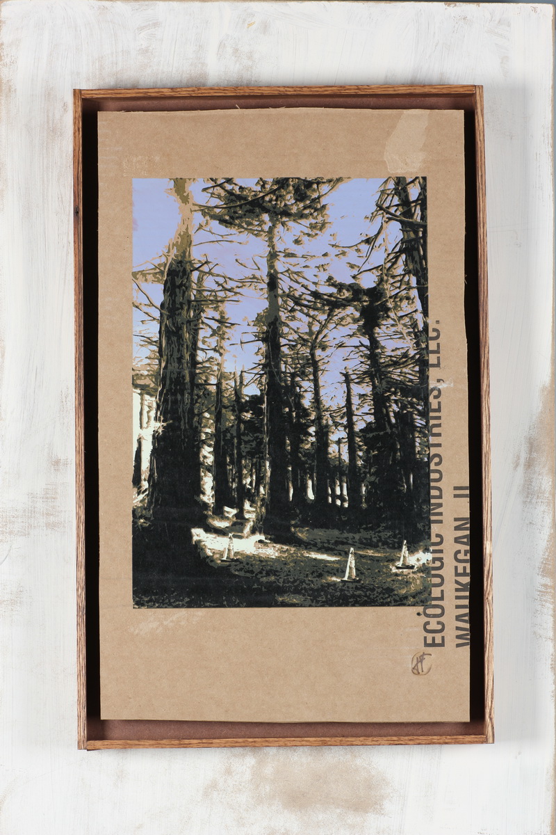
Michelle set up big, fake looking lights that made a pacifying sound when they flashed.  She showed me how to light my work without harsh reflections, and she did it all with a smile.  We shot all thirty-two pieces.  Overall, much ado for a bunch of trashed cardboard: here’s Three Cones in the Park on my Objects page.

We’ll ask how the healthcare mandate has worked out in Massachusetts

Monday, February 13th, 2012

As part of my foray into dry hopping, this is what $35 of hops looks like (after the beer went into the bottles):

If that doesn’t get you smacking your lips, I don’t know what will.

Rain or shine.

Friday, February 10th, 2012

At some point in December there was an attack on  Precita Park‘s spiritual overseer/resident homeless dude, Stephen Stymiest.  Shortly thereafter, Stephen died of wounds sustained during the assault, alleged to be a random act of gang initiation.  The whole story is just sad.  Very sad.  And it is staying with me.  I feel like Stephen was one of the best things this fast-changing neighborhood had going for it and I miss his reliable and comforting presence.  Stephen was always looking over the neighborhood but who who looking over Stephen? This got me thinking about how much more I could do as a neighbor, citizen, and fellow human.

Well there’s a lot more I could do.  For now, the immediate aftermath, since I am a printmaker, I am going make a print.  This one’s going to be for Stephen.

Here’s my image:

And here’s my stack of cardboard:

More soon.

Some good local coverage from the ever-vigilant Bernalwood blog: