Archive for the 'prints on wood' Category

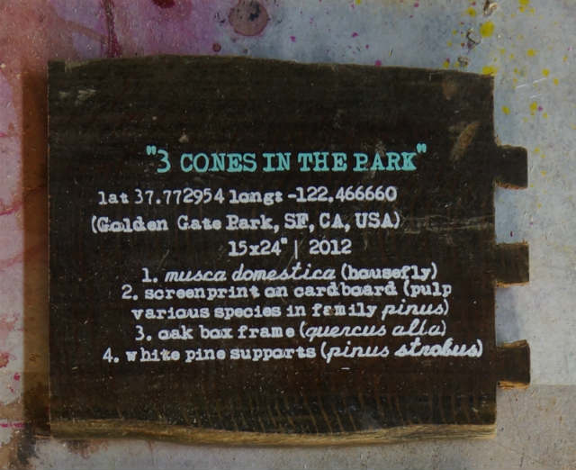
An exception to the hearsay rule which allows a witness to testify to the accuracy of a recording or documentation.
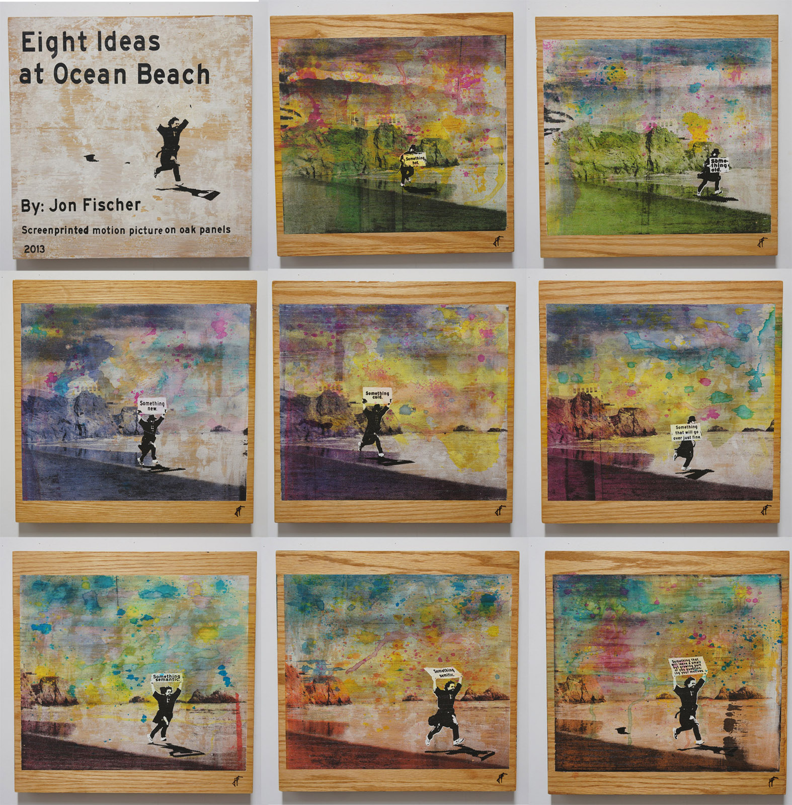
Wednesday, July 24th, 2013

One of my big summer projects was An Interview With the Author Monica Zarazua.

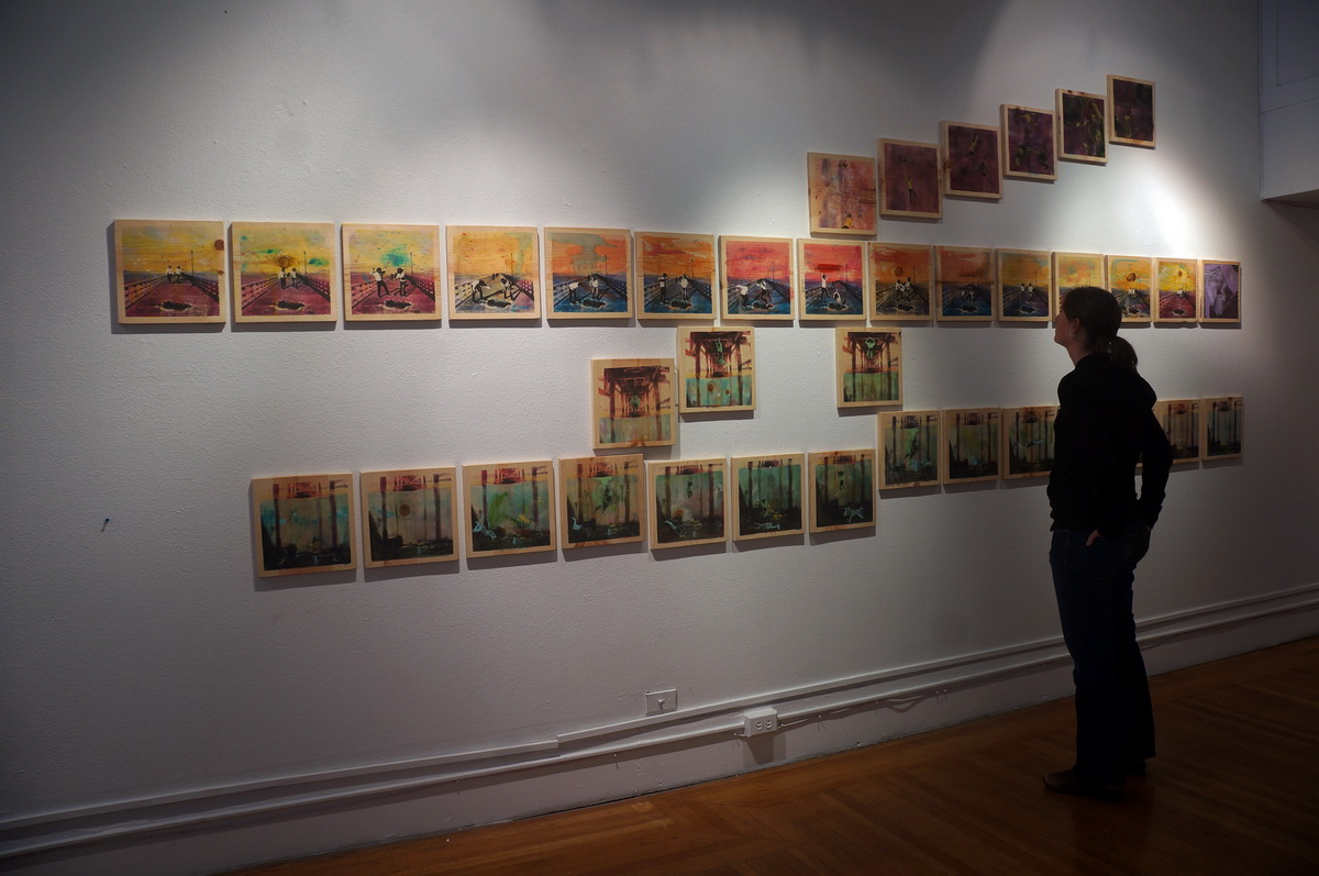
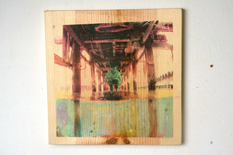
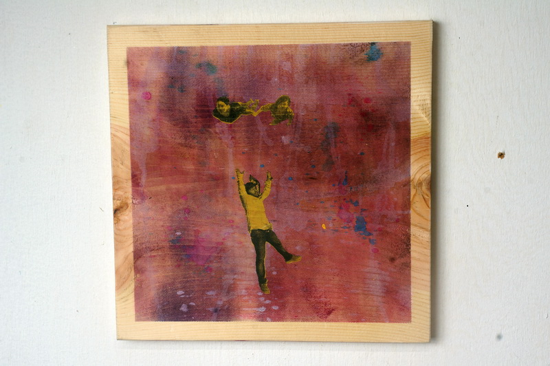
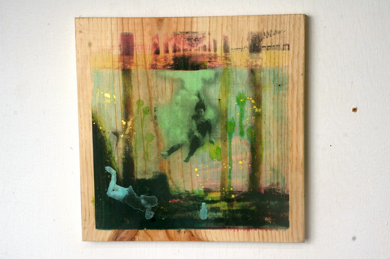
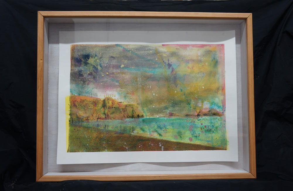
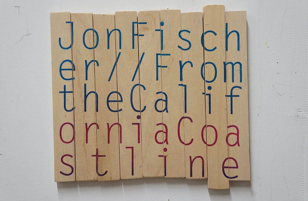
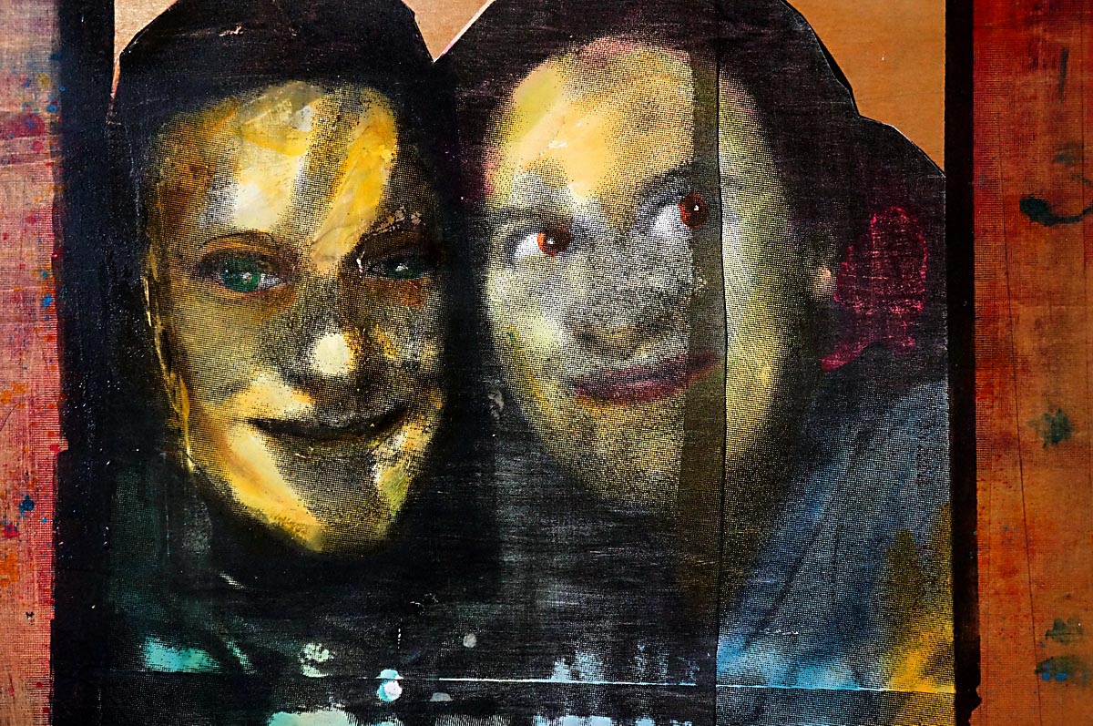
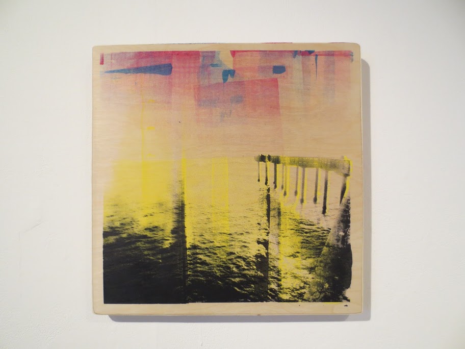
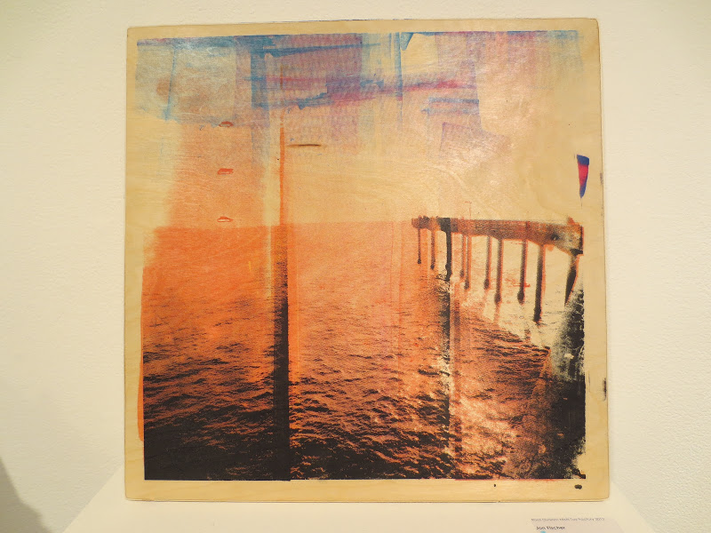
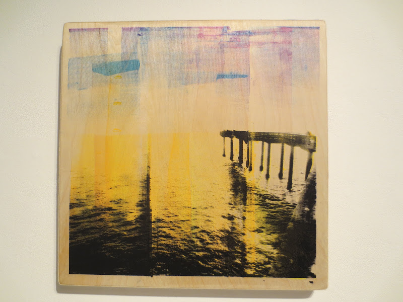
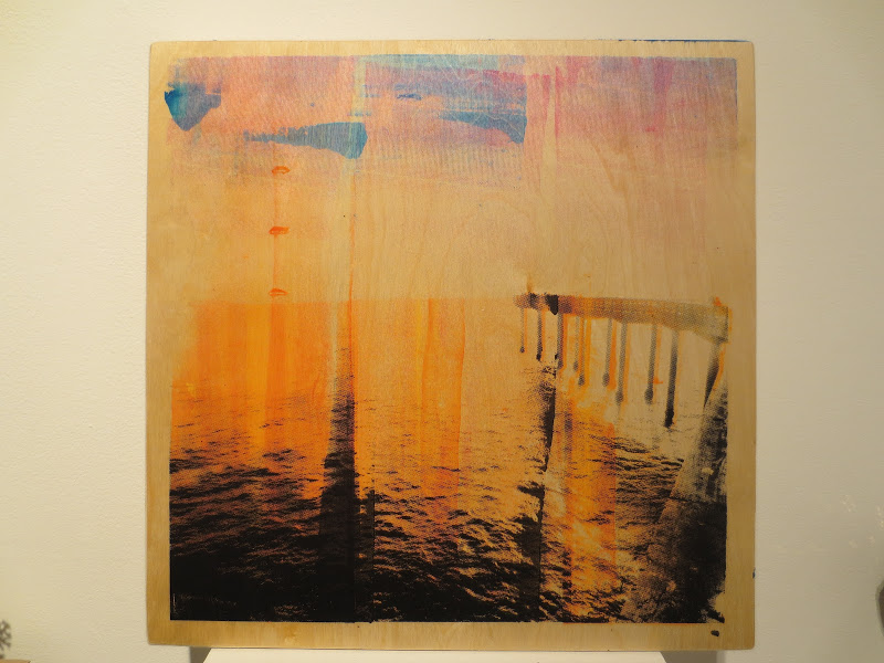
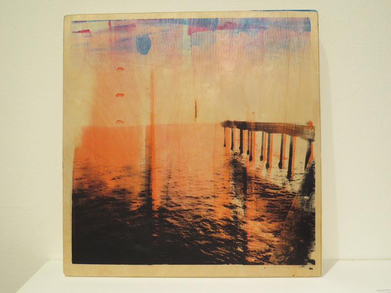
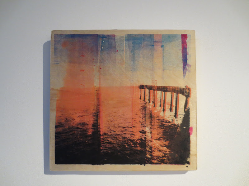
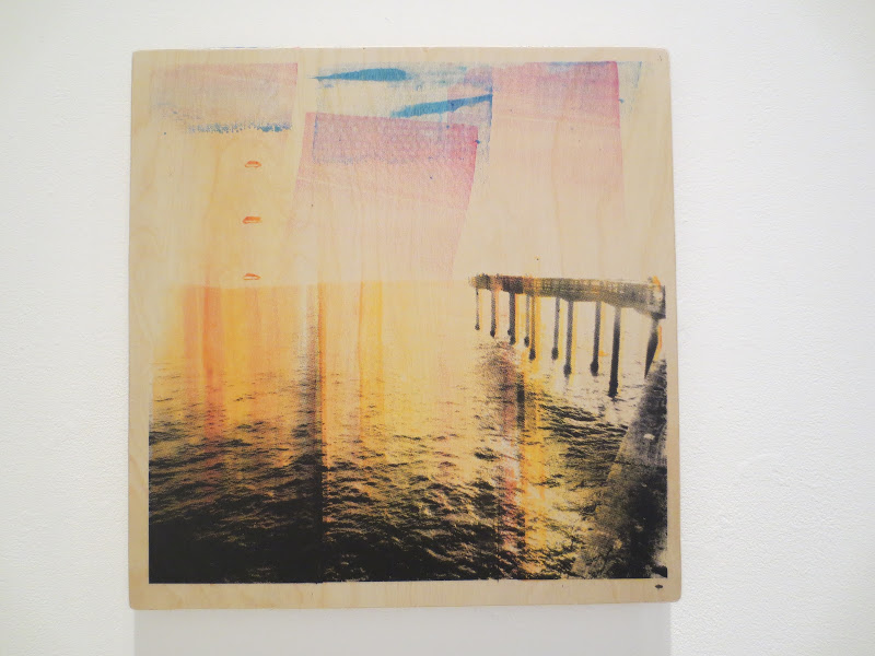
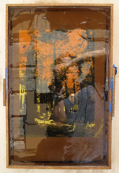
It’s a screenprinted motion picture on thirty-eight wood tiles made for a group show at Joyce Gordon Gallery in Oak-land.  That show explored intersections between the literary and visual arts and my intent for the piece was to blur the boundaries between fiction and non-fiction, creating an imaginary space for the non-imaginary author of the show’s short stories to inhabit. Here is a pdf of the show catalog beautifully put together by Xiomara Castro.

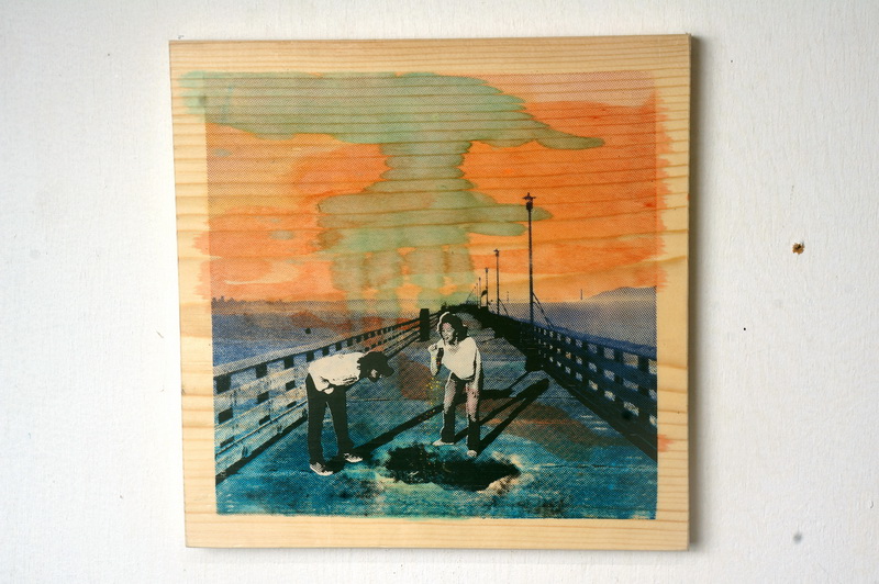
The images used in the project, which proceeds left, right, up, and down the gallery wall, were collected from photos and video recordings produced for this work.  Here’s a shitty video about one day in that process!

[iframe src=”http://player.vimeo.com/video/70608039?byline=0&amp;color=ff0179″ width=”500″ height=”367″ frameborder=”0″ webkitAllowFullScreen mozallowfullscreen allowFullScreen></iframe> <p><a href=”http://vimeo.com/70608039″>Underwater photoshoot for a screenprint project.</a> from <a href=”http://vimeo.com/user16153940″>Jon Fischer</a> on <a href=”https://vimeo.com”>Vimeo</a>.</p> <p>A four minute video filmed during the making of the visual art piece &quot;Interview with the Writer Monica Zarazua&quot; by Jon Fischer. On this day of production, Fischer enlisted several adventurous friends to improvise dozens of simple movements and sequences filmed using HD video underwater in a 59&deg;F pool. <br /> <br /> To develop the final art piece, individual images selected from single frames in the source footage were collected and reassembled to form intertwined fantastical stories that draw on motifs such as color, text, space, and movement. The result resembles something in between a period silent movie, a comic strip, and the pre-cinema locomotion studies of Eadweard Muybridge.<br /> <br /> The piece creates a story for the storyteller to inhabit. Presenting a complex structure of overlapping narratives that is generated from simple recordings of people in motion, the project explores a fluid relationship between fiction and non-fiction, in which each creates the other. <br /> <br /> Filmed by Jon Fischer and Nowell Valeri in 2013.</p>,/imframe]

From TV host to fierce defender of scientific issues.

Monday, June 17th, 2013

With a fierce commitment to words and play, the curation of my upcoming group show Character Profile is going to focus on separating Root Division in to discrete wings by topic, complete with screenprinted signage.  Want to know what sort of art’s in each of these wings?  Then join us for the July 13th 2013 opening. Do it!

And here’s the screenprinted signage:

The most violent show on TV, with 308 dead (or undead) bodies shown in the eight episodes.

Sunday, March 31st, 2013

“I thought the most beautiful thing in the world must be shadow.”
Sylvia Plath, The Bell Jar

For what is likely my final offering in this record-smashing month of feather2pixelation, I am documenting some more stuff that I am finishing up for the CityArt April show.

I am most excited about a shadowbox prototype I slapped together for these Ocean Beach paper prints.  Increasingly influenced by the impeccable eye of zMom as well as the practical concerns of selling scrap cardboard in a commercial art gallery, I am very slowly warming up to the concept of picture frames.

The primary concern is empirical. To me, the danger of presenting art behind a bunch of glass and mat board is that emphasizes the image over the physical.   I don’t want people to approach this piece as a colorful picture of the California coastline.  Much more preferable is an innate sense that comes from experiencing in person a luxuriously thick slab of paper with a surface textured in layers of  saturated inks.  Otherwise why not just print the shit out on my Epson and save $255 a month on studio rent?

That might not sound like a big deal, but in a world where there is no shortage of images–if anything, we live in a state of image overload–the  more emphasis on the material properties of the art object the better.  If I can’t smell, taste, or touch the art object, I hope to at least see it for what it is.

There is a need for visual artists working today to think of their work less as an image and more as an experience.  This is partly for ego reasons and partly for the reason that not doing so would mean that there is no compelling reason for new visual art to exist.

Thought experiment: wouldn’t we be disappointed if we went to see the original Declaration of Independence in Washington and they had framed it in mat board?  Anyone can Google the text or even an image of the Declaration of Independence, so why do we still go to the National Archives and wait in line for an hour? To see the physical ink on the original piece of parchment.  It is a thrilling piece of paper to look at.

Cue the shadowbox!  I feel like this is a very ideal solution, especially for paper work.  That it is in essence a display case for a mere sheet piece of paper in a way serves to elevate the object in borderline absurd fashion (an exaggeration that has been thoroughly deconstructed in Twentieth century art).  This particular shadow box might actually backfire, as it is made out of 3.5 inch-wide fir slats, casting a ridiculously long and possibly distracting shadow.

And I am still at a loss to make perfect miter joints.

Also: some new signage and an alternate take on yesterday’s teaser.

A victory for marriage equality.

Thursday, March 28th, 2013
City Art April 2013 teaser

City Art April 2013 teaser | 10x12" | Screenprint on plywood

Here’s the teaser for my third consecutive group show at CityArt Gallery.  Join me and two hundred of my new best friends for the April 5th opening at 828 Valencia!

And if not, don’t hesitate to stop in the gallery any other Wednesday through Sunday this month to check out wallspace number twenty-six.

The largest property crime in American history.

Monday, March 18th, 2013

I decided on a slightly darker stain for my second edition of Michelle’s Print.

BEFORE

AFTER

Michelle’s Print | 1 of 9 (2nd edition) | Screenprint on Pine | 12 x 18″ |2013

This is one of a few reoccurring episodes in which a particular observation has recently come to light. Not that I expect most people to take too much interest, but for me this simple detail could have repercussions on the way I make art.  Long story short: I have discovered that I can layer other media on top of my screen prints.   Even watercolors and stains.  All I have to do is properly heat set my prints.

A kind of computer sex in which a joy-stick-dildo can be animated by a user on a distant computer.

Saturday, March 16th, 2013

I recently completed a piece for the beloved of a beloved friend.  Based on a photobooth picture, the piece was made entirely from materials I had lying around my studio. Bill (on the left) came out looking a wee bit feminine, but he is a very secure man and so I didn’t worry to much about it.

Bill and Christina | Ink,  Screenprint on Plywood | 18×20 in | 2013

A defiantly high-concept, low-budget, intimately realized yet grandly imagined drama.

Tuesday, March 12th, 2013

Due to popular  demand (!),  I did a second edition of Michelle’s Print from last summer.  Inspired from a photo my sister shot of some jerk in Santa Cruz, she specially requested the original project.  I made nine for her birthday and now there are eight more.  I just need to brand ’em. Decidedly more rainbowy than the originals, here is how one of them turned out:

Michelle’s Print | 1 of 9 (2nd edition) | Screenprint on Pine | 12 x 18″ |2013

Many theaters were unable to sell even a single ticket, an embarrassment for the Communist Party.

Tuesday, March 12th, 2013

Here is one of two 8-frame motion picture studies that I screenprinted on oak panels earlier this year.  I’ve been  contemplating this idea in a bunch of new written proposals, shopping it around for an opportunity to expand the project.  The next step might look something like this.  I think I may have just that opportunity this June.  So I am getting excited.


Eight Ideas At Ocean Beach (A) | Screenprint and ink on oak | nine 16×16″ tiles | 2013

The horse meat in IKEA meatballs.

Monday, February 25th, 2013

I’m getting ready for the March show at City Art:

…By printing some labels on wood, complete with Linnaean taxonomy, for my series of Invasive Species screenprints.

(Remember this print with embedded flies?  Me neither.)

Anyway, some see them all Friday March 01, 2013 at City Art. 828 Valencia from 7-10PM.

PS: If you buy the art at the show, you get the wood label for free!

Finebaum had told the campaign to prep Romney to talk sports, but Romney “didn’t have a clue who Nick Saban was.”

Saturday, December 15th, 2012

Last weekend I took my live screenprinting act on the road.

By on the road, I mean four blocks from my studio to Root Division for the second annual  Misfit Toy Factory.

It’s a live artmaking event featuring over 35 artists making sculptures, toys, and gifts onsite in the gallery space at Root Division.  All works made in this one night only event are cash and carry for $40 each and benefit RD.  It’s like a holiday-themed sweatshop for artists, except without the paycheck.   I made nine pieces inspired from a visit to California’s other Ocean Beach, in San Diego.

Here is a Picassa album with most of the work.  Here some of my pictures:

While none of the alleged victims could recognize all three players, Mitchell recognized Street from a class they took together on vampires.

Sunday, November 18th, 2012

This long image shall be my next screenprint.

It shall!

Perhaps you are thinking, pretty but not the most original image I’ve ever seen. My dear critical reader, how much I admire and respect you despite your near constant torments.  In principle I will concede your point.  However, the thought of screenprinting this image on a certain four foot long piece of wood is exciting to me, and since I have a day job that affords me if nothing else the luxury to screenprint things that excite me, screenprinting this exciting to me image is exactly what I plan to do. (I think I may have previously expelled some bullcrap about about experimenting with this four foot long piece of wood.)     Then there are the words on the sign.  They are not meant ironically.  In many ways they are the most sincere words that could ever be written.  When this is all through, it will be you conceding that to me.

A sensual, visually stunning journey of discovery into a new dimension.

Thursday, September 6th, 2012

Labor Day 2012 was spent in the studio with Michelle, printing Hillside Supper Club’s 25-pound exterior sign.  I spent a bunch of time this summer fabricating the steel frame and prepping the junkyard wood, so it was fun to finally complete the project.  On Tuesday, the sign was unveiled for a crowd of Hillside supporters at a special duck dinner in the restaurant (duck appetizers, mains, and dessert).  I felt a special sense of neighborly happiness when we got a round of applause.

Here’s photos from the printing session.  It was a tricky job because it was double sided and the graphic was large.

The results are displayed in an easy-to-understand document.

Monday, July 2nd, 2012

I wanted to write more about these mystery tiles.  They are a study for a large series that I am preparing, in which each one of these connected, free associative phrases gets its own treatment.  The so called treatment I am envisioning is a conceptual piece with a lot of working parts not shown here, but the backbone is this succession of wordplay.

(All of this is being prepared in parallel with a wordplay-based exhibition I am planning with a group of collaborators .  If all goes well, it might happen in July 2013. )

For now, this study was a way of giving the phrases a physical manifestation, to see what they looked like on a wall.

I am pretty happy with it.  The phrases are still subject to change and I would welcome any feedback from devoted colleagues.  In particular, I don’t know about “something retarded.”  I was hoping to sort of reclaim the word from it’s more uncomely usages, instead presenting it as the converse to the previous “something to quickly convince someone of something.”  But I don’t know if it plays right.  I need outside impressions, I think.

If you missed class this week, or just want a weekend boost, be sure to join us on Saturday.

Friday, June 29th, 2012

Here is where I am recording the July 2012 configuration of my display at Coyote Counter Collective.  423 40th street in Oakland.  This month I’m showing framed prints on cardboard, Michelle’s beach print on pine, and a mini installation of wooden tiles.