Archive for the 'printed signs' Category

From TV host to fierce defender of scientific issues.

Monday, June 17th, 2013

With a fierce commitment to words and play, the curation of my upcoming group show Character Profile is going to focus on separating Root Division in to discrete wings by topic, complete with screenprinted signage.  Want to know what sort of art’s in each of these wings?  Then join us for the July 13th 2013 opening. Do it!

And here’s the screenprinted signage:

Already looks to be back in pre-baby shape just two weeks after giving birth.

Monday, June 17th, 2013

After almost a year of waiting, hordes of Bernal residents finally got to see Hillside Supperclub‘s principle signage installed.  Chained to the corner of Folsom and Precita and pointing dead Northwest for the 18 month shelf life of Matsui screenprinting ink the end of time, it is a beauty. I really like the way that one turned out.  (Thanks again, Jonathan Bregman)

I have already pridefully sighted passersby noticing the sign, perhaps then giving the restaurant a new found and previously absent consideration?  That’s right you guys,   Hillside’s in the house now.

Thanks to Tony and Jonathan (Not Bregman) for the opportunity.

A huge insurance run.

Tuesday, April 23rd, 2013

This might be the best thing I’ve ever printed. Details about this project are on this pdf.

precita park sign

In case it isn’t obvious, this is a site specific children’s toy/word art installation. The tiles are interchangeable by row. I made eighteen tiles for each column (not shown).

The tiles were cut out with a computer controlled router–a true gift of modernity:

[iframe width=”560″ height=”315″ src=”http://www.youtube.com/embed/k0HjaESKE2A” frameborder=”0″ allowfullscreen]

Thanks to zMom for the world’s fastest drying acrylic paints.

Great for separating different content and grabbing the readers attention at the same time.

Friday, March 8th, 2013

I think people are getting the wrong idea.  So here are your new cardboard art instructions.:

The horse meat in IKEA meatballs.

Monday, February 25th, 2013

I’m getting ready for the March show at City Art:

…By printing some labels on wood, complete with Linnaean taxonomy, for my series of Invasive Species screenprints.

(Remember this print with embedded flies?  Me neither.)

Anyway, some see them all Friday March 01, 2013 at City Art. 828 Valencia from 7-10PM.

PS: If you buy the art at the show, you get the wood label for free!

What’s standing in the way is democracy.

Monday, November 19th, 2012

Sandwich board for Bernal Outdoor Cinema.  Yum.

Thanks Anne and Leslie for helping me grow the feather2pixel Bernal Sandwich Board empire.

A sensual, visually stunning journey of discovery into a new dimension.

Thursday, September 6th, 2012

Labor Day 2012 was spent in the studio with Michelle, printing Hillside Supper Club’s 25-pound exterior sign.  I spent a bunch of time this summer fabricating the steel frame and prepping the junkyard wood, so it was fun to finally complete the project.  On Tuesday, the sign was unveiled for a crowd of Hillside supporters at a special duck dinner in the restaurant (duck appetizers, mains, and dessert).  I felt a special sense of neighborly happiness when we got a round of applause.

Here’s photos from the printing session.  It was a tricky job because it was double sided and the graphic was large.

I’m selling it. this is real deal not scam and i have phone # to contact .

Saturday, July 28th, 2012

First dance, first fistfight, first girlfriend: having logged many seminal moments of my life at summer camp, it was with a commitment to the memorable that I recently executed my duties as art director for one week of San Francisco Boys Chorus away camp.

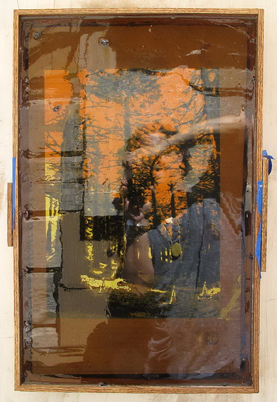
It’s never really possible to know what kind of impact you are making on eleven year olds, but my basic plan was to win them over slowly by focusing on a precise five day project. Something that would keep kids busy with their hands and look really cool when it was done. Since the goal was to construct set pieces and props for EB’s parallel kid operas, we ended up painting a 50×50 inch Resistance-style portrait of Camp Director Claire. In her creation class, EB helped the boys work the painting into their story.

We began with a photoshoot.

I digitally processed one of the better images into seven discrete layers:

Over the course of five camp days, I projected each layer independently for kids to outline and paint on canvas hung from the wall. Registration marks were used to line everything up.

Then we stretched the canvas on a frame, ready for the show.

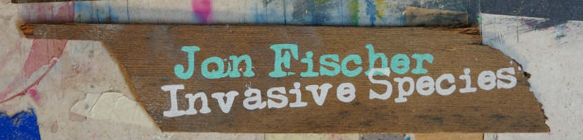
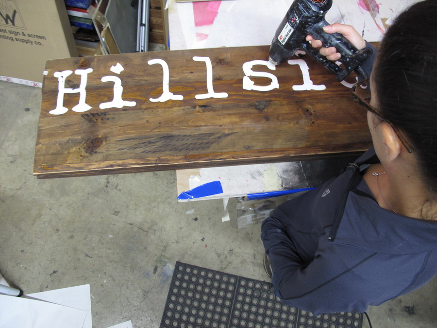
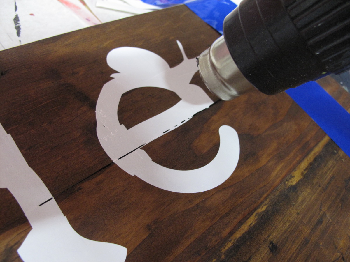
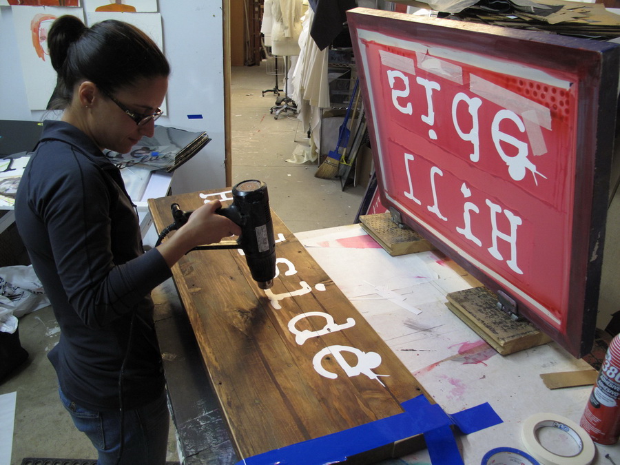
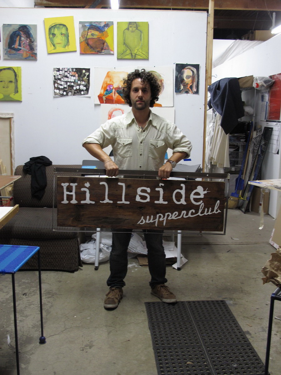
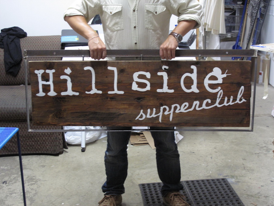
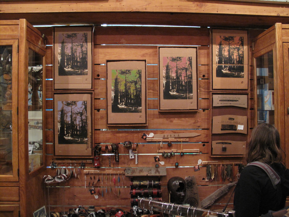
So it was pretty cool. And I got the kids to call me Jono. The painting looked very fine from a distance and I think the boys were into the program. Of course we did a bunch of other stuff. We made signs and banners. One day I chopped up a bit of branch from an apple tree and we made medallions. Located in Sonoma County at a Seventh Day Adventist boarding school on the banks of the Russian River, the setting was a nicer than summer camps I remember but the food a lot worse. A huge thanks to EB, Camp Director Claire, and Jess the counselor.

For my fellow generation Z peeps.

Tuesday, June 19th, 2012

Here’s the new Hillside logo, looking natural and at ease on the hips of chef Tony Ferarri‘s Vespa scooter.
photo (30)

You can get it in tubes, but the homemade version tastes much fresher.

Sunday, June 10th, 2012

Check it out:

Our first retail license at Coyote!

And I have been finding our screen printed signs popping up all around the Temescal environs of Oak-land.

All of this activity coincided with our grand opening party last night. To mark the occasion, EB and I printed some shirts re-appropriated by Rachel H.

Thank you to the devoted lot who stopped by to mark the occasion.

an exciting double-life.

Monday, May 14th, 2012

Our newest neighbor is this pop-up restaurant taking residence in the Italian place downstairs on Monday and Tuesday nights. In the last month or two, I have been doing a bunch of graphics and signage work for the enthusiastic chef-owners Tony and Jonathan because I want to stuff my face with their delicious food for free in a neighborly spirit of collaboration and mutual benefit.

The logo stuff is hard for me. I suck at Adobe Illustrator and my sole success in this arena is soon to be obsolete. But I enjoy the challenge so I gave it the old grad school try. Jonathan and Tony wanted something typewritery with a snail–eerily reminiscent of the tried and true feather2pixel regalia.  The final ingredient was some Bernal imagery.  I was a little concerned about churning out a cliche but in the end I got to use not one but two of my beloved typing machines along with a silhouette of San Francisco’s most overlooked radio tower.

My first official physical creation was this screenprinted sandwich board, to be replaced this Fall when the HSC pop-up locks-up its stock-up by taking over all nights with a suitably permanent sign to talk-up.

ready-made works on gallery walls.

Monday, May 14th, 2012

I found an exciting new place to display my work.  Coyote Counter Collective is what we in the industry call a re-tail space and those who have ever seen a coyote know that motherfucker has one serious tail.  Upon reflection I guess it’s a little hard to imagine a coyote ever needing to re-tail so I am not exactly sure if we quite have that right yet.  Or perhaps that’s the Counter part.

Anyway it’s a co-op storefront in Oak-land, where the trees are green but the Occupiers are not,  and my first official duty as a member was to screenprint a fistful of signs for some to-be-determined guerrilla advertising.  They came out well I think–a rehash of my go-to sign in one afternoon design–featuring glyphs from my beloved Remington 333 (eternal thanks for that, Kristin Roeder):

And here’s what my inaugural hanging looks like in situ.

Rain or Shine 2.

Tuesday, February 21st, 2012

Well, after battling with old expired emulsion, runny ink and a shitty design problems (all mercifully not chronicled here), I finished Stephen’s Print.  It looks like this:

Careful observers will note that I needed to enlarge the size of the dots on his jacket from the previous design.  Details like this consumed me for the most part, but every once in a while the project made me sad.

I took the liberty of spreading a few of these around the neighborhood, particularly in the West end of Precita Park, where Stephen lived.  I found a few strategically placed trees to discretely nail into.  Also I placed a limited edition of prints for public distribution at Charlie’s and Precita Park Cafe.  I think they will either be gone very soon or sitting around forever.

I documented the project in detail for my objects section.

And finally here is a good Times article on the incident.

Discover cosmopolitan luxury in the heart of Miami.

Thursday, October 6th, 2011

To make up for full speed ramming me on skis in 2010 Because he admires my work, ex-sailor Tommy Stillwachs allowed me the honor of printing the open/closed sign for Arbor, a new taphouse cafe in Oakland he is involved with.  Owned and operated by Chris Marquez and Suzanne Stillwachs, Arbor opened last Saturday.   And that night it closed.  The next morning it opened and after precisely nine hours it closed yet again.

I would like to think my sign made all of this activity possible.

The sign was screen printed on some beautiful and seriously warped scrap wood.  Precision screen printing requires a very uniform separation between screen and substrate, so I was happy this wasn’t a precision job.    The final prints turned out appropriately sloppy.