Archive for the 'screenprinting' Category

A bit of an adjustment going from no noise downstairs ever, to music till 11am.

Sunday, March 17th, 2013

Little Opera shirts! And bags!  Come see the cute little beasts perform at the Alcove Theater in downtown SF! Next week!

(Attending will grant you the possibility of seeing a few of those beasts  in color-coordinated and adorable micro baseball shirts.)

One of the most glorious musical numbers in movie history.

Tuesday, March 12th, 2013

I thought I would provide a little more detail on how I’ve been combining wet media with screenprinting. Basically I started by making a bunch of these two layer (yellow and black)  screenprints on very thick watercolor paper:

Then I applied the wash over the print.  And that’s the cool part: because the wet media is liquid and mostly transparent, I can work right on top of my image.  This is a lot more fun than the other way around, which would require inventing a way to figure out where the image will end up before it’s printed.

And here is my latest attempt, for the April 2013 “Pink” show at CityArt Gallery on 828 Valencia:

Cliff House | Screenprint and Ink on Paper | 18x 24 inches  | 2013

A succession of hats worn with a severe aplomb.

Tuesday, March 12th, 2013

Here’s a random finished piece from my series of prints on trash.  I am submitting some stuff to a group show featuring art made with recycled materials, so it’s actually not all that random.

What was more random was the inspiration to fabricate these pine boxes over the summer.  I remember thinking it would be cool to design the one on the left with a sliding plexiglass cover so I could fill it with something later.  Turns out the something was landfill, and I really like the “art materials” bag visible on the end:

San Bruno Electrical Distribution | Landfill, Screenprint on Cardboard |  10 x 20″ each | 2013

Detail:

Normally I do this in the dark of the night, to avoid the prying eyes.

Sunday, March 10th, 2013

Now that I have somewhere to sell them, I finally got around to properly matting my dozens and dozens and dozens of paper prints depicting each intersection of 24th Street in the Mission District. Totally coincidentally, there are twenty-four intersections of 24th Street in the Mission and, somewhat less coincidentally, each of these prints was made on a different size paper.  That was a lot of needlessly complicated matting logistics to sort though.  Also, this is the type of gross inefficiency that illustrates why it’s good that I still have a day job.

But why dwell on the past? Life is about the present.  And you should buy one of these for a present, especially if you know anyone who likes the Mission District, art, or visual experiences of any kind. The great news is that these are available for crazily patriotic President’s Day prices at City Art Gallery till April (828 Valencia, SF, CA).

Behind The Latest ‘Downton Abbey’ Departure

Sunday, March 10th, 2013

I have seen the future and it is wet media.

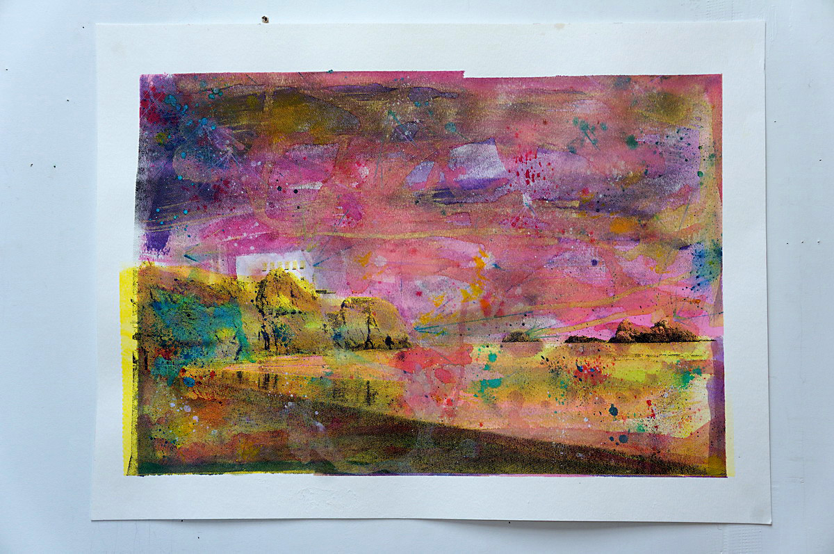
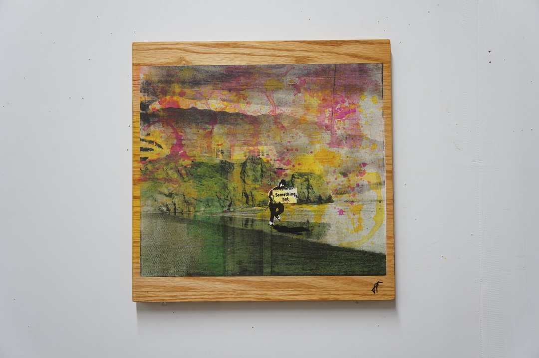
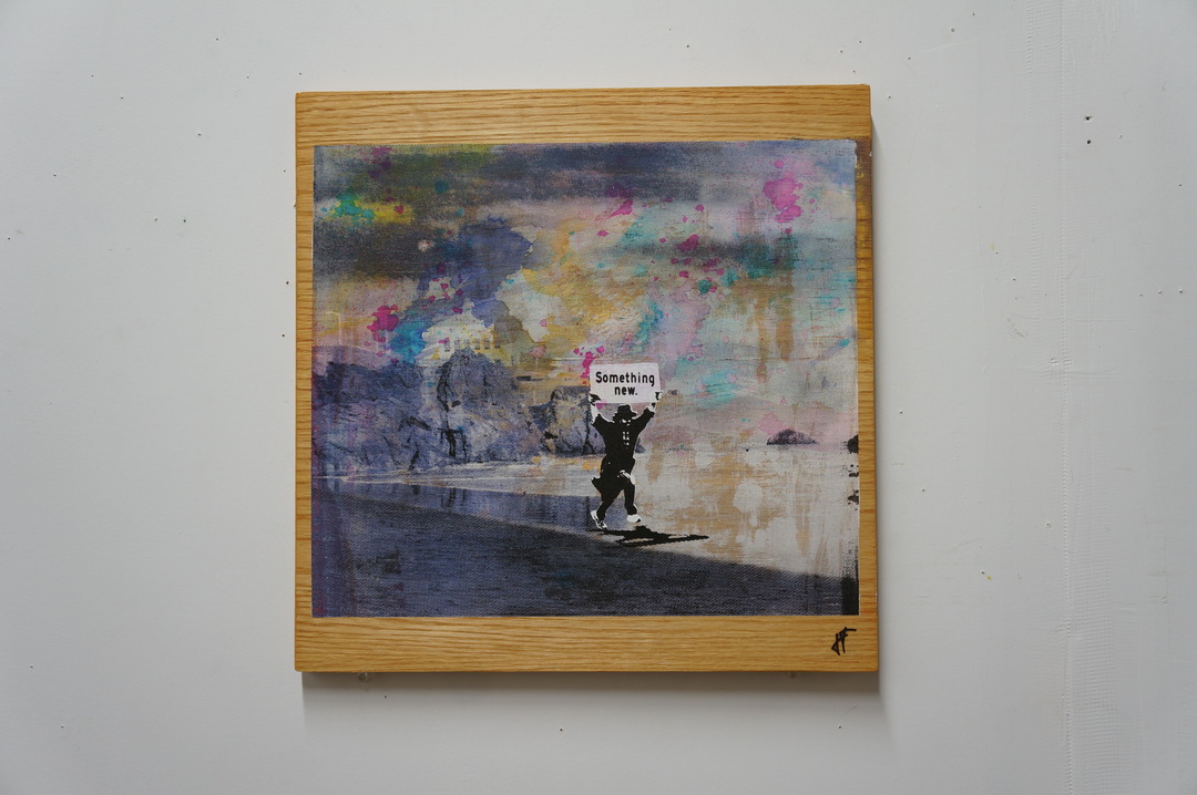
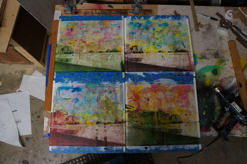
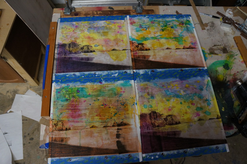
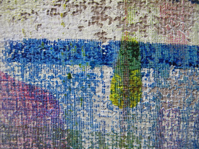
Those kindly and supportive folks following my last few projects may have noticed a painterly touch developing.  Or rather than “a touch,” one could fairly call it ” a punch in the face” as there is nothing gentle about it.  At least not yet. Like in all all arenas besides street fighting and lab report grading, I do aspire to always brandish a gentle touch.  So with the long road ahead in mind, I have been experimenting with inks, washes, and watercolors–the large group of liquidy art materials generally known as wet media–and I aim to harness their drippy and vibrant properties to shift the balance of my screenprinting towards the organic.

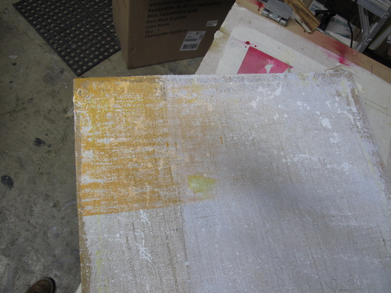
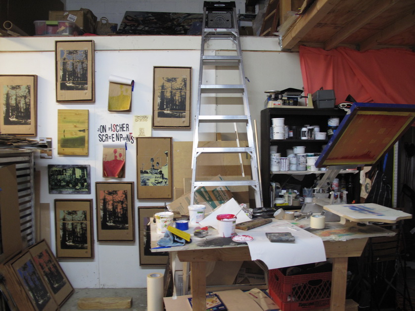
One of the things I love about screenprinting is that it involves a unique tension between control and lack of control.  Preparing, exposing, and layering stencils is an analytic process with little room for error.  It is followed by a printing stage that is tactile, free, and subject to limitless possibility.  Most screenprint stuff trends towards one of these poles.  For example, on one extreme end I would think of production print work (t-shirts, signs, etc) while some of the more abstract work from the last century stakes out the most identifiable territory on the other.  A big ongoing goal of mine is to develop a unique physical screenprinting process that negotiates a balance in between.  And that is a long journey.

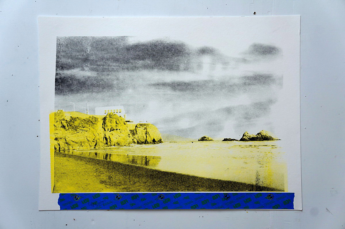
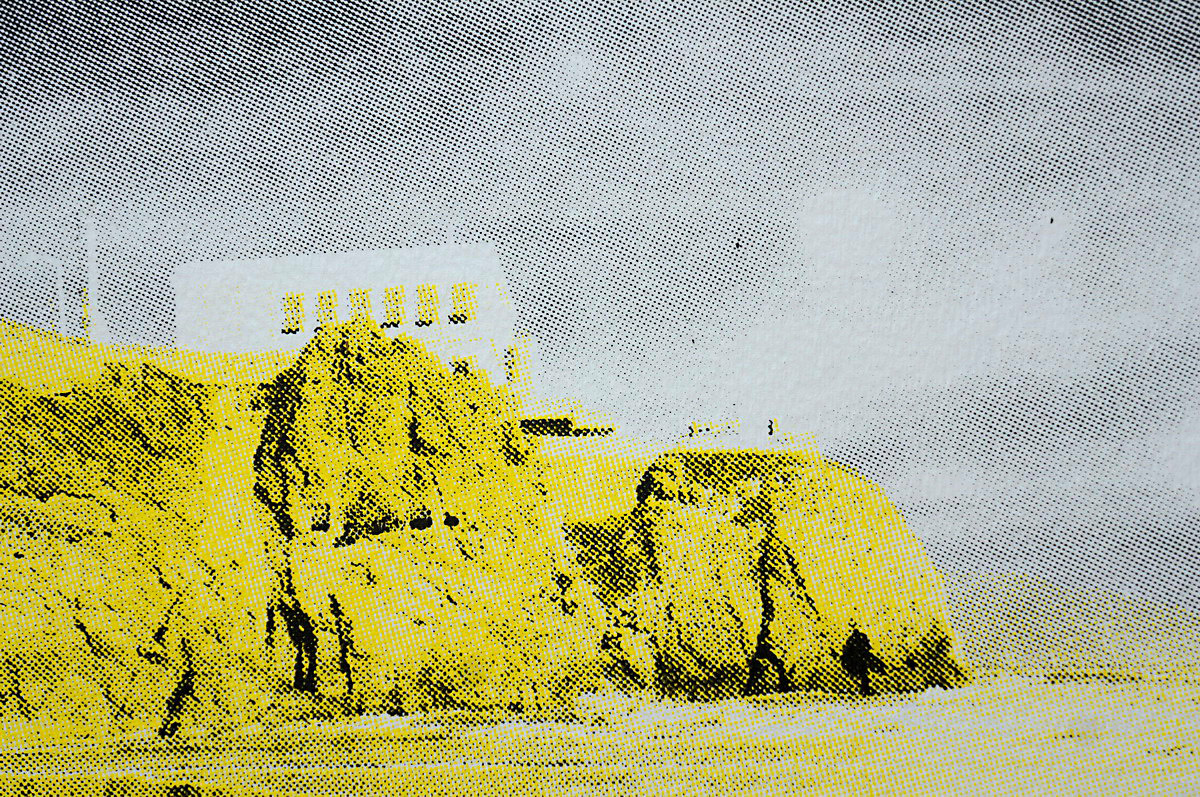
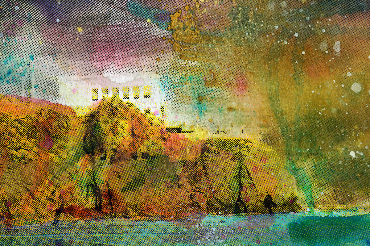
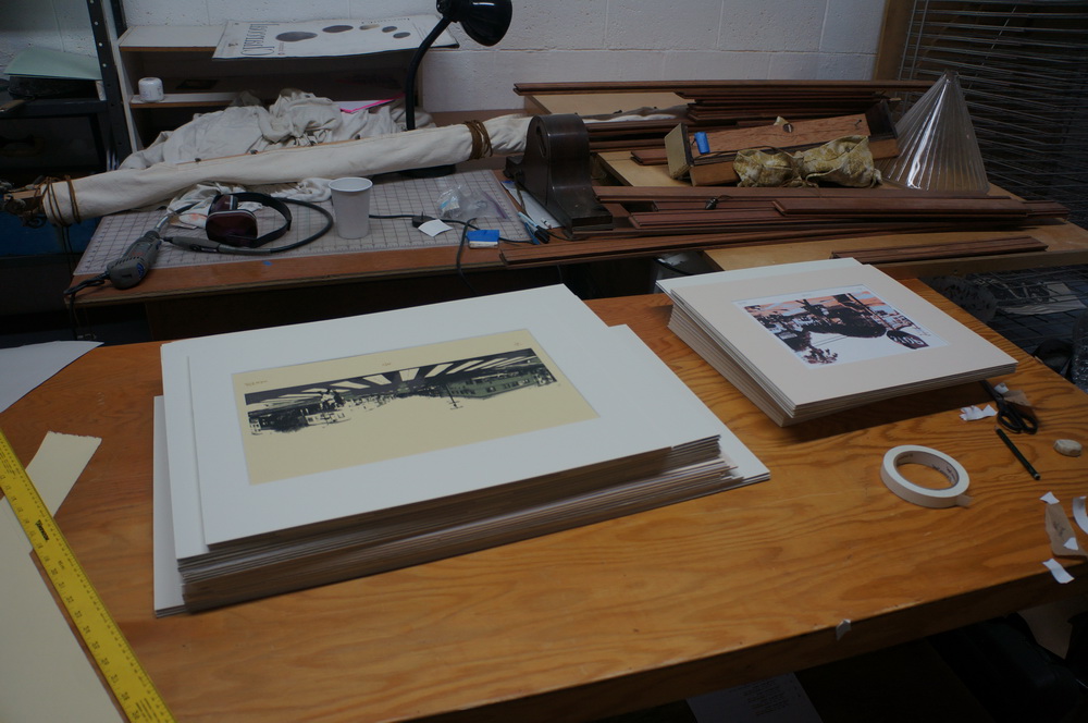
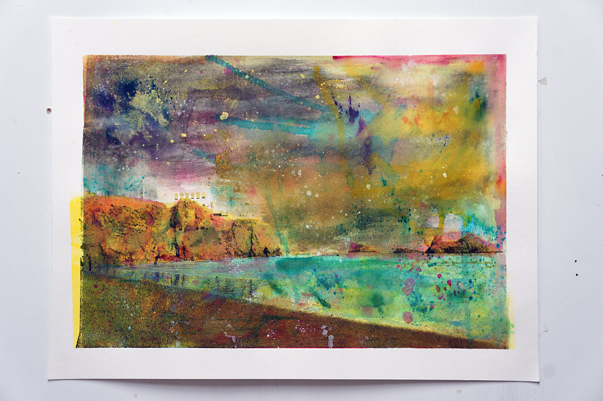
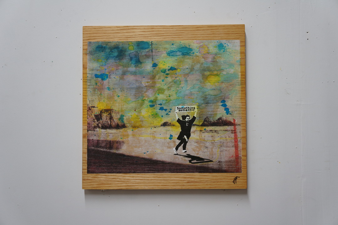
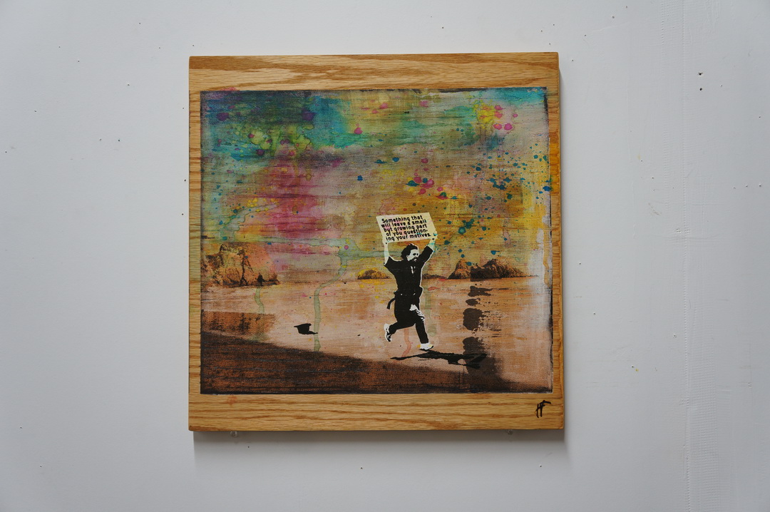
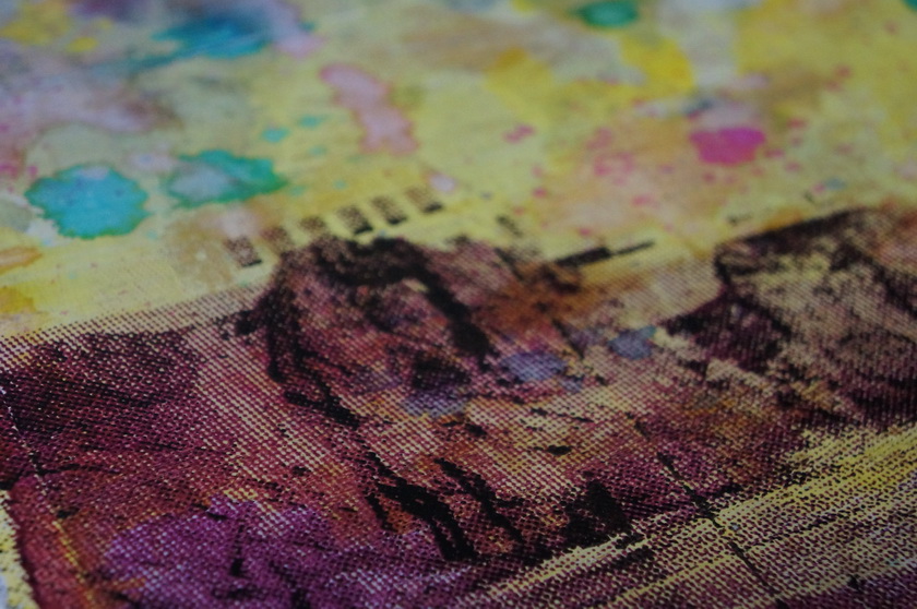
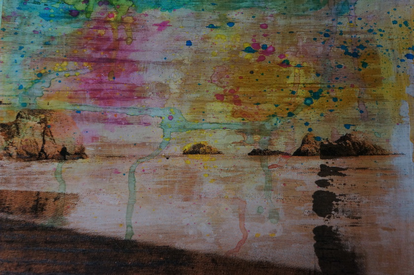
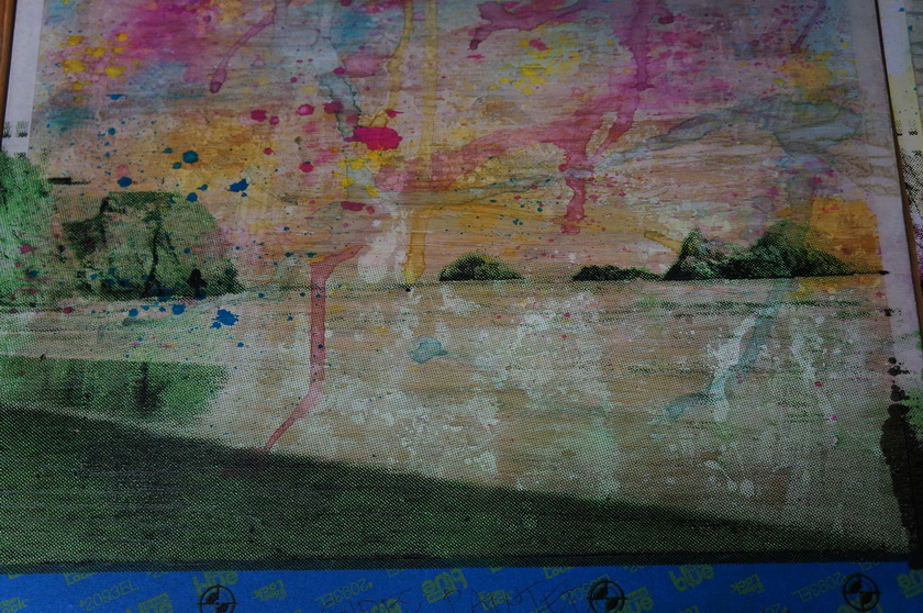
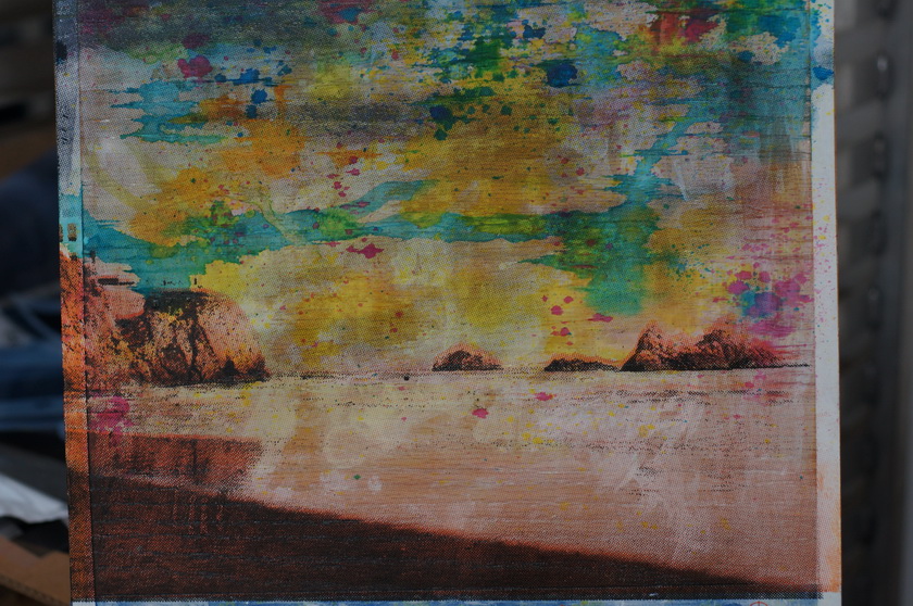
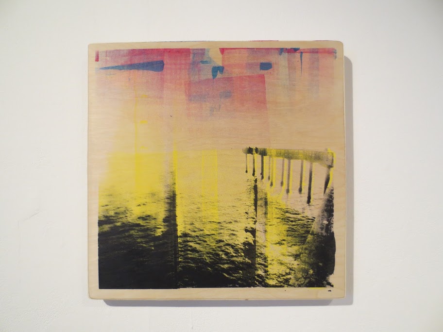
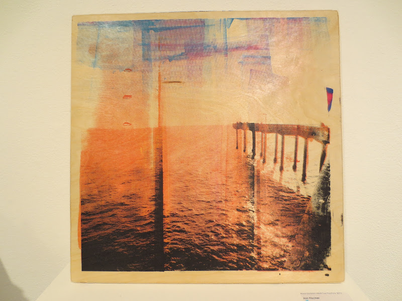
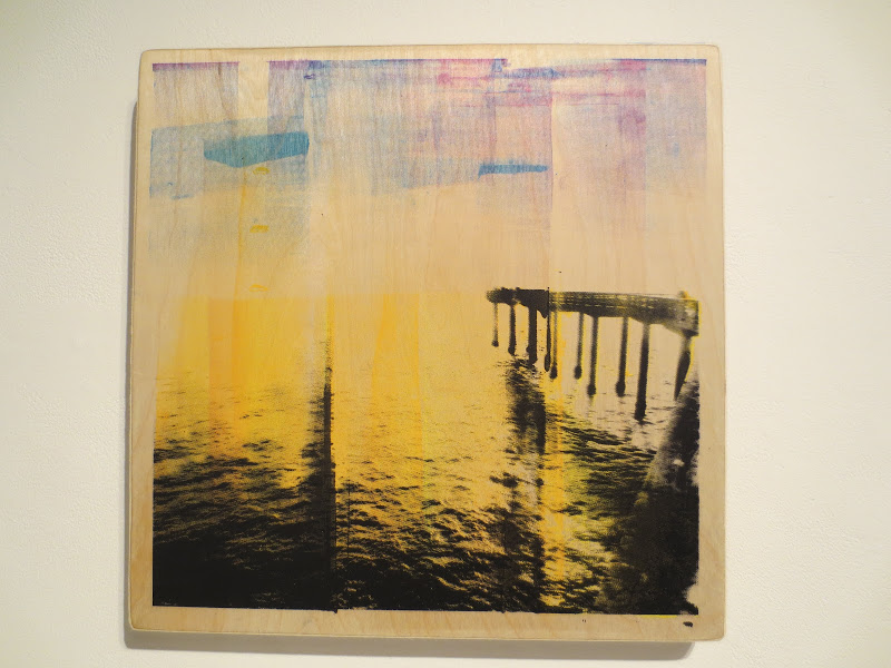
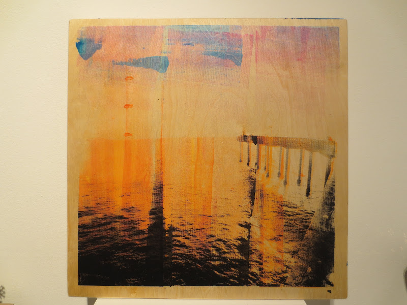
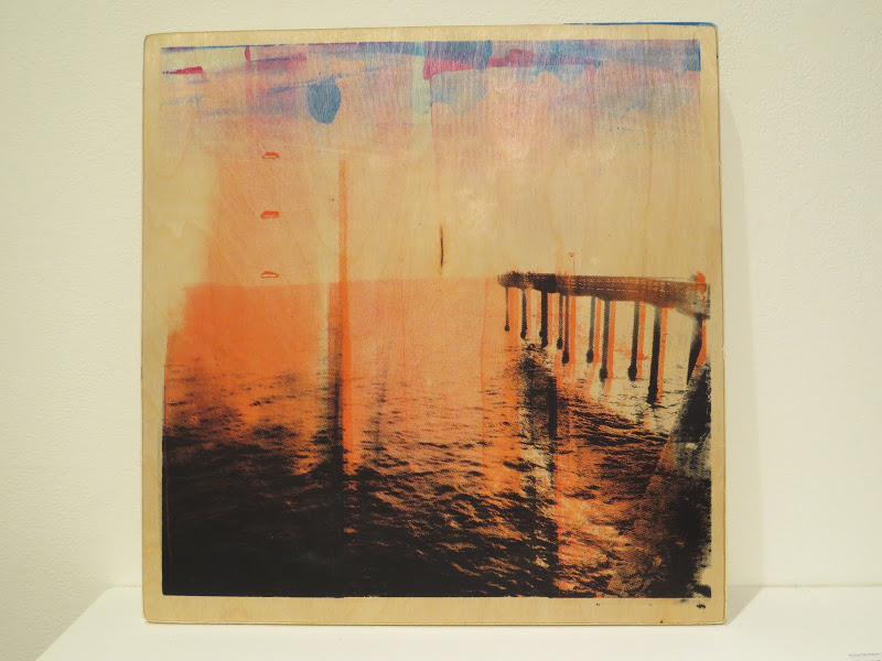
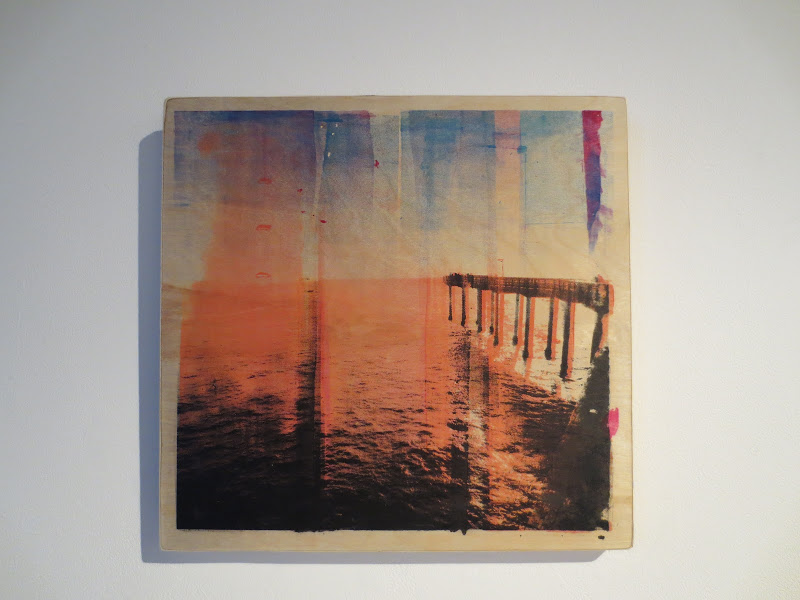
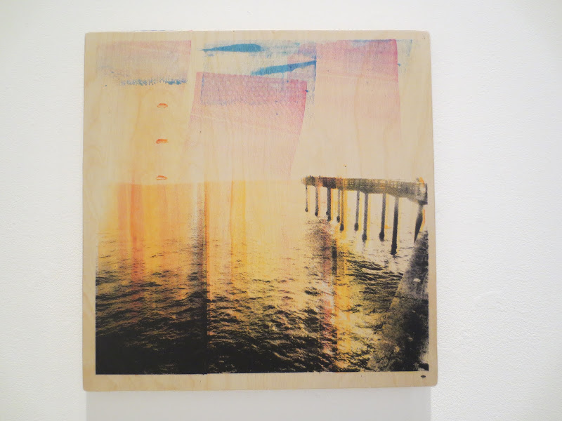
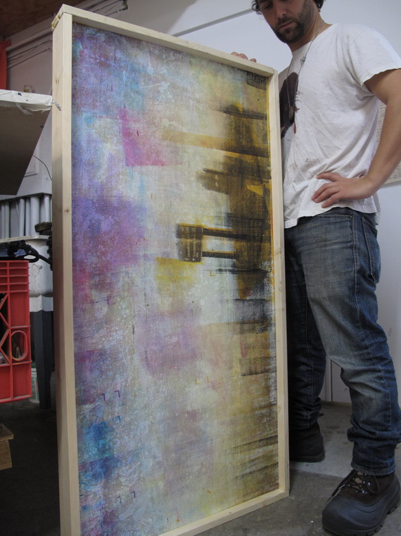
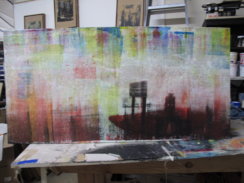
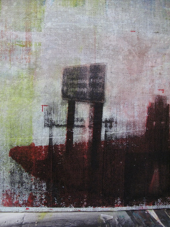
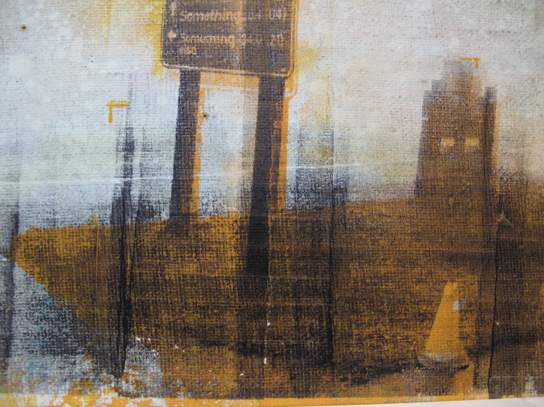
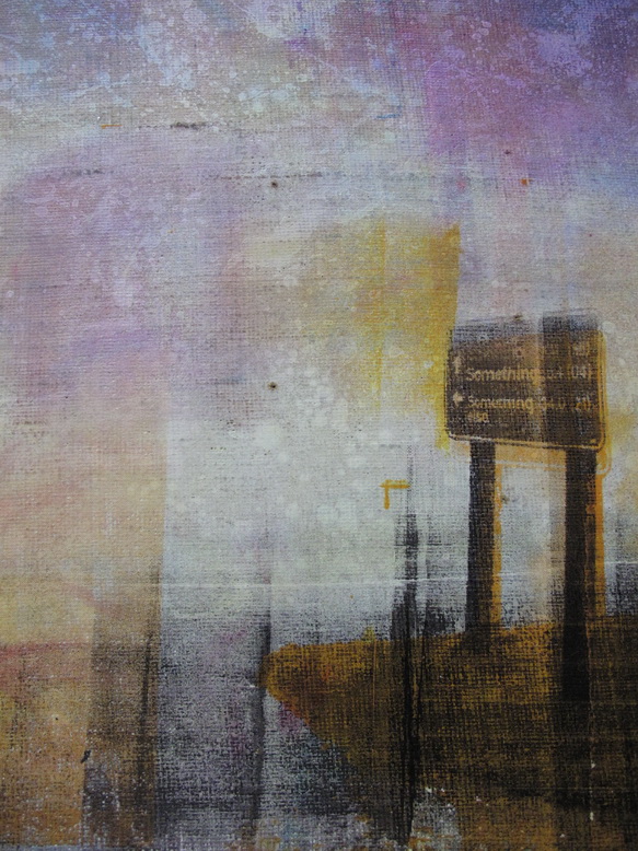
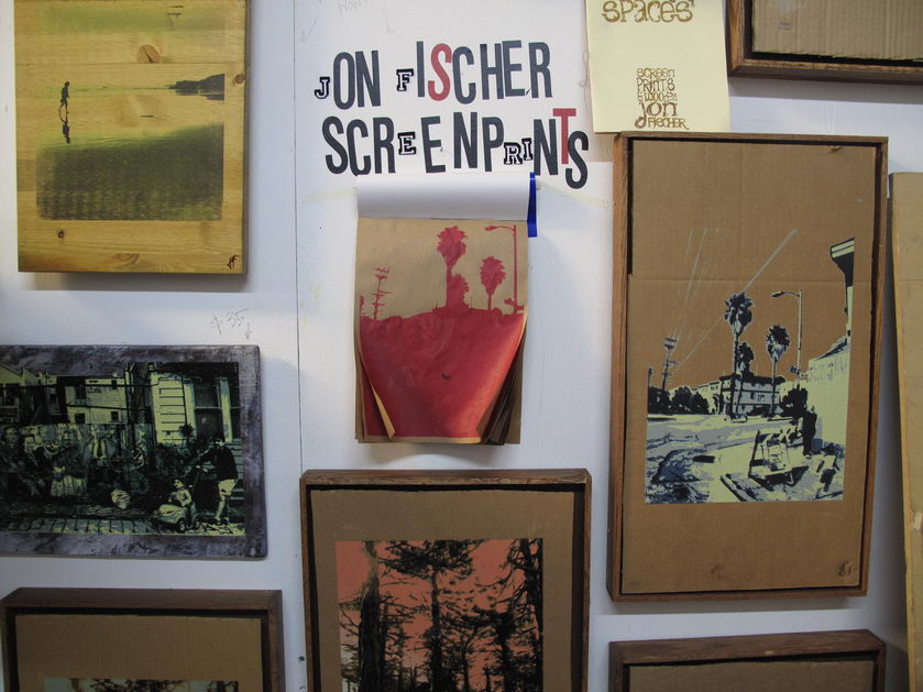
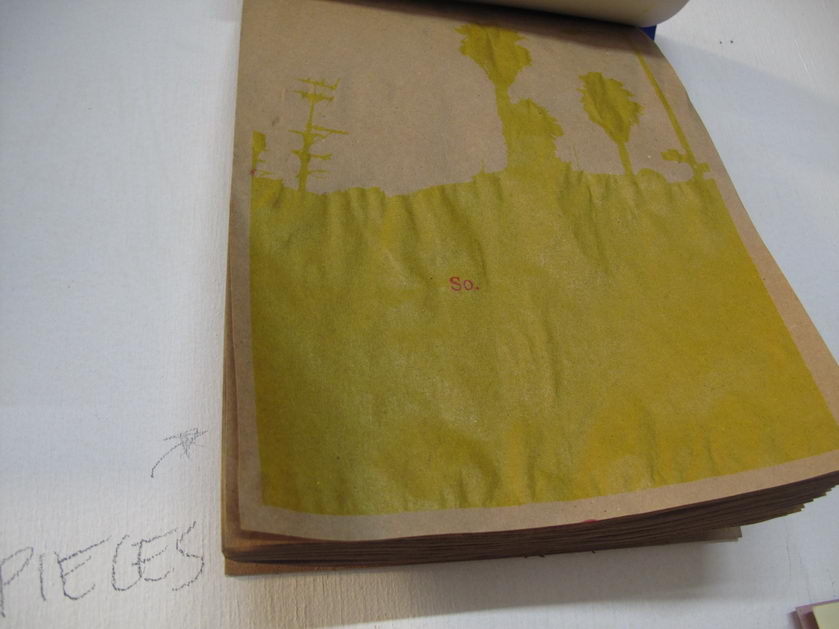
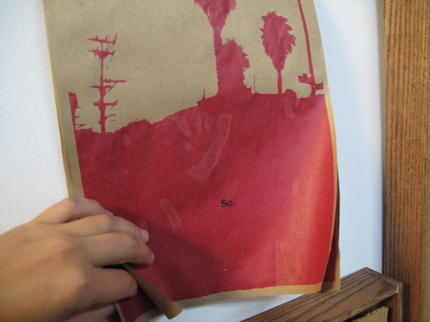
That’s also a long way of saying look at this practice piece.  I recently acquired a variety of really nice papers and this is one of my first shots at applying art to it (possibly for the purposes of one final edition of Silian Rail posters for their imminent, final show ever).  From my “Eight Ideas at Ocean Beach” stencils:

Cliff House | Screenprint and ink on paper | 18×24″ | 2013

I didn’t turn in the homework because I got confused about what the homework actually was, but now i understand it was the questions at the end of the chapter.

Sunday, January 27th, 2013

Here’s a preview of my latest series Eight Ideas at Ocean Beach.   There are actually sixteen separate pieces–each with a corresponding idea at Ocean Beach–but the gallery wall only fits eight at a time and I do not want to confuse visitors.  They will  likely be confused enough about why I would print images of myself running around with a crazed look over a perfectly beautiful image.

I am calling this a screenprinted motion picture. I think that is legitimate because each piece is truly one frame in a film I shot for this project.  Notice how the background scrolls from left to right?  Notice how I lose my hat at the end? Notice how I am wearing a bathrobe? (It’s got an ideal shape for screenprinting). I feel excited about this new direction and my aim is to cultivate collaborations with directors, writers, and actors, costume folks.  This time around, it’s just me though.  Thanks to EB for filming.

The Ocean Beach Ideas are from my working list of phrases documented in these posts.

Come see them in person all month!

City Art February Show
Opening reception: Friday 2/1/13 7-10 PM
City Art Gallery
828 Valencia @ 20th. SF CA

The Case of the Shaven Head Case.

Saturday, January 26th, 2013

Some works in progress for my City Art debut on February 1st. These pieces are 16×16″ 3/4 inch thick oak panels.

Amidst this unexpected flow of materials.

Saturday, January 26th, 2013

A new artist information sheet printed on scrap cardboard! For my City Art debut on February 1st.

Finebaum had told the campaign to prep Romney to talk sports, but Romney “didn’t have a clue who Nick Saban was.”

Saturday, December 15th, 2012

Last weekend I took my live screenprinting act on the road.

By on the road, I mean four blocks from my studio to Root Division for the second annual  Misfit Toy Factory.

It’s a live artmaking event featuring over 35 artists making sculptures, toys, and gifts onsite in the gallery space at Root Division.  All works made in this one night only event are cash and carry for $40 each and benefit RD.  It’s like a holiday-themed sweatshop for artists, except without the paycheck.   I made nine pieces inspired from a visit to California’s other Ocean Beach, in San Diego.

Here is a Picassa album with most of the work.  Here some of my pictures:

Click here for some of our age-old tips on what you can do to manage rainy day workouts.

Saturday, December 1st, 2012

Today I finished printing and framing the two latest pieces I have been furiously chronicling here for no apparent reason. By the way, this piece is a small part of a project I am ramping up called “The Twenty-Seven Best Memories of Theodore Clayborne by The Genius Artist Hiromi.” If that title sounds intentionally ridiculous, maybe that is because it is meant as more of a story-visual art hybrid; a fictional piece of art might be an okay way to put it. Or maybe the title is ridiculous, which is definitely not what I am going for, but I passionately feel that there is an exciting idea in there and therefore proceeding is just something I have to do.

Here’s the second piece.  The black was a lot runnier and the whole thing is a bit less nuanced.  It’s like the angry, destructive version of the serene and sanguine first piece.

And just so that the completion of these prints is not just an occasion for me to write to myself online,  I joined 900 of my closest friends in this line for a slim shot at exhibiting immediately.

Thanks to Rodney and Andy for tool support.

The donkey’s bones are still on display at the University

Thursday, November 29th, 2012

Printing of the Mt. Tam pieces continues.  One of the many things I appreciate and enjoy about screenprinting is that it allows me to produce several versions of one work in parallel.  This provides incentive for freer experimentation, since it’s not a disaster if any one experiment should yield catastrophic results.  This is sort of similar to absurdly low rates of taxation on investment profits providing the appropriately reduced risk that society’s elite need to trickle all that cash down to us schmucks with day jobs.  Actually it is exactly like that.

So far I think I kind of like where this experimentation is going, with the image resolving into photorealism at a distance and the bright color splotches revealing themselves to be made up of little dots when you get real close.  I like art that has different stuff going on at up close and from a distance.  Or if the nothing else, the pine box frame makes it look like legitimate art.

Note that I still have one more black print to add on the far right…or does it look more interesting the way it is?

This would not be the first time that rumors eclipsed the actual findings from Mars.

Tuesday, November 27th, 2012

I decided this first print on my Mt. Tam piece was a failure:

However, this failure wasn’t totally negative.  I really like the quality of the print up close:

I just need to re-calibrate.

A replica of the H.M.S. Bounty sank off the North Carolina coast.

Monday, October 29th, 2012

This year  I took a literal approach to San Francisco Open Studios and held it in my studio.  Plenty of interesting people showed up and I got some good work done, too.  Joel B. and Meztli, if you are reading this: thank you.  (I first met Meztli at 2008 Open Studios when when she was in 3rd grade and drew me a picture that was so awesome, it inspired me to make a bunch of postcards.  I was so happy when she stopped by this weekend…as a seventh grader!).  Here are some snaps.

A sensual, visually stunning journey of discovery into a new dimension.

Thursday, September 6th, 2012

Labor Day 2012 was spent in the studio with Michelle, printing Hillside Supper Club’s 25-pound exterior sign.  I spent a bunch of time this summer fabricating the steel frame and prepping the junkyard wood, so it was fun to finally complete the project.  On Tuesday, the sign was unveiled for a crowd of Hillside supporters at a special duck dinner in the restaurant (duck appetizers, mains, and dessert).  I felt a special sense of neighborly happiness when we got a round of applause.

Here’s photos from the printing session.  It was a tricky job because it was double sided and the graphic was large.