Archive for the 'screenprinting' Category

He has no doubt that the starship has traveled to the past, as bullets are no longer used on Earth in the 2150s.
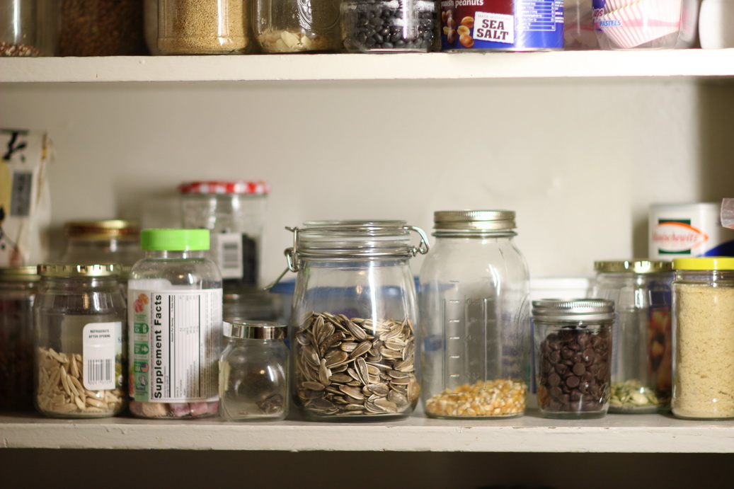
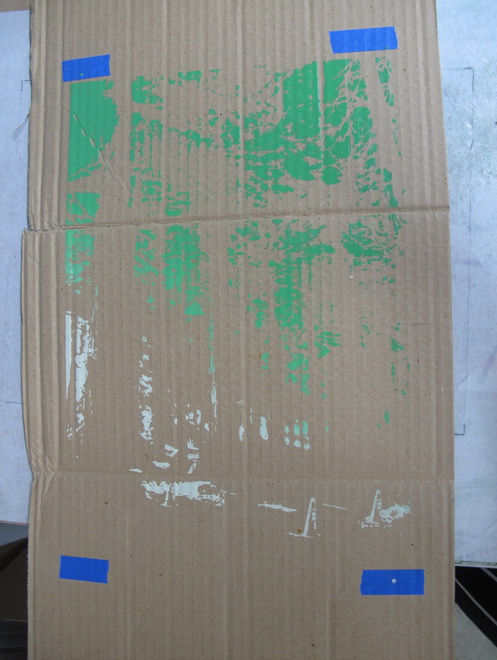
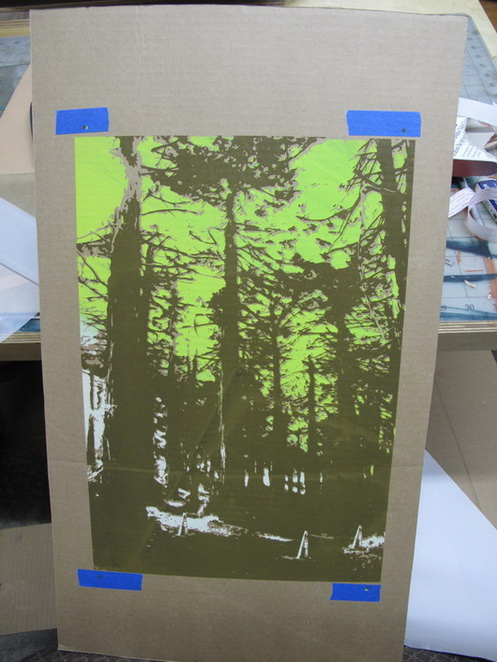
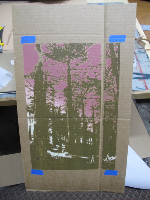
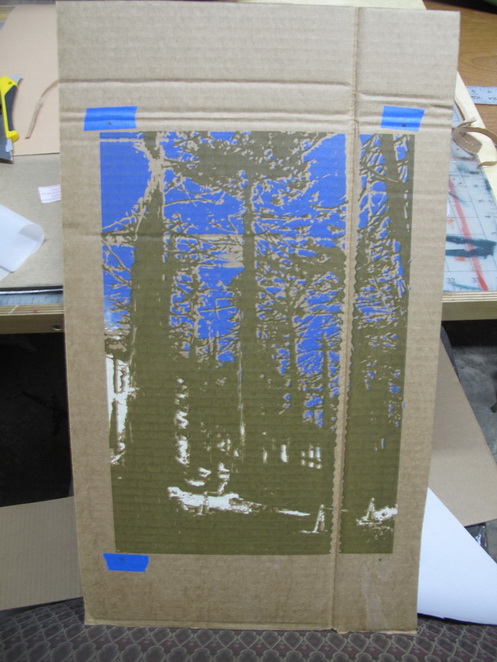
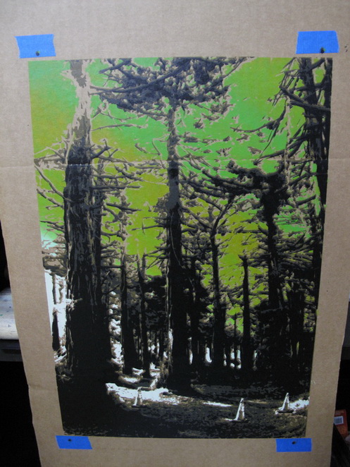
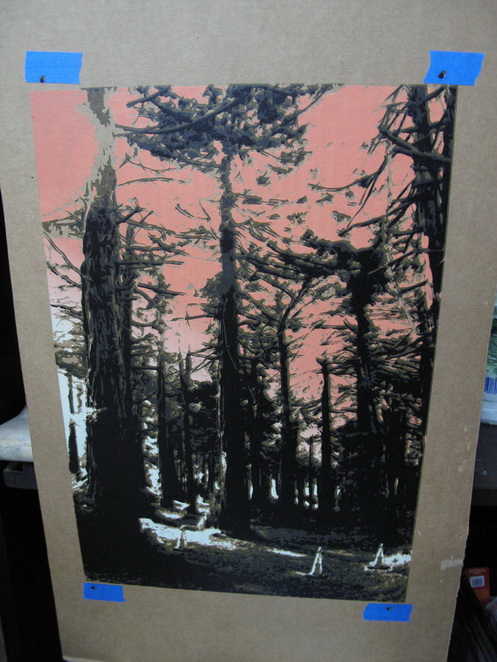
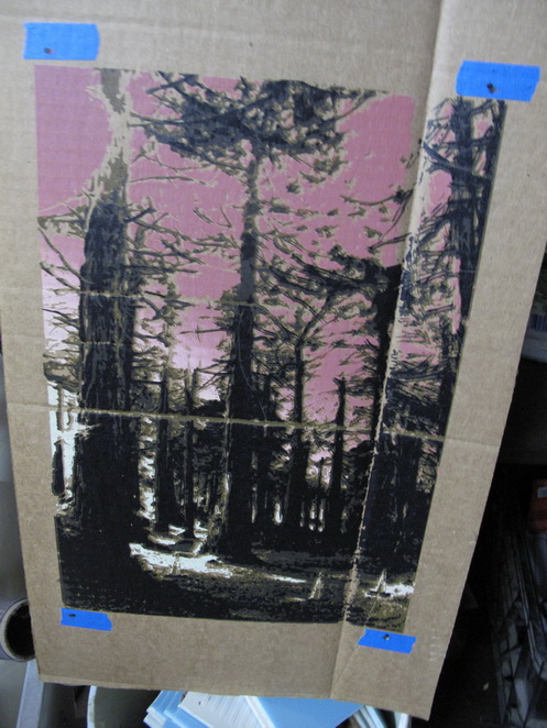
Wednesday, August 8th, 2012

I have been working on preparing my prints on cardboard series for an upcoming installation.  Mostly this involves fabricating lots of box frames out of hardwood flooring planks, but I also started thinking about ways to transform a few of the pieces into small dioramas. It’s been fun to think of ways for the art to interact with stuff.

In general I’m interested in exploring the possibilities of the limited edition in printmaking.  Traditionally, printmakers (and often sculptors) generate a limited edition of anywhere from two to a few thousand identical prints, typically in one session,  designating each piece with a serial number and then destroying the master plate so that no more prints can be struck.

To me this is one of the most compelling aspects of printing in the age of mechanical reproduction.  The edition draws attention to a separation between the expressive and technical components of art making that is unique to printmaking.  Printers spend most of their time pulling prints, which usually feels like an entirely different thing than being creative.  The inspiration diverges from the perspiration–they can be entirely different activities.

Part and parcel to the workmanlike aspect of manufacturing prints is the intriguing burden that technology places on the contemporary printmaker:  in an era when reproducing multiples of anything is frivolously easy,  the art maker is compelled to not only generate multiples by hand–the art maker needs an interesting enough reason for multiples to exist.

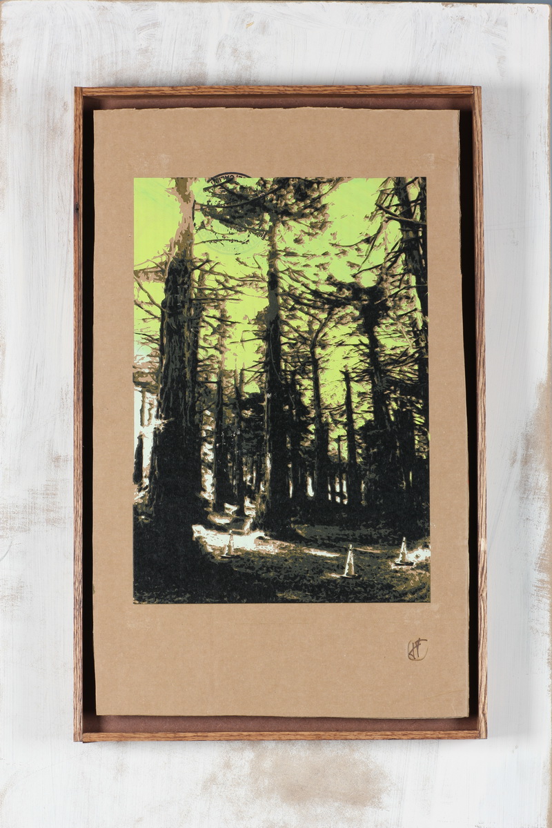
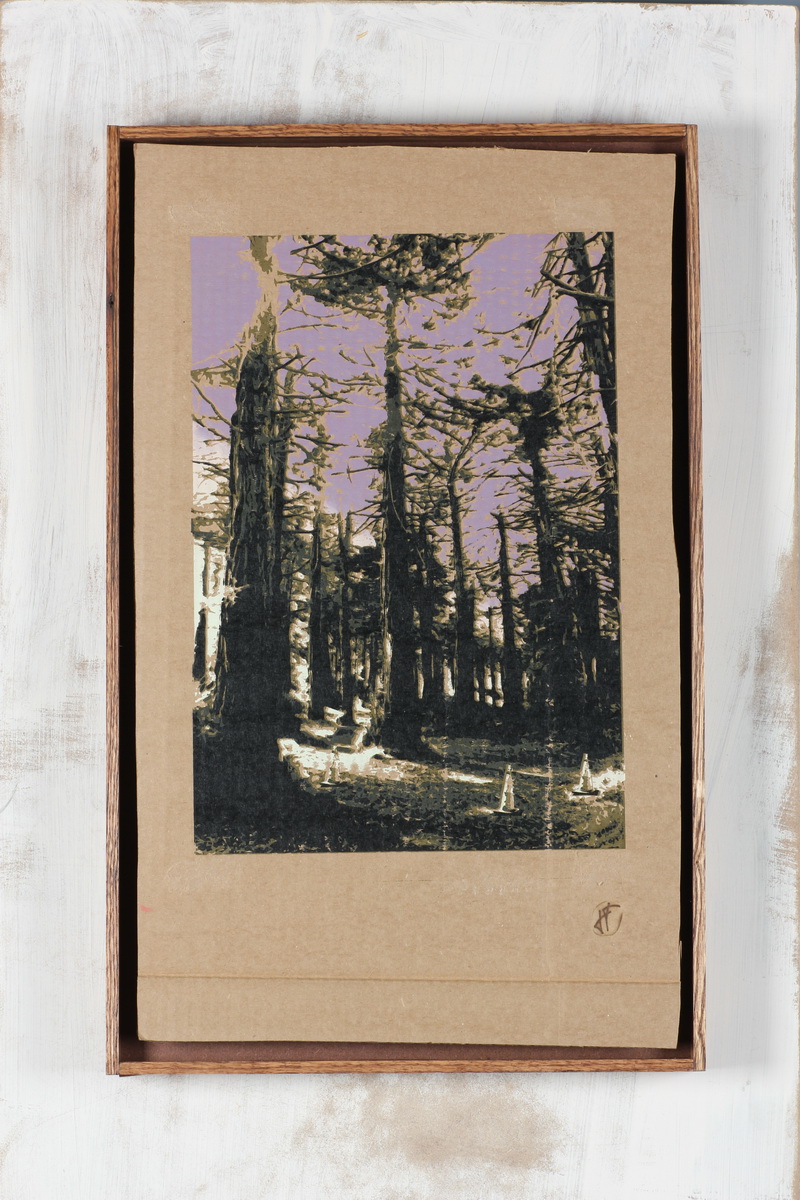
With that said, here are two of my frivolous ideas for transform a few of my multiples into playful dioramas.  I think the installation will feature 14 regular prints and 4 or 5 different altered prints.

1. Three Cones print cast in amber. Embedded with prehistoric bugs, the surface is hopelessly glossy so the photos suck.

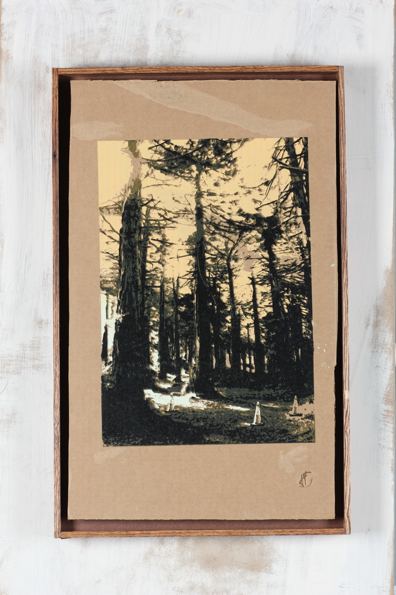
2. SF Botanical Garden print with dino. I found this plastic toy on a walk a few years back.  It seemed strange that it was unpainted, maybe some kind of prototype?  My best guess of the species is Suchomimus or perchance Baryonyx.  Joe Pisch, can you confirm?  Anyway, this is a rare case in which hoarding weird shit I find on the beach paid off.

It is not our job to protect the people from the consequences of their political choices.

Thursday, June 28th, 2012

Mystery tiles,  out of order, for the time being.

Further action is required to complete your request.

Thursday, June 28th, 2012

Hello.  I recently completed a small commission to develop this photo into a series of prints, using only nine planks of laminated pine and one slice of homemade Ranier cherry pie:

The commissioner? My sister Michelle. The event?  Her birthday in July.  The final prints can be found in my objects section.  Here is a small sample:

an exciting double-life.

Monday, May 14th, 2012

Our newest neighbor is this pop-up restaurant taking residence in the Italian place downstairs on Monday and Tuesday nights. In the last month or two, I have been doing a bunch of graphics and signage work for the enthusiastic chef-owners Tony and Jonathan because I want to stuff my face with their delicious food for free in a neighborly spirit of collaboration and mutual benefit.

The logo stuff is hard for me. I suck at Adobe Illustrator and my sole success in this arena is soon to be obsolete. But I enjoy the challenge so I gave it the old grad school try. Jonathan and Tony wanted something typewritery with a snail–eerily reminiscent of the tried and true feather2pixel regalia.  The final ingredient was some Bernal imagery.  I was a little concerned about churning out a cliche but in the end I got to use not one but two of my beloved typing machines along with a silhouette of San Francisco’s most overlooked radio tower.

My first official physical creation was this screenprinted sandwich board, to be replaced this Fall when the HSC pop-up locks-up its stock-up by taking over all nights with a suitably permanent sign to talk-up.

ready-made works on gallery walls.

Monday, May 14th, 2012

I found an exciting new place to display my work.  Coyote Counter Collective is what we in the industry call a re-tail space and those who have ever seen a coyote know that motherfucker has one serious tail.  Upon reflection I guess it’s a little hard to imagine a coyote ever needing to re-tail so I am not exactly sure if we quite have that right yet.  Or perhaps that’s the Counter part.

Anyway it’s a co-op storefront in Oak-land, where the trees are green but the Occupiers are not,  and my first official duty as a member was to screenprint a fistful of signs for some to-be-determined guerrilla advertising.  They came out well I think–a rehash of my go-to sign in one afternoon design–featuring glyphs from my beloved Remington 333 (eternal thanks for that, Kristin Roeder):

And here’s what my inaugural hanging looks like in situ.

And yet it is too early to say that the government is winning.

Monday, May 14th, 2012

The twelve week screenprint workshop I have been teaching with the glamorous Angie Crabtree is complete.  We asked our nine high schoolers to print on nice paper for this show at Root Division, but some of the more exciting projects were their clothes and bags.  I wasn’t able to photograph everything, but I did want to record here the little I did get for the ages.  Nice work brahs.  And Angie thanks for everything. Especially the black eye.

Sir after calculating my score with your percentages present in the syllabus I came up with a percentage of 61.75%

Sunday, April 29th, 2012

Check out how good this tee-shirt came out.

It was done by Martin (with a little creative input from Banksy, who fully supports the appropriation), one of nine SF high schoolers in a screen print class I’ve been teaching at the nonprofit arts center Root Division this spring.

It can be hard at first to convince high schoolers that screenprinting in the age of mechanical reproduction is almost by definition not about technical perfection.  But then we get to magic moments like this that make more sense than me talking.  The shirt not only looks great but it maintains the trace of its maker: way cooler than a shirt bought at a store.  Creative high schoolers understand that.

When it gets sold we’ll let you know.

Wednesday, April 18th, 2012

My Silian Rail posters are complete.  Instead of settling on one way to print all of them, I decided to provide a few options for potential owners to choose from.  In forcing myself to be loose and more flexible (or, more accurately, marginally less inflexible), I felt rewarded by the compelling and vaguely playing card-like effect that flipping the stencil produced in some of these.

All posters are 14×17″.  An edition of 30.

At our meeting yesterday we all decided to support you by giving you a gift certificate.

Friday, April 13th, 2012

I should chose between four ways to print this Silian Rail poster. Here’s the candidates I printed with the complete stencils (all posters are 14×17″):

Keep the following documents for four years from the date

Thursday, April 12th, 2012

Another year, another Silian Rail Poster.  In a good way of course.  I very much enjoy working with Eric and Robin who both share the highly fortunate personality trait of trusting their artistic collaborators.  I think this comes across in their music as a sort of highly complex  but refined sense of balance.   Even their sense of gender is equal in a way most music isn’t and not just the even number of boys (1) and girls (1), but something more along the lines of a harmonious male and female presence.

Anyway I am back into halftones, with some serious questions to be answered.  So this’ll help me.

The original mock up:

Printed layer 1: CYAN

Send your best interpretation of the theme.

Sunday, February 26th, 2012

Q: What’s seventeen inches long and divided into eight segments?
A: You are technically correct if you guessed the Peruvian giant yellowleg centipede, but you are more correct if you answer was “sheets of Fischer’s latest postcard edition

Because I want to maintain pace for 100 postcards in 100 years, putting my Three Cones in the Park stencils in service of a new edition seemed like a good weekend goal.

PS_Print was having a sale on posters, so I designed a postcard pattern and got it printed on some beautiful 11×17 card stock. Using the screens from my original piece on cardboard, I reprinted layers 2 and 5  on top of the pattern in metallic ink.

So the print is on the address side of the postcards, which is unconventional but I think it’s a good idea because it (a) subverts the tyranny of the two sided postcard (if you write on the front of a postcard, which side gets the fridge magnet?); (b) invites the sender to addtheir own art; and (c) looks more interesting.

Resisting the temptation to dig too much deeper in to postcard semiotics, I deferred to practicality and cut out paper squares that left white space for addresses.  After all, postcards are meant for mailing and mail needs addressing. It’s a pretty simple little screen printing trick: just lay some paper cutouts between the screen and the substrate–the ink will hold them in place for hundreds of pulls:

The resulting print:

After the second and final layer, I finished things off by hand perforating the sheets.

Here’s what one of the final 8 postcards looks like.  Go to my postcards section to see the entire sheet in all its 72dpi glory.

A figurative painter whose sultry and damaged women cavort unrestrained through opulent settings.

Sunday, February 26th, 2012

By no means is this a novel screen print technique, but I really like the effect of printing the same image in two slightly offset colors.  Here is an example for my studio session yesterday, shown in metallic red and violet.

That’s it.

Why the best chocolate is the one you eat last.

Tuesday, February 14th, 2012

Yesterday I rented a fancy telephoto camera lens to photograph my recent series of prints on old cardboard.  The lens isn’t just fancy but incredible in its ability to make almost anything look good, shooting a razor thin depth of field that separates subject from a background that blurs into creamy oblivion.  But could it make my art look good?

After bringing the lens home in a car that is only a few times more valuable, I did some testing with CW’s new camera.  Just messing around without much idea of what I was doing opened up a new world of quality that I will probably never have access to again.   I guess I can sort of understand how photographers get obsessed with gear, although the idea is pretty unappealing.

Anyway my friend Michelle very generously donated her morning to hosting me and my cardboard at the City College SF Photo Lab, where there are two rules:

  1. I don’t touch anything.
  2. I don’t touch anything.

They must have been expecting me.

Michelle set up big, fake looking lights that made a pacifying sound when they flashed.  She showed me how to light my work without harsh reflections, and she did it all with a smile.  We shot all thirty-two pieces.  Overall, much ado for a bunch of trashed cardboard: here’s Three Cones in the Park on my Objects page.

This was no mere crossover project, she insisted, but an attempt to visit a parallel universe.

Saturday, January 28th, 2012

OK, because the gallery that was to show my ambitious new series (24 new pieces in 24 days) has dissolved before it even got started, there remains no reason to pursue the imaginary sense of suspense I was previously attempting.  I shall heretofore reveal all.  This new project is another series of prints on trash, but even more legitimate trash.  Imagine me diving into an absurdly deep dumpster at work wearing my fancy dress shoes and you will have imagined the back story of this series.

The image is three traffic cones sitting in one of my favorite Golden Gate Park glens, and the neat thing about the series is that each piece is unique.  Not only is each rectangle of cardboard disgusting in its own special way, but the base layer of every piece is printed in a different color that blends into the same white light that illuminates the cones throughout.  The different colors span the entire visible spectrum and the net effect is a gradual journey from twilight to dusk and back again.

I am not sure if that makes such sense, but the idea was to hang a six-by-four matrix of all twenty-four pieces by color.  Kind of like this mockup.  The idea was to price them so low that people would be idiots to not buy them, and as they did the installation would dissolve and I would be rich.

Here’s the sequence of a few of the pieces:

Layer 1
Layer 3
Layer 5

Next: A small oak tree becomes thirty frames.