Behind The Latest ‘Downton Abbey’ Departure

Sunday, March 10th, 2013

I have seen the future and it is wet media.

Those kindly and supportive folks following my last few projects may have noticed a painterly touch developing.  Or rather than “a touch,” one could fairly call it ” a punch in the face” as there is nothing gentle about it.  At least not yet. Like in all all arenas besides street fighting and lab report grading, I do aspire to always brandish a gentle touch.  So with the long road ahead in mind, I have been experimenting with inks, washes, and watercolors–the large group of liquidy art materials generally known as wet media–and I aim to harness their drippy and vibrant properties to shift the balance of my screenprinting towards the organic.

One of the things I love about screenprinting is that it involves a unique tension between control and lack of control.  Preparing, exposing, and layering stencils is an analytic process with little room for error.  It is followed by a printing stage that is tactile, free, and subject to limitless possibility.  Most screenprint stuff trends towards one of these poles.  For example, on one extreme end I would think of production print work (t-shirts, signs, etc) while some of the more abstract work from the last century stakes out the most identifiable territory on the other.  A big ongoing goal of mine is to develop a unique physical screenprinting process that negotiates a balance in between.  And that is a long journey.

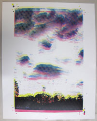
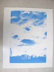
That’s also a long way of saying look at this practice piece.  I recently acquired a variety of really nice papers and this is one of my first shots at applying art to it (possibly for the purposes of one final edition of Silian Rail posters for their imminent, final show ever).  From my “Eight Ideas at Ocean Beach” stencils:

Cliff House | Screenprint and ink on paper | 18×24″ | 2013
When it gets sold we’ll let you know.

Wednesday, April 18th, 2012

My Silian Rail posters are complete.  Instead of settling on one way to print all of them, I decided to provide a few options for potential owners to choose from.  In forcing myself to be loose and more flexible (or, more accurately, marginally less inflexible), I felt rewarded by the compelling and vaguely playing card-like effect that flipping the stencil produced in some of these.

All posters are 14×17″.  An edition of 30.

At our meeting yesterday we all decided to support you by giving you a gift certificate.

Friday, April 13th, 2012

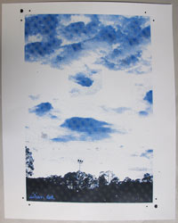
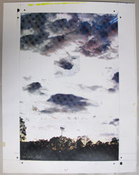
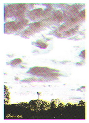
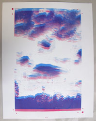
I should chose between four ways to print this Silian Rail poster. Here’s the candidates I printed with the complete stencils (all posters are 14×17″):

Keep the following documents for four years from the date

Thursday, April 12th, 2012

Another year, another Silian Rail Poster.  In a good way of course.  I very much enjoy working with Eric and Robin who both share the highly fortunate personality trait of trusting their artistic collaborators.  I think this comes across in their music as a sort of highly complex  but refined sense of balance.   Even their sense of gender is equal in a way most music isn’t and not just the even number of boys (1) and girls (1), but something more along the lines of a harmonious male and female presence.

Anyway I am back into halftones, with some serious questions to be answered.  So this’ll help me.

The original mock up:

Printed layer 1: CYAN

How else can I afford another solid gold Humvee?

Friday, August 20th, 2010

Much as Spy Kids (2001) begot 2002’s Spy Kids 2: Island of Lost Dreams, so the Silian Rail poster resulted in a spin off project that I will detail in this sequel to the previous post.  Following their tour, the band played a CD release show in San Francisco.   At this show I was connected with Lia Rose, whose inspiring success in funding her debut solo album on kickstarter.com afforded her the funds to print some t-shirts.  That’s where I came in, she suggested.  I don’t usually print t-shirts because (1) I don’t have the proper gear (2) There are plenty of other people who print t-shirts and (3) They are much better at it than I.  We decided to give it a try anyway and and to my surprise we were able to crank out 75 one layer t-shirts in just one long Wednesday night, including coffee break.  I worked the squeegee, Lia Rose worked the heat gun.

This was the goal:

lia_rose_mockup

Typically,  printing a light color on dark fabric is the screenprinter’s classic pain in the ass scenario.   There’s almost no ink that will look opaque and bright when printed light-on-dark alone.  Printing a light graphic on a dark shirt usually requires a base coat of white or an initial spot bleaching step to lighten the bit of shirt directly under the ink (i.e. discharge printing, which is like magic.  Check out this fantastic video demo for excruciating technical detail more info). Naturally,  I was pretty sure I would fuck up all of the above and waste poor Lia Rose’s hard earned venture capital.  Once again, I found myself toeing the line between mediocre and piss poor.

What was I going to do?

Luckily, the light-on-dark dilemma is only a dilemma if a bright and opaque graphic is desired.  You actually get a somewhat cool vintage-y look if you just say screw it and print with no conditioning.  So screw it we did, hard and long with excellent results.  It was an edition of 75 shirts, printed on Alternative Apparel with Matsui RC  ink, heat set at 320° for 60 seconds.  Mediocrity pays off again!  Here’s Lia Rose with a freshly heat set men’s medium.

lia_rose

And a close up of the feaf, a “feather-leaf hybrid.” I think they have them in Madagascar:

lia_rose_close

I’ve heard so many good things about this.

Thursday, August 19th, 2010

Silian Rail Poster:

I thought a productive way to kick off the July printing season would be to crank out a series of starkly radiant posters for my favorite Bay Area boy-girl post post-rock experience, Silian Rail. Time was of the essence as our heroes were embarking on a west coast tour in a matter of days, and the project proved to be a much bigger pain in the ass than anticipated. This was mainly due to incompetence on my part.

The image was inspired by a recent camping trip to Angel Island with Christina, Marella, and EB (I can’t believe I have never done that before).   I had a feeling that the band would be in to a subdued natural scene that invoked their native Oakland.  That led to this Bay Bridge-Victorian-moon rise trifecta.  The images were printed on 30 x 22 Canson stock in a variety of colors:

(Click to enlarge)

BLUE BLUE
BLUE BLUE
BLUE BLUE

Here’s some details.  The bridge:

The window:

The moon:

Of course I accidentally produced all the exposure films one inch too long for the paper. This near fatal mistake required some eleventh hour jerry-rigging in order for the band name to come through, which it barely did in the end. Luckily there was room for me to tape the text in the bottom corner of the film. Here’s what I am talking about.

And here’s some of the other (slightly too long for the paper) films:
Layer 1:

Layer 2:

And that’s probably more than anyone ever needed to know about the Silian Rail posters. Eric and Robin hit the road and the posters were on sale up and down the continent for an incredibly affordable five dollars. A limited edition of 45 or something.

We need to have you become a listener-supporter.

Thursday, February 5th, 2009

So after a lot of frustration, I finally used brush and ink to design a screen print with all organic elements.  Nothing lifted from any cameras or old textbooks.  The project is a poster for my friend Eric‘s band, Silian Rail, and this morning I experimented with mini mock ups on 8 x 14 inch Bristol paper.

(more…)

Saturday, November 3rd, 2007

Joe’s gone. Before he left, Nowell, him, and I enjoyed a fancy civic center dude evening with the Kronos Quartet at the never comfortable Herbst Theater (has it always been hot as hell in there?). After checking in with the wives, we headed down to the bars south of Cesar Chavez, which are slowly becoming my favorite places to drink in the Mission: the courtyard at El Rio is downright charming, the photo booth at The Knockout is second to none, and for good measure there’s even a Taqueria Can-cun in the area. Even the Argus lounge makes up for an overall lack of inspiration with free shots of vodka gimlet and projected Kubrick films.

It was good to have a night out drinking. The moon was high and brilliant. Mission Street felt like a loving old relative with questionable hygiene. The city glowed. Joe is a believer in the well-timed sentiment and so we spilled lots of beer over locked-eye toasts as we made our way through the rounds. Each new drink comes with a small slug of intensity and that’s how drinking with Nowell and Joe is. Later, Joe learned that on this side of the Cascades, ordering a “carne asada” gets you a plate, not a buritto. Nowell successfully ordered a chorizo burrito (every time Nowell gets chorizo, it seems to generate a new inside joke) and I got my secret weapon: cheese quesadilla.

A few days later, I found myself south of Cesar Chavez again, with Adrienne to watch her boyfriend’s band play the Knockout on a Monday night. Spontaneity! Plus a chance to revisit the photo booth! Adrienne remind me of me. Since starting graduate school, she’s been constantly embattled, yet she’s full of plans for displaying our crafts to the world. Thank goodness somebody is.