Click here for some of our age-old tips on what you can do to manage rainy day workouts.
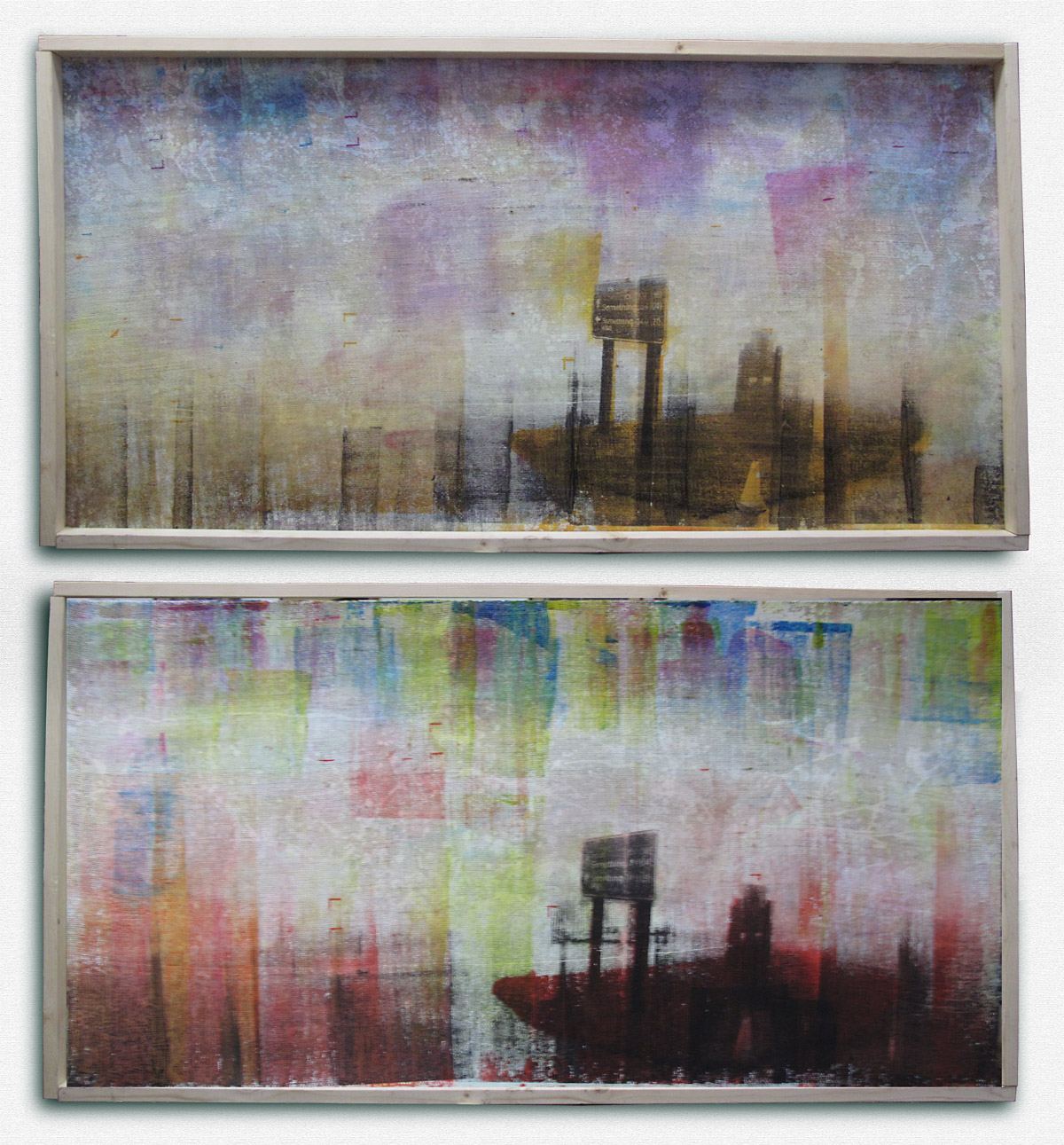
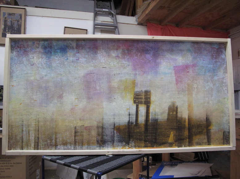
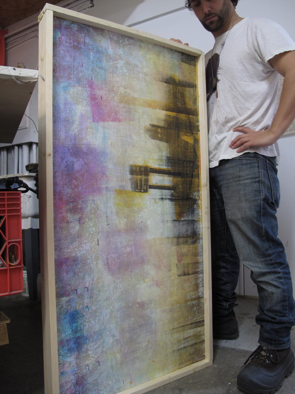
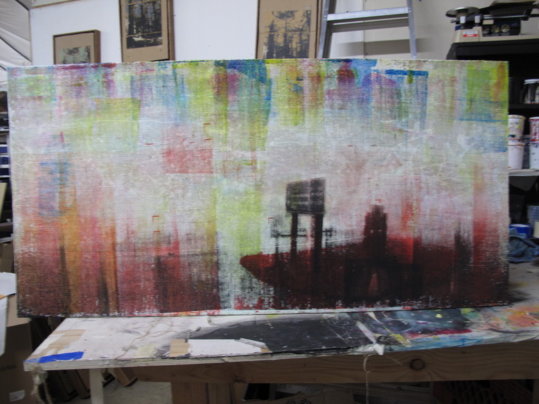
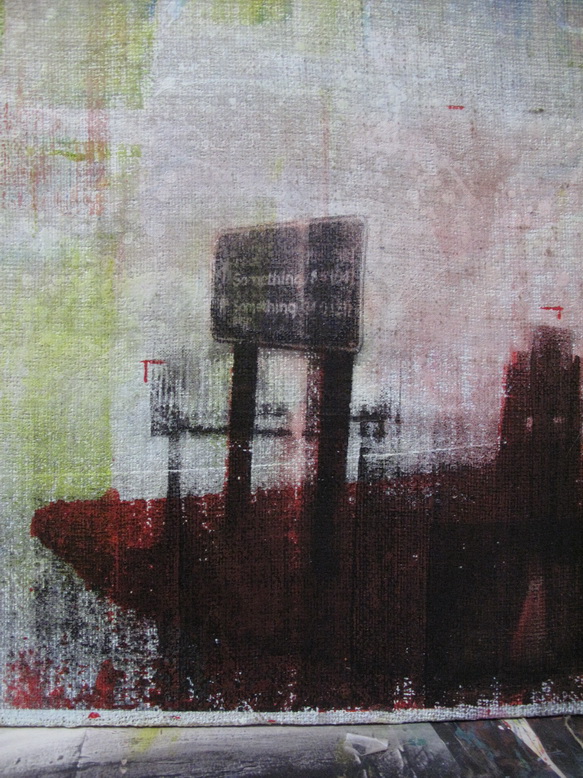
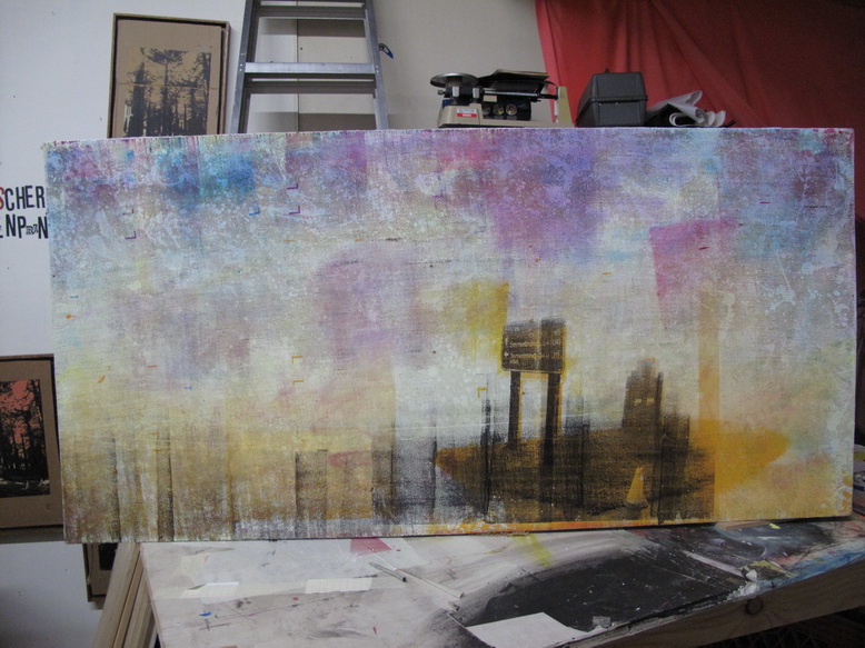
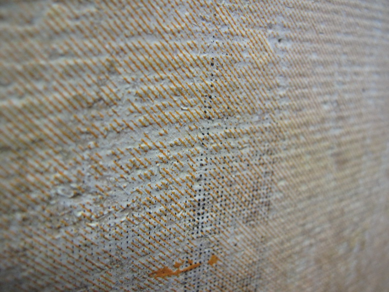
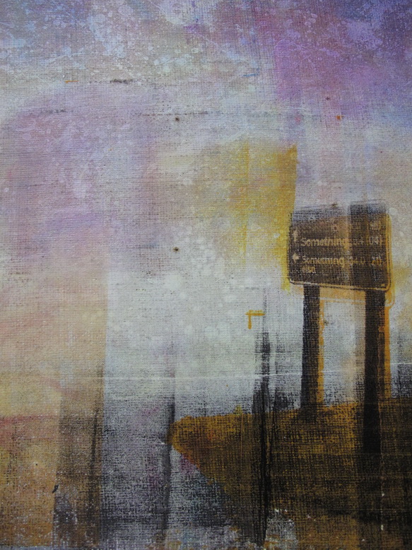
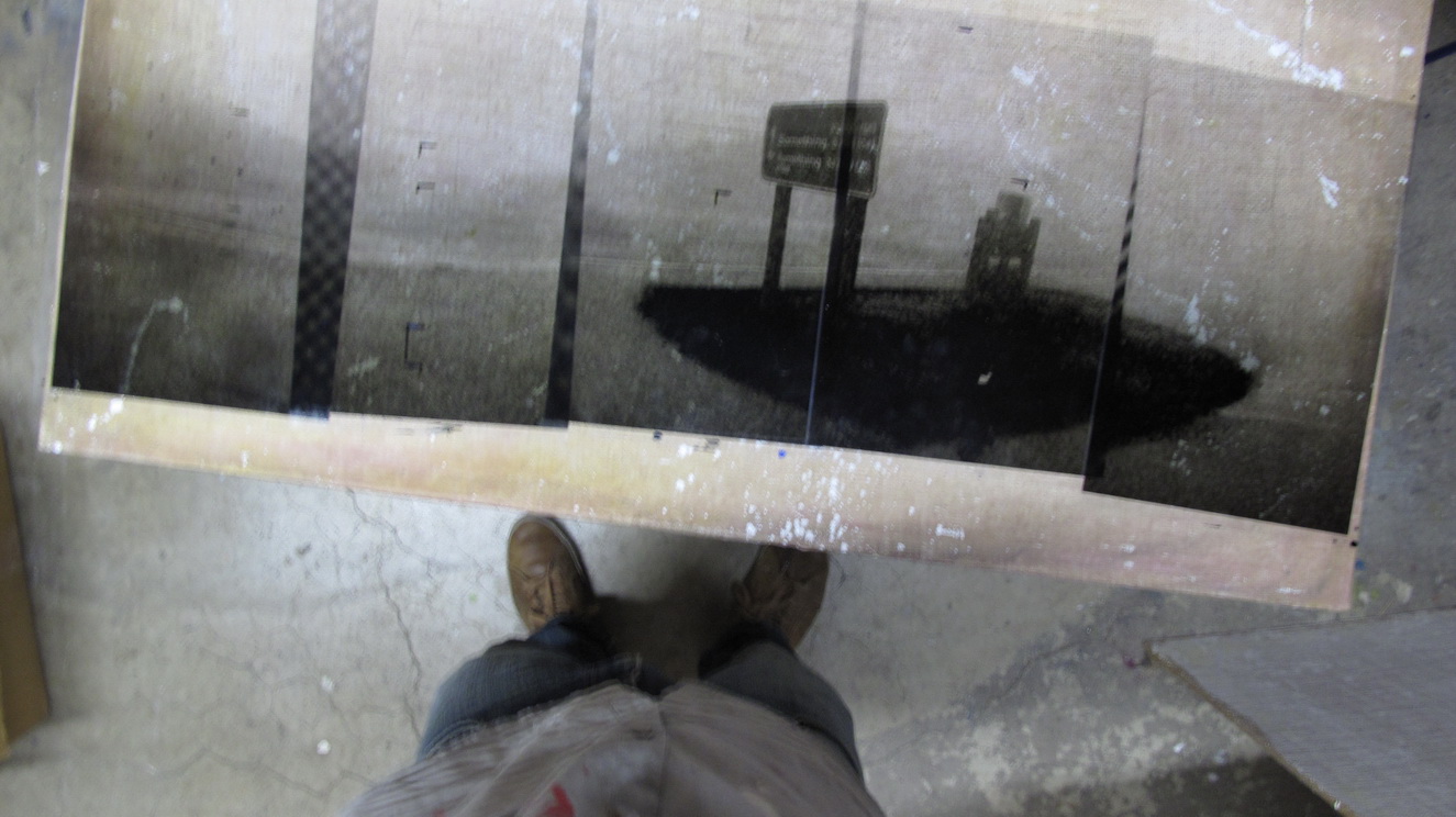
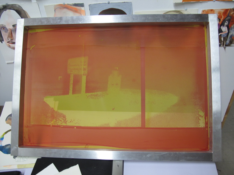
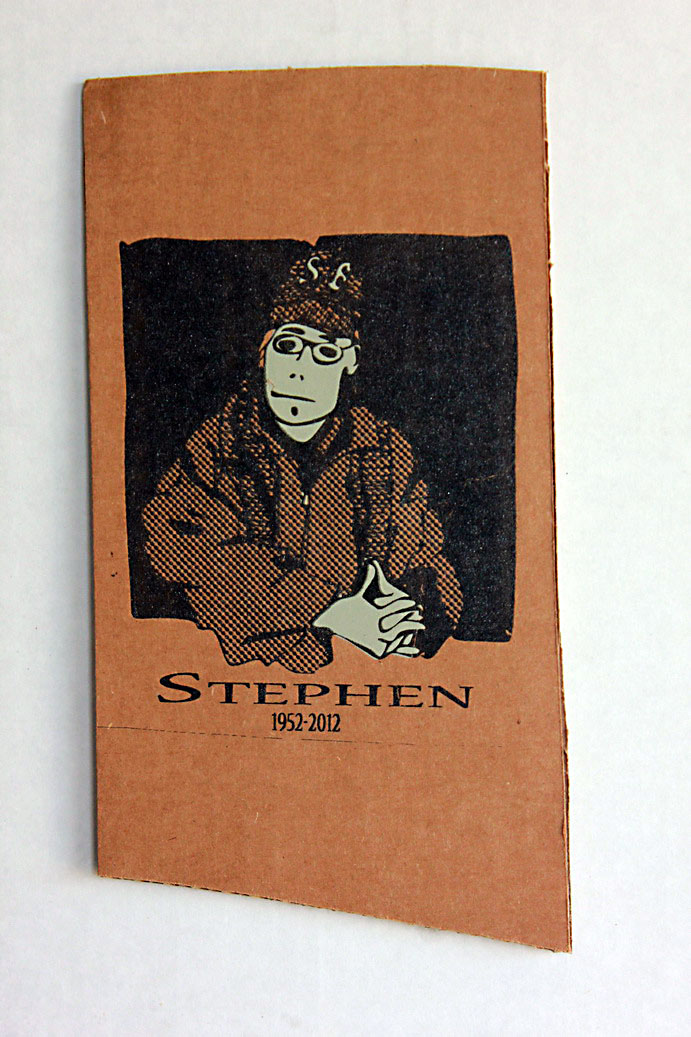
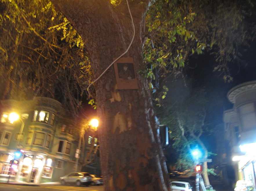
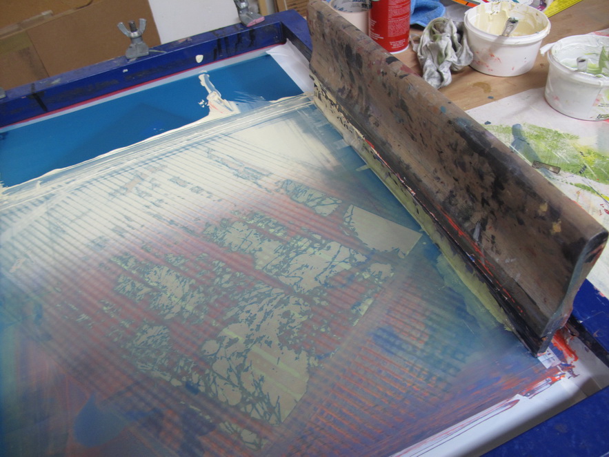
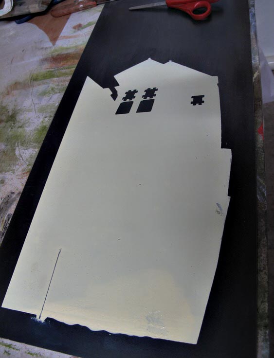
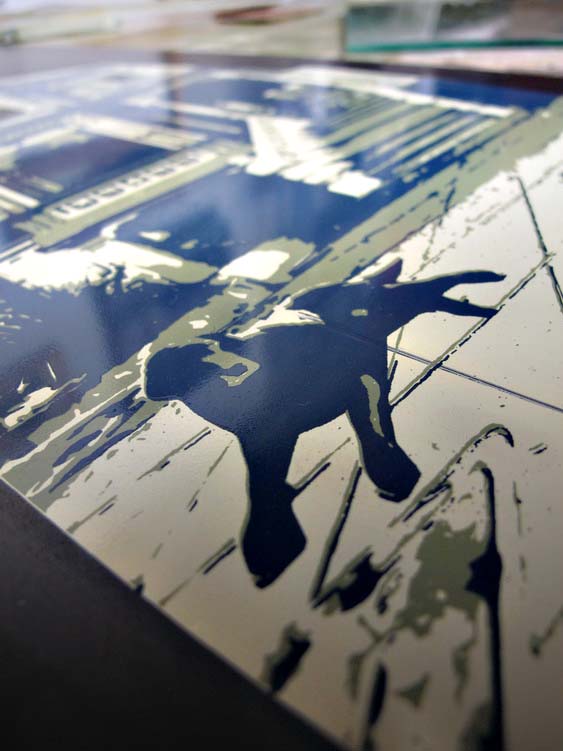
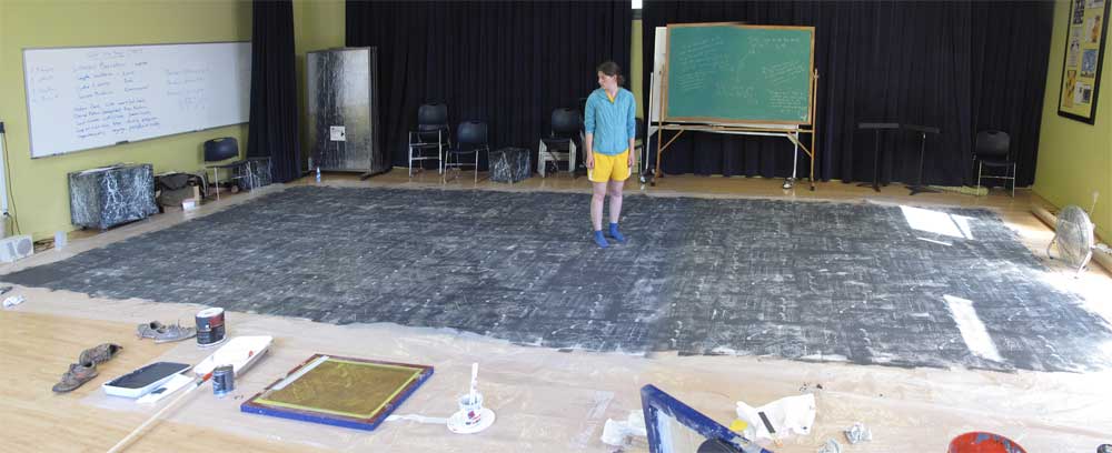
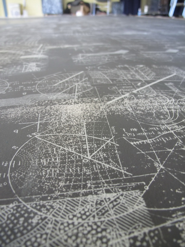
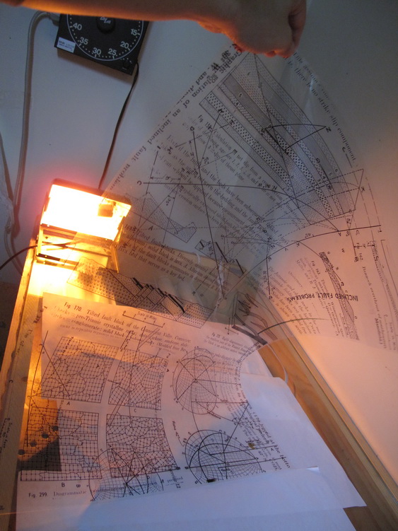
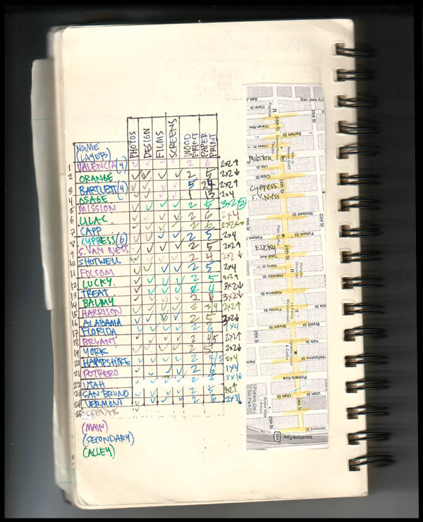
Saturday, December 1st, 2012

Today I finished printing and framing the two latest pieces I have been furiously chronicling here for no apparent reason. By the way, this piece is a small part of a project I am ramping up called “The Twenty-Seven Best Memories of Theodore Clayborne by The Genius Artist Hiromi.” If that title sounds intentionally ridiculous, maybe that is because it is meant as more of a story-visual art hybrid; a fictional piece of art might be an okay way to put it. Or maybe the title is ridiculous, which is definitely not what I am going for, but I passionately feel that there is an exciting idea in there and therefore proceeding is just something I have to do.

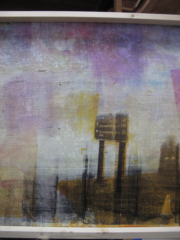
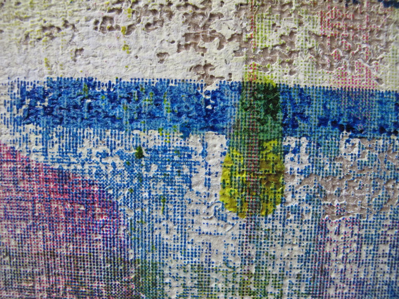
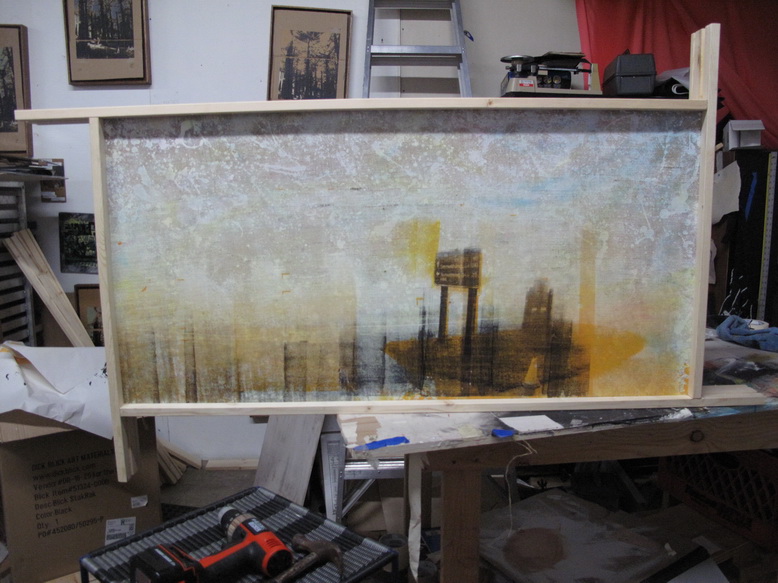
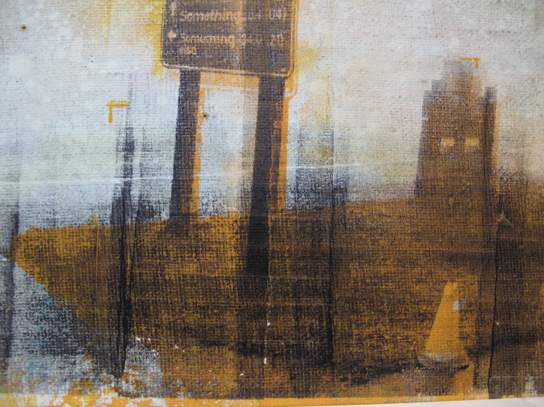
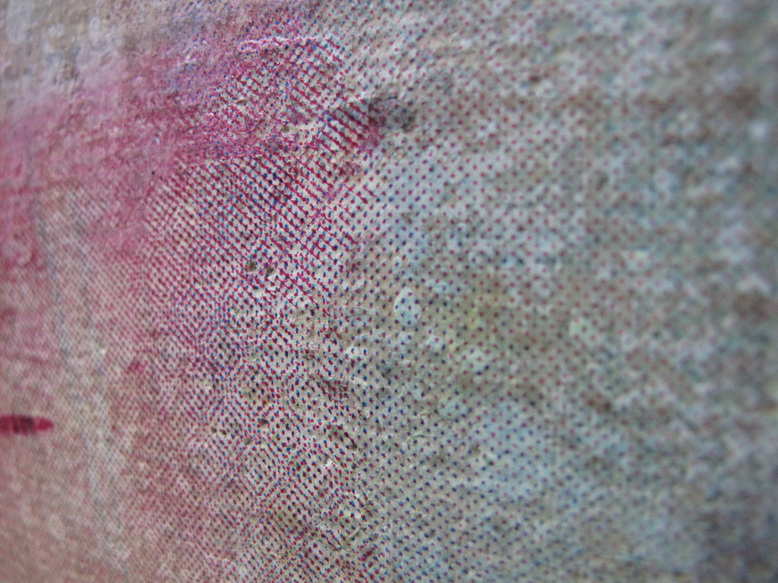
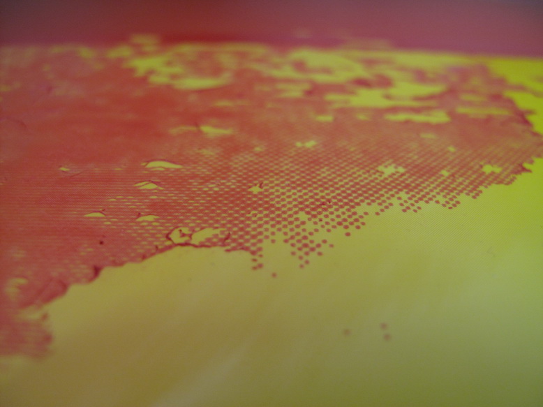
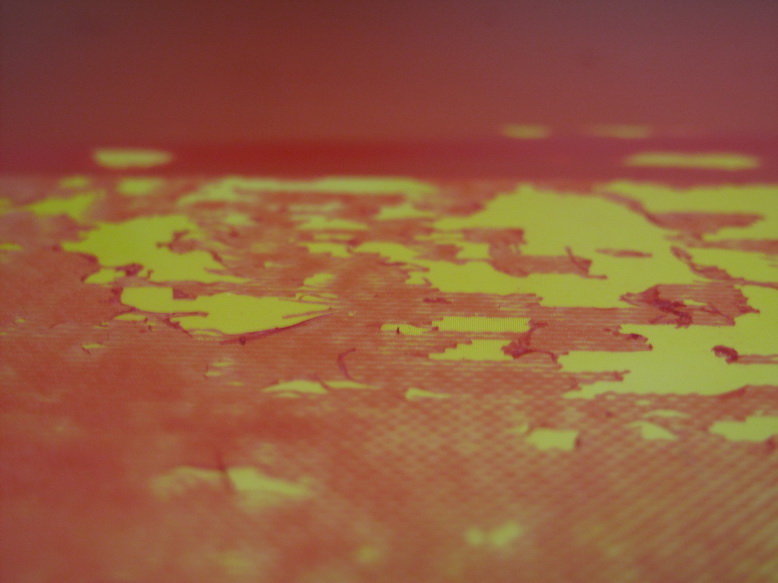
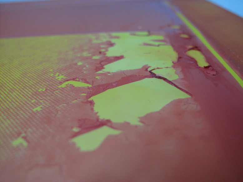
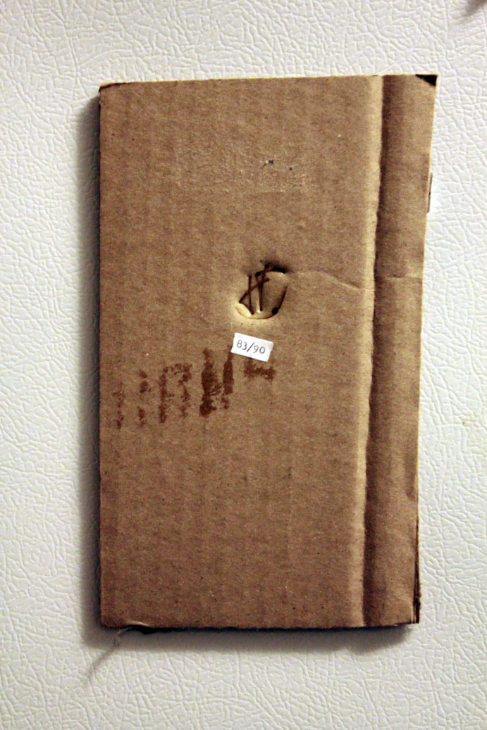
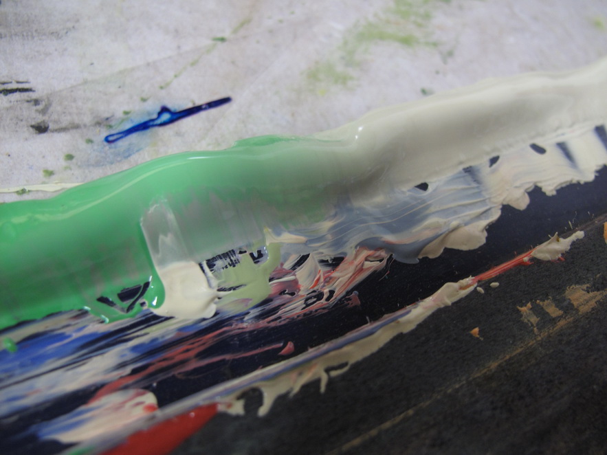
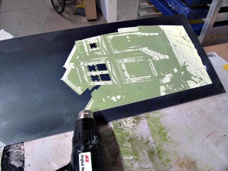
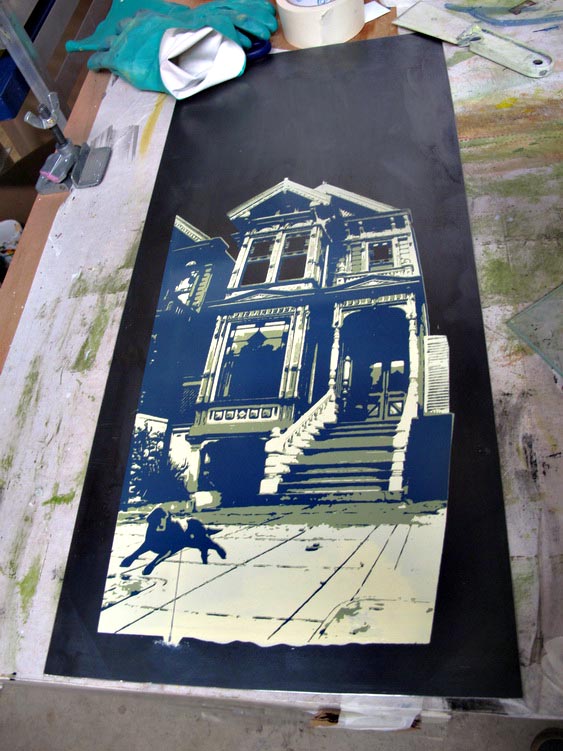
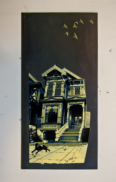
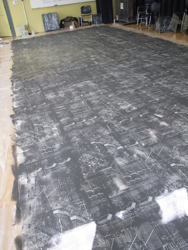
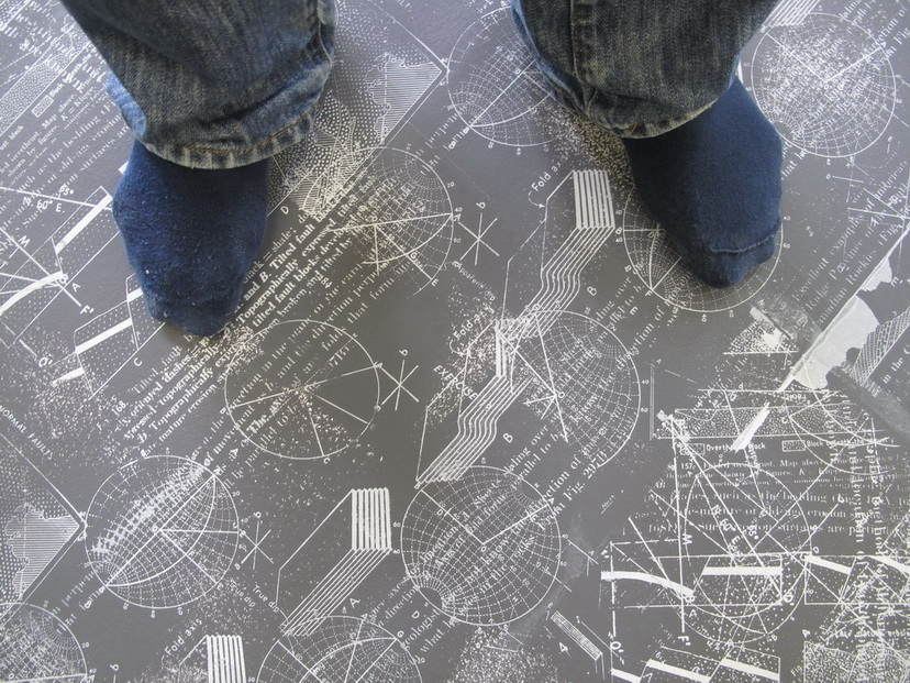
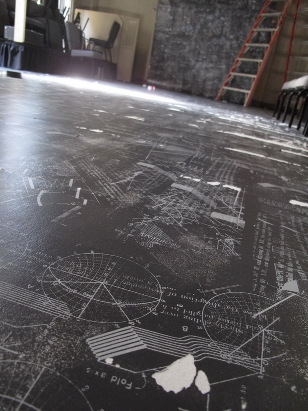
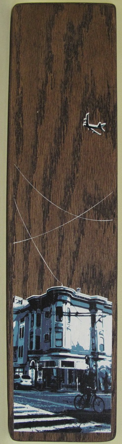
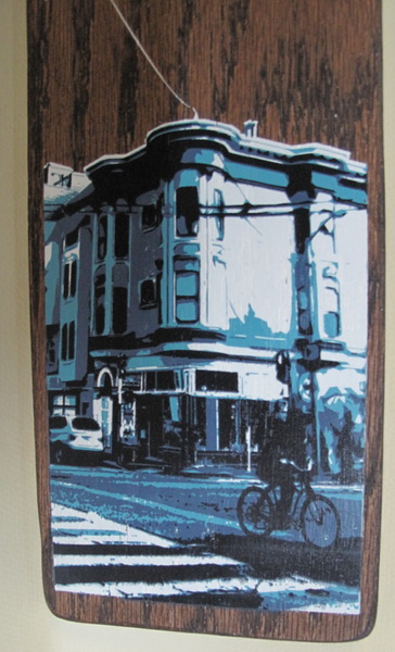
Here’s the second piece.  The black was a lot runnier and the whole thing is a bit less nuanced.  It’s like the angry, destructive version of the serene and sanguine first piece.

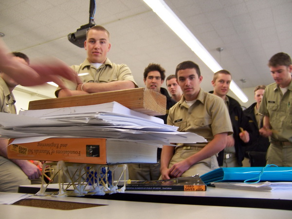
And just so that the completion of these prints is not just an occasion for me to write to myself online,  I joined 900 of my closest friends in this line for a slim shot at exhibiting immediately.

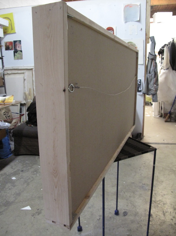
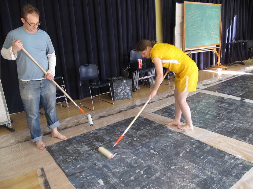
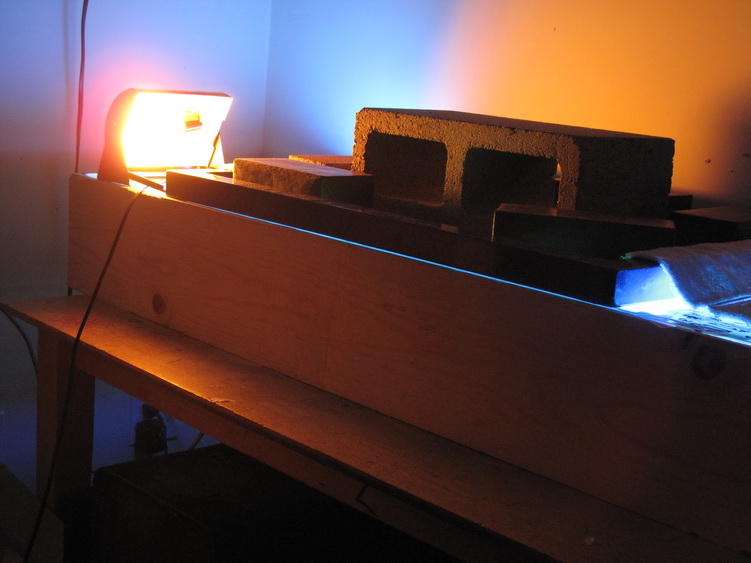
Thanks to Rodney and Andy for tool support.

The donkey’s bones are still on display at the University

Thursday, November 29th, 2012

Printing of the Mt. Tam pieces continues.  One of the many things I appreciate and enjoy about screenprinting is that it allows me to produce several versions of one work in parallel.  This provides incentive for freer experimentation, since it’s not a disaster if any one experiment should yield catastrophic results.  This is sort of similar to absurdly low rates of taxation on investment profits providing the appropriately reduced risk that society’s elite need to trickle all that cash down to us schmucks with day jobs.  Actually it is exactly like that.

So far I think I kind of like where this experimentation is going, with the image resolving into photorealism at a distance and the bright color splotches revealing themselves to be made up of little dots when you get real close.  I like art that has different stuff going on at up close and from a distance.  Or if the nothing else, the pine box frame makes it look like legitimate art.

Note that I still have one more black print to add on the far right…or does it look more interesting the way it is?

This would not be the first time that rumors eclipsed the actual findings from Mars.

Tuesday, November 27th, 2012

I decided this first print on my Mt. Tam piece was a failure:

However, this failure wasn’t totally negative.  I really like the quality of the print up close:

I just need to re-calibrate.

When astronauts get cold they turn on the space heater.

Monday, November 26th, 2012

As part of printing this big 2×4 foot image, I am working on ceding some control and encouraging the art-making to take on a more natural course. I believe there is a hard fought balance to be found that negotiates two competing items I hold to be true:

  1. The reality that without a high degree of control screenprinting doesn’t work at all.
  2. Learning how to surrender to nature is part of my life work doing visual art.

For this project, surrendering control/embracing nature is taking the form of certain decisions such as working with old emulsion that blows out the image randomly.  Here’s some pictorial dispatches from the studio I wanted to record.  I think it’s going to look pretty cool when I print it.

Rain or Shine 2.

Tuesday, February 21st, 2012

Well, after battling with old expired emulsion, runny ink and a shitty design problems (all mercifully not chronicled here), I finished Stephen’s Print.  It looks like this:

Careful observers will note that I needed to enlarge the size of the dots on his jacket from the previous design.  Details like this consumed me for the most part, but every once in a while the project made me sad.

I took the liberty of spreading a few of these around the neighborhood, particularly in the West end of Precita Park, where Stephen lived.  I found a few strategically placed trees to discretely nail into.  Also I placed a limited edition of prints for public distribution at Charlie’s and Precita Park Cafe.  I think they will either be gone very soon or sitting around forever.

I documented the project in detail for my objects section.

And finally here is a good Times article on the incident.

Yaron lives across the street from the propsed restaurant and deeply respects the neighborhood.

Sunday, January 22nd, 2012

Did I mention I was invited to join a new collective gallery owned and operated by artists?

Did I mention that this gallery is on the same Larkin Street block where I purchase my quasi-legal pharmaceuticals as my favorite Morrocan restaurant?

Did I mention our first show goes up this February?

It is all true and I am planning something exciting, complete with special effects.  Check out the gradient technique:

I bet Andy Warhol never thought of that, welcome to the future,.

Please check in again soon to see what I am making and how this series comes out.  Or even better come to the show.  I would love the moral support:

Gallery 1044 February 2012 Show
1044 Larkin St, San Francisco
Feb 01-Feb 26
Opening Reception: 2nd Thursday (2/9) 6-10pm
(Did I mention I will be offering this absurdly cheap, unique and gallery-enabled series of screenprints)

Even my volatile father was mellow, having switched from his usual gin to wine.

Thursday, December 8th, 2011

I just finished a commission for a new print.

…On metal!

In what could be described as a compressed period of time, the entire feather2pixel operation has been thrust into the Bronze age, though The Raw Steel age might be more accurate as bronze actually turns out to be too expensive.

Like many recent decisions, I accepted this challenge without a good understanding of what it entailed. Like many recent consequences, my ignorance was punished.

For example, I thought quarter inch-thick  steel seemed reasonable for this project.

Funny, I never realized that you can’t return one hundred and fifty-four cubic inches of machined metal just because you didn’t realize it would make an absurdly heavy art piece before you bought it.  Metal is heavy.

After I obtained a more reasonable slab of steel on my second try, I was introduced to enamel screen printing inks, which are toxic, extremely flammable, and are known to to cause cancer in California residents.  These inks, which resemble nail polish, are what you use to print on basically any non-pourous material.  My studiomates loved it.

The project depicts the home of the commissioner, on the aptly named Hill Street.  Here’s what happened:


(Hill Street on Steel on f2p Objects page)

Discover cosmopolitan luxury in the heart of Miami.

Thursday, October 6th, 2011

To make up for full speed ramming me on skis in 2010 Because he admires my work, ex-sailor Tommy Stillwachs allowed me the honor of printing the open/closed sign for Arbor, a new taphouse cafe in Oakland he is involved with.  Owned and operated by Chris Marquez and Suzanne Stillwachs, Arbor opened last Saturday.   And that night it closed.  The next morning it opened and after precisely nine hours it closed yet again.

I would like to think my sign made all of this activity possible.

The sign was screen printed on some beautiful and seriously warped scrap wood.  Precision screen printing requires a very uniform separation between screen and substrate, so I was happy this wasn’t a precision job.    The final prints turned out appropriately sloppy.

He had communicated with women online and sent them explicit photos.

Monday, June 6th, 2011

My friends like to pretend that I pass my summer days lazily collecting sand dollars and breaking the law, but I will have anyone who will listen know that I recently executed the largest continuous screenprint of my life.  This print makes up a floor and wall for the world of Down A Little Dirt Road, produced in my capacity as the play’s Set Designer.

How big is it?  The main floor sheet measures about 350 ft2–with a few extensions including a large piece that crawls up the upstage wall, the total is around 550 ft2.

To produce this one serigraph to rule them all , we first purchased one large sheet of economy vinyl flooring from our local mega-home improvement garrison and then got to work on its backside.  After a coat of Cracked Pepper Black was loosely applied with paint rollers, we got down on hands and knees to apply the screen prints in pairs, one painful  square foot at a time.  One person held the screen steady while the other manned the squeegee.  After seven hours of this, the pattern was complete and the surface was protected with a polyurethane sealant known to the state of California to cause birth defects while wet.

Not too many days of artmaking have shortened my life expectancy like this one probably did.  But the floor looks great:

Backside of the flooring

After a quick coat of black

After screen printing

Applying the selant

The pattern

Installed in the venue, I was happy with way the prints transformed the space:

before

after

Unfortunately there was a heartbreaking amount of tearing when the flooring was unrolled in the venue.  The vinyl just kind of stuck to itself:

A small tear.

Find out how this problem was solved:  Down A Little Dirt Road opens June 9 and runs Thursdays through Sundays until July 3.  Tickets available at brown paper tickets. Thanks to Jonathan S., Erin B., Molly A., Louel S., and especially Maddie  for all the help making this happen.

The leading choice among homeowners and professionals alike.

Thursday, April 7th, 2011

Step number two in developing the DaLDR set was exposing three screens worth of test stencils from my geology book imagery.

This printing day was a struggle from start to finish.

I produced film positives from my images, which went well enough:

Film Positives

Film Positives

Exposing the screen went fine.

Exposing the screens went fine.

Unfortunately with a manufacturer recommended shelf life of three weeks, my emulsion was long passed expired.   Screens coated with expired emulsion will usually expose, but the most magical step in screenprinting, washout of the stencil,  is near impossible.  This typically presents the printer with two options:

  • Be smart and start over.
  • Use force.

Of course a Born in the USA runaway train such as myself only has one speed: full steam ahead.  And I was pissed.  Not in the mood to relive my Tuesday morning, it was time to bust out the big guns.  That’s right, the hour had approached to unleash 1600 Watts  of heavy-duty aluminum axial cam pounding 1400 psi of unforgiving H2O through any weak-ass bullshit expired emulsion in its way.  And at 651 square inches of total area, these pissant screens were about to meet (651 in2 x 1400 psi) 911,400 total pounds of punishment.  Ladies and Gentlemen, meet the Husky 1600 Power Washer.  I like to keep it handy for close encounters.

Note the difference in the washout before and after power washing.  Now I had myself some stencils.

Next post: Taking it out on the card stock.

[audio:BornInTheUSA.mp3]

People with this name tend to be very warm and nurturing.

Tuesday, January 11th, 2011

truck faceHave you ever been to a zine festival?

Well I have.  And recently, too.  Seduced by a roomful of lovingly crafted publications of  varying aesthetic merit, I found myself inspired but only to take the laziest possible action: to spend money.   So I bought a bunch of zines and thought that maybe in the future I might like to print a zine, too.   My favorite of the lot was “Truck Face,” a memoir of a punk’s work as an elementary school teacher.

I suppose that experience planted the inspirational seed for Erin‘s Christmas present, an edition of her play Tvá Kamila that I designed, screen printed, and bound.  Right now it’s my favorite of her plays, and possibly even the most zine-like.  That’s pretty much the entire story besides the part where I misspelled the name of the play on the cover, which did not even turn out being the stupidest thing I did all week (cue footage of me desperately speeding to the San Jose airport to catch a flight I forgot about).  But besides that I rule.

Here it is:

The wall frame

The wall frame

The wall frame

The wall frame

The wall frame

How else can I afford another solid gold Humvee?

Friday, August 20th, 2010

Much as Spy Kids (2001) begot 2002’s Spy Kids 2: Island of Lost Dreams, so the Silian Rail poster resulted in a spin off project that I will detail in this sequel to the previous post.  Following their tour, the band played a CD release show in San Francisco.   At this show I was connected with Lia Rose, whose inspiring success in funding her debut solo album on kickstarter.com afforded her the funds to print some t-shirts.  That’s where I came in, she suggested.  I don’t usually print t-shirts because (1) I don’t have the proper gear (2) There are plenty of other people who print t-shirts and (3) They are much better at it than I.  We decided to give it a try anyway and and to my surprise we were able to crank out 75 one layer t-shirts in just one long Wednesday night, including coffee break.  I worked the squeegee, Lia Rose worked the heat gun.

This was the goal:

lia_rose_mockup

Typically,  printing a light color on dark fabric is the screenprinter’s classic pain in the ass scenario.   There’s almost no ink that will look opaque and bright when printed light-on-dark alone.  Printing a light graphic on a dark shirt usually requires a base coat of white or an initial spot bleaching step to lighten the bit of shirt directly under the ink (i.e. discharge printing, which is like magic.  Check out this fantastic video demo for excruciating technical detail more info). Naturally,  I was pretty sure I would fuck up all of the above and waste poor Lia Rose’s hard earned venture capital.  Once again, I found myself toeing the line between mediocre and piss poor.

What was I going to do?

Luckily, the light-on-dark dilemma is only a dilemma if a bright and opaque graphic is desired.  You actually get a somewhat cool vintage-y look if you just say screw it and print with no conditioning.  So screw it we did, hard and long with excellent results.  It was an edition of 75 shirts, printed on Alternative Apparel with Matsui RC  ink, heat set at 320° for 60 seconds.  Mediocrity pays off again!  Here’s Lia Rose with a freshly heat set men’s medium.

lia_rose

And a close up of the feaf, a “feather-leaf hybrid.” I think they have them in Madagascar:

lia_rose_close

I’ve heard so many good things about this.

Thursday, August 19th, 2010

Silian Rail Poster:

I thought a productive way to kick off the July printing season would be to crank out a series of starkly radiant posters for my favorite Bay Area boy-girl post post-rock experience, Silian Rail. Time was of the essence as our heroes were embarking on a west coast tour in a matter of days, and the project proved to be a much bigger pain in the ass than anticipated. This was mainly due to incompetence on my part.

The image was inspired by a recent camping trip to Angel Island with Christina, Marella, and EB (I can’t believe I have never done that before).   I had a feeling that the band would be in to a subdued natural scene that invoked their native Oakland.  That led to this Bay Bridge-Victorian-moon rise trifecta.  The images were printed on 30 x 22 Canson stock in a variety of colors:

(Click to enlarge)

BLUE BLUE
BLUE BLUE
BLUE BLUE

Here’s some details.  The bridge:

The window:

The moon:

Of course I accidentally produced all the exposure films one inch too long for the paper. This near fatal mistake required some eleventh hour jerry-rigging in order for the band name to come through, which it barely did in the end. Luckily there was room for me to tape the text in the bottom corner of the film. Here’s what I am talking about.

And here’s some of the other (slightly too long for the paper) films:
Layer 1:

Layer 2:

And that’s probably more than anyone ever needed to know about the Silian Rail posters. Eric and Robin hit the road and the posters were on sale up and down the continent for an incredibly affordable five dollars. A limited edition of 45 or something.

Enjoy this superb script.

Tuesday, January 26th, 2010

The principle printing for the 24th Street project is in the books.  Oh my god!  I didn’t think it was possible.  Yet tonight at 9:22 pm PST, the following took place:

[flv:final_print.flv 480 360]

That’s right: the final pull of the final piece.  If you thought that was boring, imagine setting up one hundred and four of those screens and watching the video seven hundred and sixteen times.   Okay so it wasn’t the biggest project in the world, but at least I can show up at my day job now.

Here are the last two prints: Potrero and Vermont.