When it gets sold we’ll let you know.

Wednesday, April 18th, 2012

My Silian Rail posters are complete.  Instead of settling on one way to print all of them, I decided to provide a few options for potential owners to choose from.  In forcing myself to be loose and more flexible (or, more accurately, marginally less inflexible), I felt rewarded by the compelling and vaguely playing card-like effect that flipping the stencil produced in some of these.

All posters are 14×17″.  An edition of 30.

Keep the following documents for four years from the date

Thursday, April 12th, 2012

Another year, another Silian Rail Poster.  In a good way of course.  I very much enjoy working with Eric and Robin who both share the highly fortunate personality trait of trusting their artistic collaborators.  I think this comes across in their music as a sort of highly complex  but refined sense of balance.   Even their sense of gender is equal in a way most music isn’t and not just the even number of boys (1) and girls (1), but something more along the lines of a harmonious male and female presence.

Anyway I am back into halftones, with some serious questions to be answered.  So this’ll help me.

The original mock up:

Printed layer 1: CYAN

After many sold out screenings.

Monday, August 6th, 2007

Success!

Kind of.

I went ahead with my next CMYK experiment : a full page print with ever bigger halftones–they are really big now. And it worked. Up close it’s just clusters of large dots in four colors, but from across the room the image focuses and the colors mix:
panorama

The image is actually a small section of a panorama of Balboa and 34th Ave (a key intersection in my life, within sight of the essential Balboa Theater and the Dumpling King) I photographed this week:
balboa
So my next step is to print the whole thing in the four CMYK layers. The print will be about five feet long.

I go crawling over me.

Friday, August 3rd, 2007

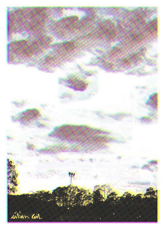
I have been experimenting with a bastardized CMYK printing process. It interests my inner scientist: how do three essentially florescent colors manage to fool the eye into experiencing the entire spectrum, and how far can one take that illusion with screen printing?

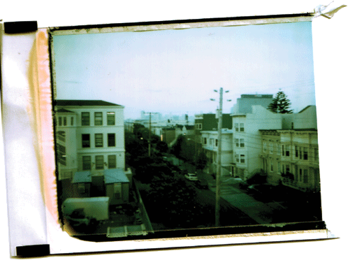
I took three full days to conduct an initial study at the Cellspace silkscreen loft (It’s great: there are no workshops going on and so, with the exception of the vaguely territorial tabby cat, I have the whole place to myself). I took six different 669 peel-apart Polaroids from the first half of 2007 and reproduced them on a series of two hundred postcards.

The original photograph was scanned:

original image

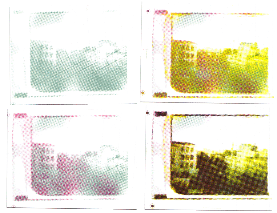
and digitally separated into it’s four base channels: cyan, magenta, yellow, and black. I forced each channel to exaggerated halftones and exposed each one on a separate screen.

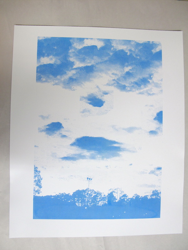
I mixed my own batch of transparent cyan, magenta, yellow, and black and printed the four screens on the same postcard in that order. This example of Bartlett Street was probably the most successful of the six, though they all looked interesting. Here is the progression from one to four colors:

composite

I can definitely move forward from here. I like the exaggerated halftones because the image and the colors only resolve themselves from a distance. On a more cerebral level, I like how it draws attention to the optical illusion of the printing process: at one glance its a cluster of dots and at another glance it is a photographic image. I want to experiment with making the halftone dots even bigger.