One of the most glorious musical numbers in movie history.

Tuesday, March 12th, 2013

I thought I would provide a little more detail on how I’ve been combining wet media with screenprinting. Basically I started by making a bunch of these two layer (yellow and black)  screenprints on very thick watercolor paper:

Then I applied the wash over the print.  And that’s the cool part: because the wet media is liquid and mostly transparent, I can work right on top of my image.  This is a lot more fun than the other way around, which would require inventing a way to figure out where the image will end up before it’s printed.

And here is my latest attempt, for the April 2013 “Pink” show at CityArt Gallery on 828 Valencia:

Cliff House | Screenprint and Ink on Paper | 18x 24 inches  | 2013

Behind The Latest ‘Downton Abbey’ Departure

Sunday, March 10th, 2013

I have seen the future and it is wet media.

Those kindly and supportive folks following my last few projects may have noticed a painterly touch developing.  Or rather than “a touch,” one could fairly call it ” a punch in the face” as there is nothing gentle about it.  At least not yet. Like in all all arenas besides street fighting and lab report grading, I do aspire to always brandish a gentle touch.  So with the long road ahead in mind, I have been experimenting with inks, washes, and watercolors–the large group of liquidy art materials generally known as wet media–and I aim to harness their drippy and vibrant properties to shift the balance of my screenprinting towards the organic.

One of the things I love about screenprinting is that it involves a unique tension between control and lack of control.  Preparing, exposing, and layering stencils is an analytic process with little room for error.  It is followed by a printing stage that is tactile, free, and subject to limitless possibility.  Most screenprint stuff trends towards one of these poles.  For example, on one extreme end I would think of production print work (t-shirts, signs, etc) while some of the more abstract work from the last century stakes out the most identifiable territory on the other.  A big ongoing goal of mine is to develop a unique physical screenprinting process that negotiates a balance in between.  And that is a long journey.

That’s also a long way of saying look at this practice piece.  I recently acquired a variety of really nice papers and this is one of my first shots at applying art to it (possibly for the purposes of one final edition of Silian Rail posters for their imminent, final show ever).  From my “Eight Ideas at Ocean Beach” stencils:

Cliff House | Screenprint and ink on paper | 18×24″ | 2013

I didn’t turn in the homework because I got confused about what the homework actually was, but now i understand it was the questions at the end of the chapter.

Sunday, January 27th, 2013

Here’s a preview of my latest series Eight Ideas at Ocean Beach.   There are actually sixteen separate pieces–each with a corresponding idea at Ocean Beach–but the gallery wall only fits eight at a time and I do not want to confuse visitors.  They will  likely be confused enough about why I would print images of myself running around with a crazed look over a perfectly beautiful image.

I am calling this a screenprinted motion picture. I think that is legitimate because each piece is truly one frame in a film I shot for this project.  Notice how the background scrolls from left to right?  Notice how I lose my hat at the end? Notice how I am wearing a bathrobe? (It’s got an ideal shape for screenprinting). I feel excited about this new direction and my aim is to cultivate collaborations with directors, writers, and actors, costume folks.  This time around, it’s just me though.  Thanks to EB for filming.

The Ocean Beach Ideas are from my working list of phrases documented in these posts.

Come see them in person all month!

City Art February Show
Opening reception: Friday 2/1/13 7-10 PM
City Art Gallery
828 Valencia @ 20th. SF CA

The Case of the Shaven Head Case.

Saturday, January 26th, 2013

Some works in progress for my City Art debut on February 1st. These pieces are 16×16″ 3/4 inch thick oak panels.

Could have been wins with one or two more key plays.

Thursday, January 17th, 2013

A lot of information in a very readable format.

Saturday, December 10th, 2011

Another winter, another drawn out slog though ever shortening days.

This year, in addition to the usual pattern of increasingly diminishing daylight,  I have for whatever reason also been paying attention to the actual path of that low December sun.

And until recently I was doing a good job of keeping this new routine rooted in tangible, real life experience.  Then the internet seized hold.

Did you know that in these parts, the sun goes from reaching a maximum angle of elevation in the sky of almost a 70°  in June to less than 25° now.  Not only that, but the total travel of the east to west path from sunrise to sunset goes from well over 240° in the summer to 150° now.  (The sunset doesn’t even make it past due west after September).  All the details can be interpolated on this chart:

The positive trade off is the angular, more horizontal moving light.  The sunset lasts a lot longer and the golden hour is like an hour long, even if the hour in question starts at 4:30.  And of course one of the best things about the west coast is that the sun sets over the Pacific Ocean, the biggest thing in the world.  It’s been pretty striking to watch this year and I have collected some photos.  I suppose that’s the point here.

Cue the clickable content:

Team Building/Virtual Team Building Team Consultant.

Monday, September 5th, 2011

Did I mention Erin is starting a kid opera company?

By company I of course mean a struggling non-profit, and by starting I of course mean spending every weekday in a foul mood over municipal tax codes or something.

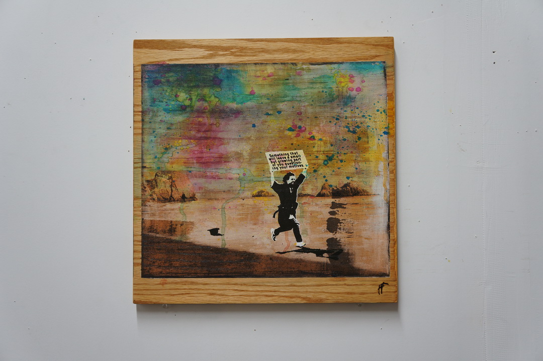
When she decided Little Opera needed a logo, I referred her to a few colleagues.  When she decided she needed a free logo, I referred her to myself.   Anyway I thought it would be fun to document the process, since I’ve never made a logo.

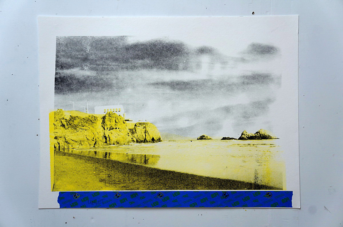
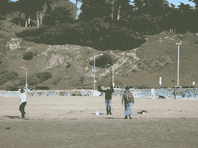
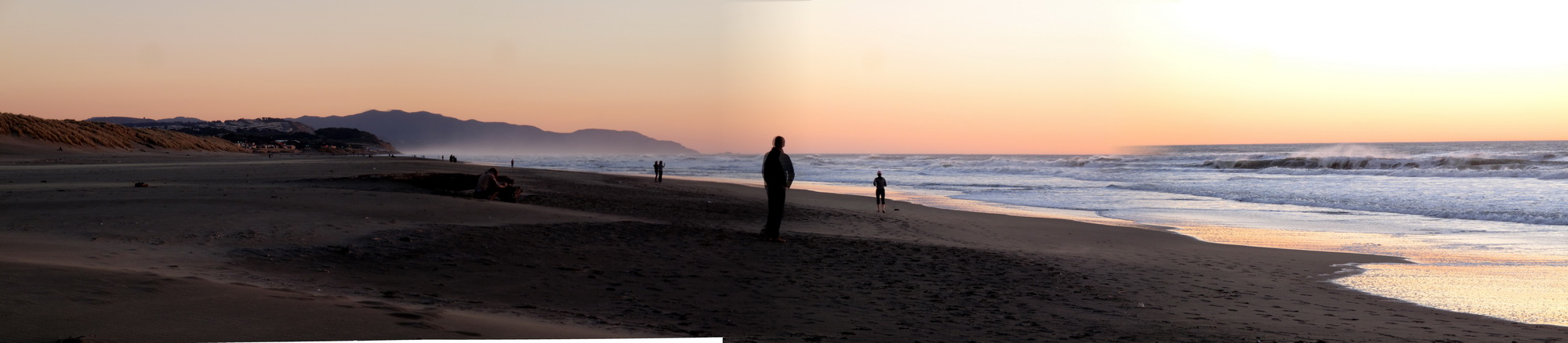
The idea was to build something around the image of a feather, which holds some kind of significance in opera that I forget.   We found some beautiful gull feathers at Ocean Beach but they ended up being too detailed to make a good logo:

This failure made me realize how conspicuous a good logo really is, the perfect example one of those things that everyone else already knows about the world but I learn the hard way.  (However I will add that this was much easier than the way I learned how to correctly pronounce the word spatula, by getting beat up in the sixth grade for standing up for my mom’s invented enunciation.  “Spatoola.”  Thanks, mom.)

My next idea involved experimenting with a fat brush and black ink.  Over the last few years  I have begun to understand the supreme power of a well made mark and my new instincts led me to believe that bold brush strokes would translate into a successful logo.

By the end, a few graceful gestures proved most effective and I was left in appreciation of how the process of making a logo was in essence a series of simplifications.  It was a most enlightening lesson.

The final, vaguely featherlike logo: