A bit of an adjustment going from no noise downstairs ever, to music till 11am.

Sunday, March 17th, 2013

Little Opera shirts! And bags!  Come see the cute little beasts perform at the Alcove Theater in downtown SF! Next week!

(Attending will grant you the possibility of seeing a few of those beasts  in color-coordinated and adorable micro baseball shirts.)

An impossibly small robot that sends backs pixel images from the surface of Mars.

Saturday, March 16th, 2013

Another year, another homemade Little Opera logo.

This one features some lovely lettering by Erin, pieced together from a fifteen page cursive drill we executed at Taqueria Vallarta.  Incidentally on our first date ever her and I shared a no sour cream no salsa regular nachos at Taqueria Vallarta. Yes, that’s pretty much just chips and beans.  Some cheese, too.

We produce some really good olive oil in the Bay Area, so why not celebrate its origins?

Sunday, March 3rd, 2013

Check out this musical apple pie I made for Little Opera‘s annual build day.  I didn’t actually take any pictures of the fantastic CandyLand sets we made, but if you want to see some cute kids perform an opera they wrote, designed, and composed you should clear some your schedule at one of these times:

    • Tuesday, Mar, 19 2013 04:30 pm
      Thursday, Mar, 21 2013 07:00 pm
      Friday, Mar, 22 2013 07:00 pm
  • Tuesday, Mar, 19 2013 04:30 pm
    Thursday, Mar, 21 2013 07:00 pm
    Friday, Mar, 22 2013 07:00 pm

A prank caller inquires about the size of Mitt Romney’s lead.

Wednesday, January 18th, 2012

Little Opera is definitely one of San Francisco’s top fifteen, possibly only, all-kids’ opera company.

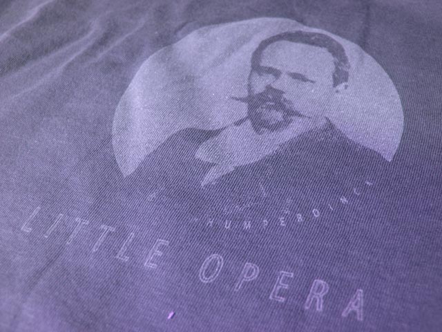
After an initial round of tee-shirt fabrication for the kids, Little Opera founder and feather2pixel sex contractor EB worked with me to print something more suitable for adults.  Since the kids’ shirts, as you will recall, featured an intriguing but possibly altogether inappropriate obscure nineteenth century composer, we figured there wouldn’t be much to change.

The kids shirts featured a dark print on a light shirt:

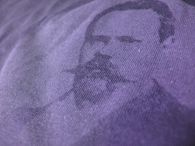
The adult shirts were printed with a negative image for the slightly more advanced light print on a dark shirt.  Getting a suitably opaque light print on a dark surface is a notoriously unfun screen printing technique to execute.  Conversely, deliberately executing light on dark poorly may result in this pleasingly nuanced monochromatic effect:

Cool, huh?  Amazing that it’s just white ink with a little medium for transparency and sparkle for attitude.  To me it says “I give to charity but I don’t take shit from anyone.”

Here’s negative and positive stencils:

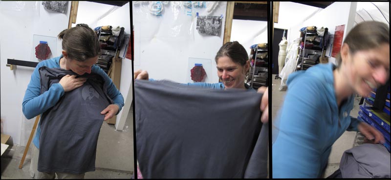
And finally, here is the staged joy of screenprinting:

By selecting this option you acknowledge that the computer complies with your organization’s security policy.

Sunday, December 18th, 2011

Kids receive their Little Opera tees:

[flv:little_opera_shirt_reaction.flv 480 360]

Team Building/Virtual Team Building Team Consultant.

Monday, September 5th, 2011

Did I mention Erin is starting a kid opera company?

By company I of course mean a struggling non-profit, and by starting I of course mean spending every weekday in a foul mood over municipal tax codes or something.

When she decided Little Opera needed a logo, I referred her to a few colleagues.  When she decided she needed a free logo, I referred her to myself.   Anyway I thought it would be fun to document the process, since I’ve never made a logo.

The idea was to build something around the image of a feather, which holds some kind of significance in opera that I forget.   We found some beautiful gull feathers at Ocean Beach but they ended up being too detailed to make a good logo:
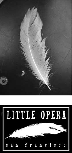
This failure made me realize how conspicuous a good logo really is, the perfect example one of those things that everyone else already knows about the world but I learn the hard way.  (However I will add that this was much easier than the way I learned how to correctly pronounce the word spatula, by getting beat up in the sixth grade for standing up for my mom’s invented enunciation.  “Spatoola.”  Thanks, mom.)

My next idea involved experimenting with a fat brush and black ink.  Over the last few years  I have begun to understand the supreme power of a well made mark and my new instincts led me to believe that bold brush strokes would translate into a successful logo.
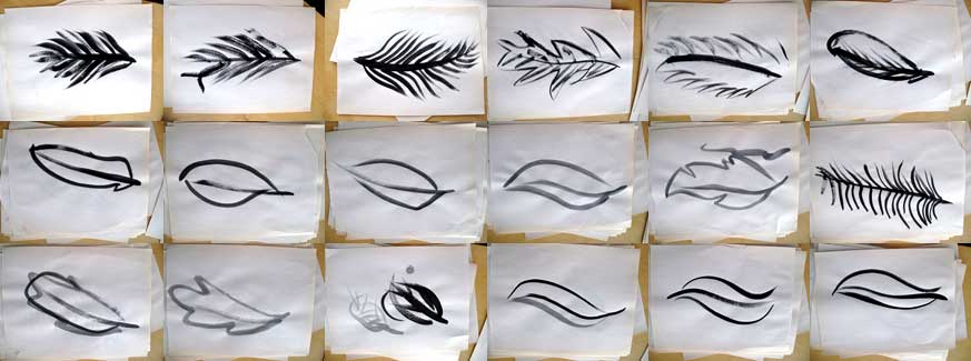
By the end, a few graceful gestures proved most effective and I was left in appreciation of how the process of making a logo was in essence a series of simplifications.  It was a most enlightening lesson.
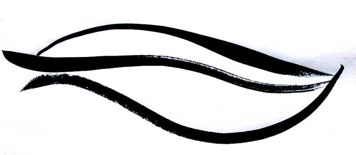
The final, vaguely featherlike logo: