Blog Archives

A prank caller inquires about the size of Mitt Romney’s lead.

Wednesday, January 18th, 2012

Little Opera is definitely one of San Francisco’s top fifteen, possibly only, all-kids’ opera company.

After an initial round of tee-shirt fabrication for the kids, Little Opera founder and feather2pixel sex contractor EB worked with me to print something more suitable for adults.  Since the kids’ shirts, as you will recall, featured an intriguing but possibly altogether inappropriate obscure nineteenth century composer, we figured there wouldn’t be much to change.

The kids shirts featured a dark print on a light shirt:

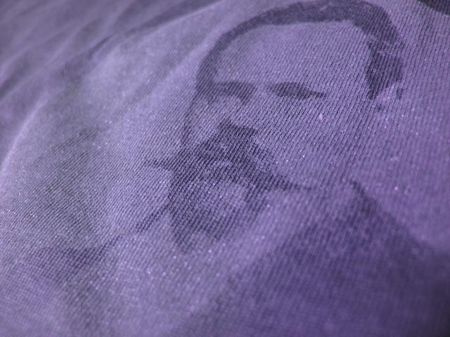
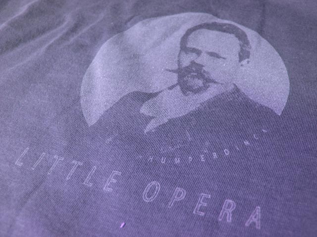
The adult shirts were printed with a negative image for the slightly more advanced light print on a dark shirt.  Getting a suitably opaque light print on a dark surface is a notoriously unfun screen printing technique to execute.  Conversely, deliberately executing light on dark poorly may result in this pleasingly nuanced monochromatic effect:

Cool, huh?  Amazing that it’s just white ink with a little medium for transparency and sparkle for attitude.  To me it says “I give to charity but I don’t take shit from anyone.”

Here’s negative and positive stencils:

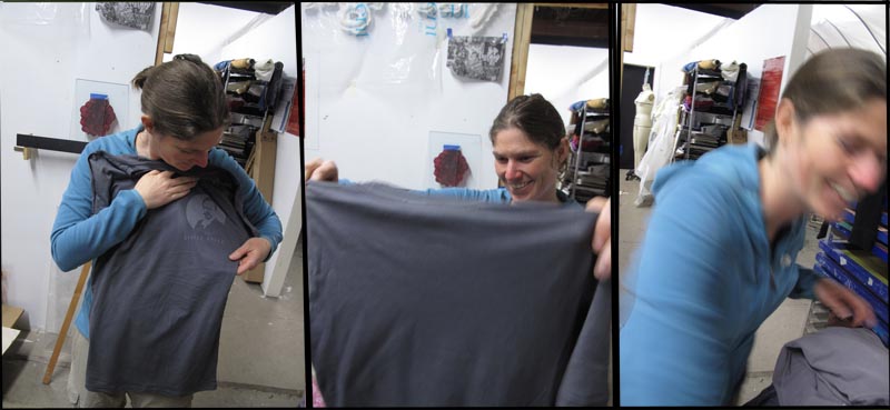
And finally, here is the staged joy of screenprinting:

By selecting this option you acknowledge that the computer complies with your organization’s security policy.

Sunday, December 18th, 2011

Kids receive their Little Opera tees:

[flv:little_opera_shirt_reaction.flv 480 360]

On “Motherless Bastard” a small boy is heard yelling for his mommy.

Tuesday, December 13th, 2011

Everyone likes tee-shirts, most people like cute kids singing, and a small number of folks like opera.  That accumulates to a fairly good reason to make tee-shirts for Little Opera, San Francisco’s newest all-kids opera company.

In discussing the design with Little Opera CEO and supreme empress Erin Bregman, we decided each year’s shirt would feature a figure from the sordid history of Opera. This inaugural year’s mascot, Engelbert Humperdinck, was selected mostly on the strength of his mustachioed headshot on Wikipedia.

Tonight we made a dark print on light shirts for kids. Stay tuned for the exciting follow up I think I will call light print on dark shirts for adults.

You will note the exquisite detail one can attain with a fine mesh screen.  Note it!

[flv:little_opera_shirts.flv 640 480]

I was actually on the spreadsheet when you were editing it!

Monday, October 3rd, 2011

Open Studios 2011 has come.  And Open Studios 2011 has gone.

Gone fast, I should add.  I forgot that the many interesting people and opportunities that pop up during the weekend make time fly.  I even got a little photo-op at Mission Local (not to be confused with Local Mission), thanks to blogger Molly Oleson.  Click to slide number 5.

My goal was to turn a humongous pile of scrap cardboard into an series of serious work that anyone who wanted could afford.  And if anyone didn’t look like they could afford it, I probably just gave the piece away.  I think that’s what Open Studios is best for.  Opening your studio to the public shouldn’t just be about self promotion, but also engagement.   As a screen printer, I am lucky enough to have the means to make this sort of thing work because I can make a shitload of prints.  So I hadn’t really thought of it exactly like this until now, but I guess my goal was to make the weekend an experiment less about promotion and sales and more about art as an act of engagement. I really want to explore this aspect of printmaking further.

Thanks to my new friends from Mexico City to City Hall to 22nd Street.  Special thanks to the old friends who showed up, Phanna, Serai, T-man, Michelle, and of course EB.  It’s nice to be supported.

Cellspace open studios 2011

Cellspace open studios 2011 (click to enlarge)

Cellspace open studios 2011

Prints on cardboard

Team Building/Virtual Team Building Team Consultant.

Monday, September 5th, 2011

Did I mention Erin is starting a kid opera company?

By company I of course mean a struggling non-profit, and by starting I of course mean spending every weekday in a foul mood over municipal tax codes or something.

When she decided Little Opera needed a logo, I referred her to a few colleagues.  When she decided she needed a free logo, I referred her to myself.   Anyway I thought it would be fun to document the process, since I’ve never made a logo.

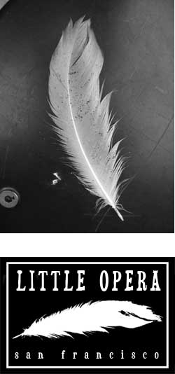
The idea was to build something around the image of a feather, which holds some kind of significance in opera that I forget.   We found some beautiful gull feathers at Ocean Beach but they ended up being too detailed to make a good logo:

This failure made me realize how conspicuous a good logo really is, the perfect example one of those things that everyone else already knows about the world but I learn the hard way.  (However I will add that this was much easier than the way I learned how to correctly pronounce the word spatula, by getting beat up in the sixth grade for standing up for my mom’s invented enunciation.  “Spatoola.”  Thanks, mom.)

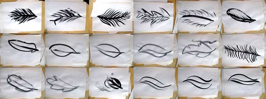
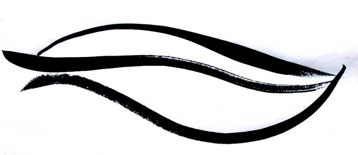
My next idea involved experimenting with a fat brush and black ink.  Over the last few years  I have begun to understand the supreme power of a well made mark and my new instincts led me to believe that bold brush strokes would translate into a successful logo.

By the end, a few graceful gestures proved most effective and I was left in appreciation of how the process of making a logo was in essence a series of simplifications.  It was a most enlightening lesson.

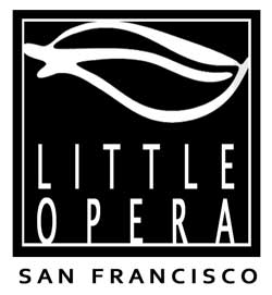
The final, vaguely featherlike logo:

You might want to point out that people have to check the backwards compatibility.

Friday, August 19th, 2011

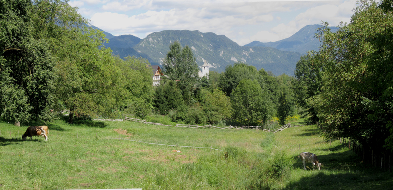
Hi.  I have returned from a long satisfying voyage, visiting friends and family in Israel, Berlin, France, Slovenia, and Scotland.  I  have a lot of work to do on feather2pixels, but for now here are some pictures waiting for your tender mousecliks.

He had communicated with women online and sent them explicit photos.

Monday, June 6th, 2011

My friends like to pretend that I pass my summer days lazily collecting sand dollars and breaking the law, but I will have anyone who will listen know that I recently executed the largest continuous screenprint of my life.  This print makes up a floor and wall for the world of Down A Little Dirt Road, produced in my capacity as the play’s Set Designer.

How big is it?  The main floor sheet measures about 350 ft2–with a few extensions including a large piece that crawls up the upstage wall, the total is around 550 ft2.

To produce this one serigraph to rule them all , we first purchased one large sheet of economy vinyl flooring from our local mega-home improvement garrison and then got to work on its backside.  After a coat of Cracked Pepper Black was loosely applied with paint rollers, we got down on hands and knees to apply the screen prints in pairs, one painful  square foot at a time.  One person held the screen steady while the other manned the squeegee.  After seven hours of this, the pattern was complete and the surface was protected with a polyurethane sealant known to the state of California to cause birth defects while wet.

Not too many days of artmaking have shortened my life expectancy like this one probably did.  But the floor looks great:

Backside of the flooring

After a quick coat of black

After screen printing

Applying the selant

The pattern

Installed in the venue, I was happy with way the prints transformed the space:

before

after

Unfortunately there was a heartbreaking amount of tearing when the flooring was unrolled in the venue.  The vinyl just kind of stuck to itself:

A small tear.

Find out how this problem was solved:  Down A Little Dirt Road opens June 9 and runs Thursdays through Sundays until July 3.  Tickets available at brown paper tickets. Thanks to Jonathan S., Erin B., Molly A., Louel S., and especially Maddie  for all the help making this happen.

Tennessee fights back against Sharia law.

Wednesday, March 16th, 2011

Looks like I am doing graphics and set for Erin‘s next play, which is being produced in Berkeley by Just Theater.  My first duty was to design this postcard.  It’s supposed to get you interested in the connection between earthquakes and dreams, ideally without invoking Tori Amos.

front

back

Recently opened the Stomping Grounds, a terrain park packed with jumps.

Friday, February 25th, 2011

Friends, family, Nigerian spam robots:  it is to you, my scarce and scattered and readership that I now make a confession.  While I have been busy in these pages attempting to seduce you with anodyne images of Northern California that you may or may not have noted in passing , I have also been secretly at work planning something big.

Let me first beg you to please not feel betrayed by the belated nature of this revelation, for it was only in the most pressing interests of self-respect that I kept this matter quiet even to you, my most devoted online readership.  (I hope you know who you are.)

What the hell am I talking about, you ask as usual?

Well, basically I recently came across my big chance in the art world.  This felt like the chance I have been waiting for, I think.  It all had something to do with a city fence, a big-time call for temporary art, and the changing Mission Bay community of San Francisco. Now not only have I been at work for the last four years doing things such as creating art about the changing Mission Bay community entitled Temporary Spaces, but I also took the time to put together and submit a bulletproof proposal for what I think is a truly exciting project.  This vague recap probably doesn’t explain anything, but I hope it at least it coveys a few good reasons why even up till Friday I felt enthusiastic and confident regarding this opportunity.
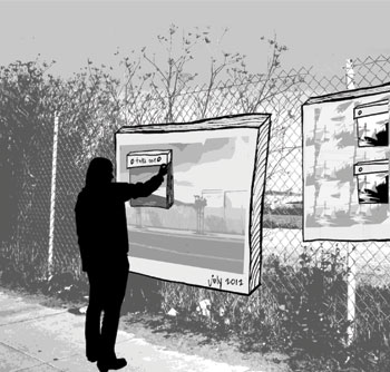
pieces are designed some months for passers-by to remove part of and take home.  Other months, this area will be designed to contribute to: not a popular idea.

'Pieces are designed some months for passers-by to remove part of and take home. Other months, this area will be designed to contribute to:' not a popular idea.

I rallied my people, I did my absolute best, and without a doubt I put my strongest foot forward.  That felt great.  I am glad I did it.  It moved me forward.  Forward is my favorite direction.

Anyway, last Friday was supposed to be the big day and it turns out that the opportunity is not to be.

The bad part is that in the end my best wasn’t good enough.

Yeah… that part really sucks.

Oh well.

I’ll probably be over it after this weekend or this month or something.

I really don’t want to sound melodramatic or anything.  There are incredible things going on in the world right now affecting the lives of millions and this thing was only about me.  But as  inconsequential and selfish as it ultimately was, I guess I really wanted this particular thing.  Even though there will be other things this perfect. Some time in the future. Maybe.

Anyway, yes: I know this is how things go.  I just thought I should mention it here, since this is my art archive-website-thing.  Or something.  Immense thanks to my four invaluable advisers: Erin, Z-mom, Montreal, and Julia H.
A partnership between NASA and teachers.

Monday, February 14th, 2011

This was really good.

2011_valentine_bbq

Valentine Day Feast:
2 racks of ribs
1 chicken
2 lbs brisket
5 lbs of sides
8 pieces of cornbread
3 pitchers of beer

(Also–The look of this picture reminds me of the cover art to the Smashing Pumpkins “1979” single)

You got a lot of these guys that think they are going to play in the NBA, but they got guys who just play.

Wednesday, February 9th, 2011

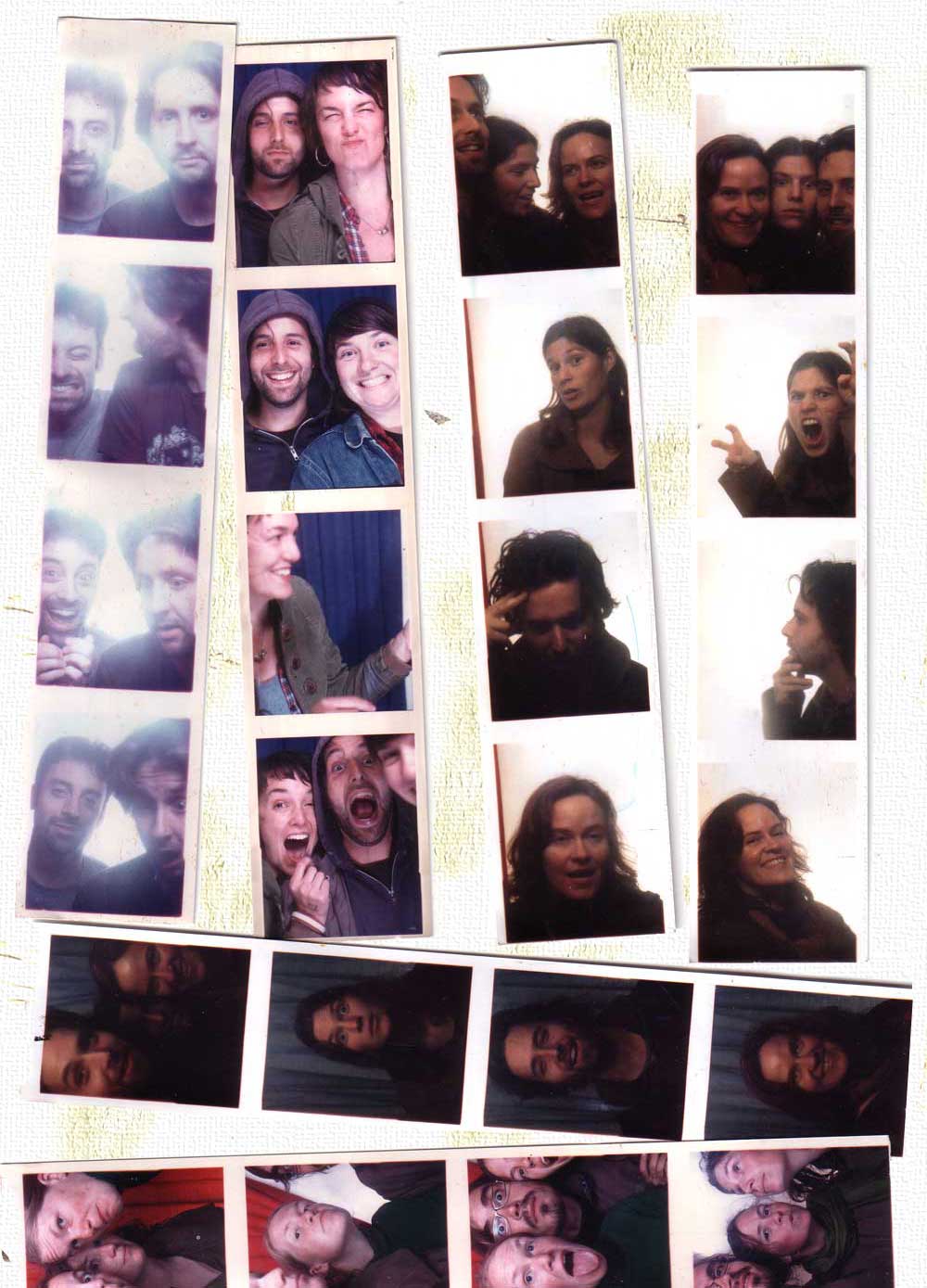
Recent photobooth activity:

Joe, Ben me, Adrienne me, Erin, Christina me, Erin, Christina
Joe, Ben me, Mira Erin Erin
Joe,Ben Adrienne me me
Joe , Ben Adrienne, me, Mira Christina Christina
me, Erin, Christina Erin me Christina
Yael,Erin,Lynsey Erin, Lynsey, Martin Lynsey, Martin, Erin martin, Yael, Erin

People with this name tend to be very warm and nurturing.

Tuesday, January 11th, 2011

truck faceHave you ever been to a zine festival?

Well I have.  And recently, too.  Seduced by a roomful of lovingly crafted publications of  varying aesthetic merit, I found myself inspired but only to take the laziest possible action: to spend money.   So I bought a bunch of zines and thought that maybe in the future I might like to print a zine, too.   My favorite of the lot was “Truck Face,” a memoir of a punk’s work as an elementary school teacher.

I suppose that experience planted the inspirational seed for Erin‘s Christmas present, an edition of her play Tvá Kamila that I designed, screen printed, and bound.  Right now it’s my favorite of her plays, and possibly even the most zine-like.  That’s pretty much the entire story besides the part where I misspelled the name of the play on the cover, which did not even turn out being the stupidest thing I did all week (cue footage of me desperately speeding to the San Jose airport to catch a flight I forgot about).  But besides that I rule.

Here it is:

The wall frame

The wall frame

The wall frame

The wall frame

The wall frame

We are providing: taco truck, drinks, horseshoes.

Tuesday, August 31st, 2010

Mere weeks after printing this, I was in the mountains for this (scroll down to see the images–I don’t know why).

Coincidence? Fate? Or does the the motion of the moon and its resultant appearance from the surface of planet Earth follow some sort of regular pattern? The answer of course is impossible to know, but I spent the final week of summer ‘010 in the Sierra Nevada contemplating such sweeping issues.

See?  Pants-less contemplation:
Dick's Lake

Also I climbed a mountain with beloved companions.
Mt Tallac

And I witnessed interfaith love consecrated at the wedding of a Wohlwend. No photos of that so far, but I did purchase this panel painted with house paint at the Nevada City Crafts Fair.
Crafts

And now I must go earn my keep. My day job starts now.

I’ve heard so many good things about this.

Thursday, August 19th, 2010

Silian Rail Poster:

I thought a productive way to kick off the July printing season would be to crank out a series of starkly radiant posters for my favorite Bay Area boy-girl post post-rock experience, Silian Rail. Time was of the essence as our heroes were embarking on a west coast tour in a matter of days, and the project proved to be a much bigger pain in the ass than anticipated. This was mainly due to incompetence on my part.

The image was inspired by a recent camping trip to Angel Island with Christina, Marella, and EB (I can’t believe I have never done that before).   I had a feeling that the band would be in to a subdued natural scene that invoked their native Oakland.  That led to this Bay Bridge-Victorian-moon rise trifecta.  The images were printed on 30 x 22 Canson stock in a variety of colors:

(Click to enlarge)

BLUE BLUE
BLUE BLUE
BLUE BLUE

Here’s some details.  The bridge:

The window:

The moon:

Of course I accidentally produced all the exposure films one inch too long for the paper. This near fatal mistake required some eleventh hour jerry-rigging in order for the band name to come through, which it barely did in the end. Luckily there was room for me to tape the text in the bottom corner of the film. Here’s what I am talking about.

And here’s some of the other (slightly too long for the paper) films:
Layer 1:

Layer 2:

And that’s probably more than anyone ever needed to know about the Silian Rail posters. Eric and Robin hit the road and the posters were on sale up and down the continent for an incredibly affordable five dollars. A limited edition of 45 or something.